HOME | DD
 jeree01 — GlassAMPv1.3
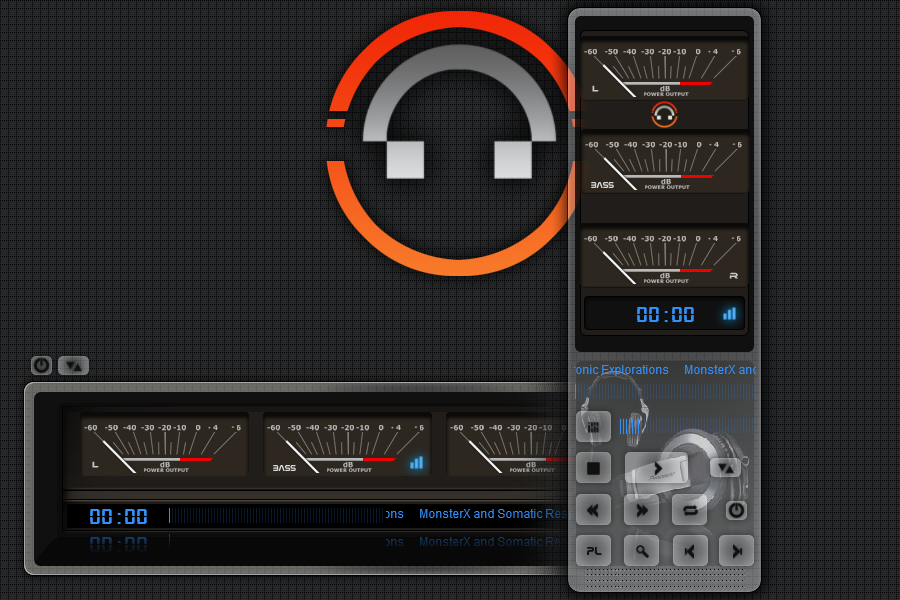
Published: 2006-03-17 14:55:13 +0000 UTC; Views: 24699; Favourites: 31; Downloads: 12404
Redirect to original
Description
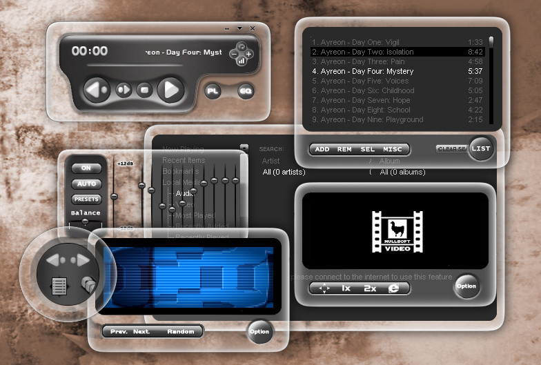
This is my first release.I've tried to match Longhorn Percept WB by savourymonkey....I will keep it for testing,because I think there are a few of bugs. So I will you people to help me with it....Thanxv1.3
new round thinger...
new player-shade....
shade mode for playlist editor....
media library has new frame.....
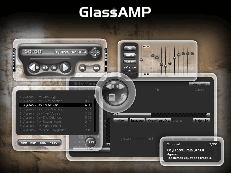
v1.2 the last....I hope
new equalizer with better shadow
added buttons in AVS
and a few other problems solved...
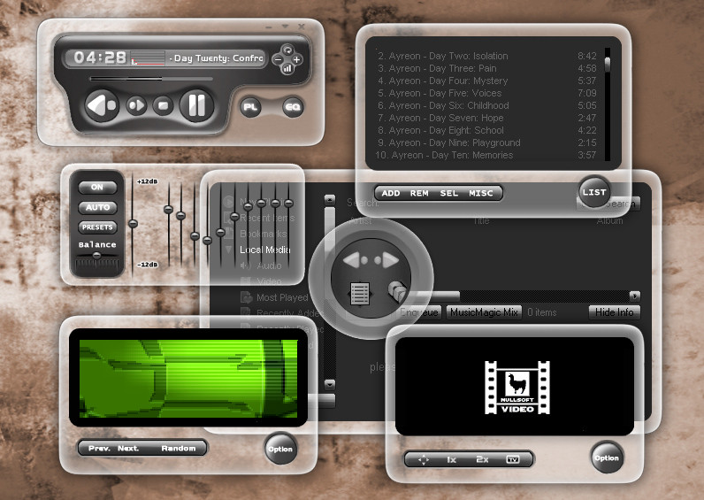
just a simple thinger added...
all as you have asked for...hope
Have just added a zip file in which are two skins...One old and one with a more milky glass....Can you try,which one do you like better?
If any problems,send a picture of it...my English isnt so good and sometimes I dont understand what you want
 (Smile)") )))
)))Thanx
And forgot to thank Savourymonkey ([link] ) for the inspiration and Frisbeemonkey for the tutorial.... ([link] )
Related content


Comments: 28

@Bul37: klick the 'download to desktop' button
eh... grate one... i really like it
")
 (Wink)")
👍: 0 ⏩: 0


ooh, nice job on this... however, i think you could work on the gfx just a little bit, to make this a winner.
The circular buttons have slightly jagged edges where they meet the glass parts...
The min/max/close buttons could be better, they're very thin compared to the other thick symbols and buttons and look a little out of place.
you could kinda outline the text-ticker area on the main window with a neat black stroke, so it doesn't look weird when the text ticks off the ticking area into nowhere. you could also add a similar outline for the seek area, the flat gradient doesn't look very good.
also, the symbols on the Video window buttons are a bit too large, and extend onto the curving bevelled area of the buttons, making them look odd... they could be a bit smaller.
lastly, on the eq window, the vertical white lines for the balance could be a bit thicker, to go with the rest of the thick theme going on.
other than that, there are a few coding bugs, which i can see the boys at winamp.com have pointed out. keep at it, and you'll have a top-grade skin. cheers!
👍: 0 ⏩: 1

Hi abe....I have made some changes at main window...Now just screehshot....Can you have a look at this?Look in my scraps...Thanx a lot...
👍: 0 ⏩: 0


hehe, ta tu chvalia kamosko!tak dufam ze hladame job v grafickom biznise, ci ja som pod tvoju uroven?
tato druha verzia je uz ovela lepsia!
ten druhy obrazok co som uverejnil velmi neber vazne,len som nieco skusal, uz by som rad ta stretol a pokecal ale nevychadza to nijak do pucy!tak drz sa a posluchaj!
👍: 0 ⏩: 0

Quality skin my friend. 
What software did you use to put it together?

👍: 0 ⏩: 1

tips :when you want to answer has a message to click on "reply" (he go in the author of the message), if I had not looked at yet your skin I would not have seen the answer !
👍: 0 ⏩: 0

Very nice ...keep up the good work...still no bugs
👍: 0 ⏩: 0
savouryspacemonkey-thanx monkey...I was just inspirated by yours work....Just couldnt wait for your winamp skin in the GUI kit....
👍: 0 ⏩: 0
DeviantNep-you should turn on AlphaBlending in Options ->
👍: 0 ⏩: 0

Great Work! I haven't found any buggers yet. I do have a "wish list" item - Controls on the Vis window for advancing to the next visualization & a "hold" advance button.
👍: 0 ⏩: 0

It's great work, and it should be doubly applauded, because you've taken the time to skin all the windows. Wish I had that patience. I really is fantastic, and it's a relief becuase winamp's my favourite player.
👍: 0 ⏩: 0


hi ! the shadows on the media library, playlist, equalizer may be cut a the top...but good skin
👍: 0 ⏩: 0

I my opinion those glass parts are too thick. Also edges are too bright.
👍: 0 ⏩: 0
Xav73-I have made the whole skin according to the tutorial...But needed time to understand how to skin the windows
👍: 0 ⏩: 0

for first is good !
you are look the tutorial link i send you in a forum for finish your skin ?!!!
👍: 0 ⏩: 0


To get it to work:
Unzip (rename the wal to zip if you have no decent archiver), then go into the GlassAMP.beta folder and zip up its contents. Rename that zip to GlassAMP_beta.wal and install it.
👍: 0 ⏩: 0
Scubabliss- What?Why doesn't inastall?
👍: 0 ⏩: 0


Thats a sweet skin. When is it gonna be out of beta? I would like to use it
👍: 0 ⏩: 0
