HOME | DD
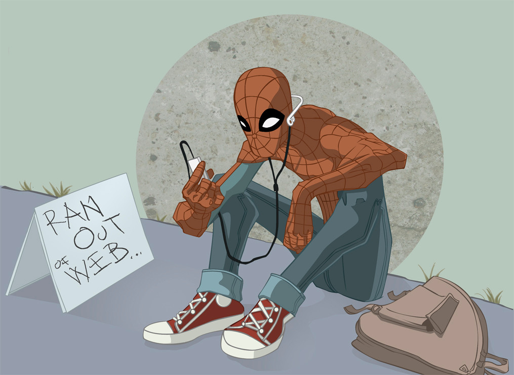
 JeremyTreece — worst spidey ever

Published: 2005-03-03 06:18:51 +0000 UTC; Views: 4350; Favourites: 138; Downloads: 527
Redirect to original
Description
yeah.. this sucks.. bah......Related content


Comments: 57

SUCKS?! This RULES! i REALLY dig the non-uniform web pattern on the costume.
👍: 0 ⏩: 0

why do you think this one sucks? could it be the webbing? cause i think thats why i like it alot.
👍: 0 ⏩: 0


this does NOT suck! this is one of the better spidey pics ive seen! its a damn-sight better than anything i could do. dont put urself down
👍: 0 ⏩: 0


darker colors work better for spidey...its a lot easier to notice a bright blue and red thing flinging across the sky during the day...but dark colors during the night would be ninja and shadow like...except...spidey...over all i like
👍: 0 ⏩: 0

dude, this is totally perfect (well, maybe not perfect, but more than acceptale!!!) style for spidey. i like this one!
👍: 0 ⏩: 0


This doesn't suck! As a matter of fact, I think this looks like a version of a Spiderman cartoon that you might see on Adult Swim or something. Nice job.
👍: 0 ⏩: 0

worst? not quite my friend.
he looks i'd have to say "bad ass" for lack of a better word in your style
👍: 0 ⏩: 0


Worst ever? Mine is WAY worse!!!
[link]
I actually really like your picture. It's pretty rad.
👍: 0 ⏩: 0

 (Smile)")

hEY mAN, do not let the devil poke fun. your drawing is extraordinary.
👍: 0 ⏩: 0

No, that rocks! 

👍: 0 ⏩: 0


Aww IU'ms sorry you don't like it. It's ok. I can see some issues but it's still cool.
👍: 0 ⏩: 0


Yay! it 'spider man ...thats like what got me into drawing ....
👍: 0 ⏩: 0


")

I think that looks real good man. Great pose, you have a nice style on the hands
👍: 0 ⏩: 0

God you freakin hack...You drew that spidey Doc Ock better....lol
👍: 0 ⏩: 0

this is prolly the most unsucky drawing i have ever SEEN!
me like. me like alot
👍: 0 ⏩: 0


it doesnt suck plus if i tried to make spidey he'd look oddly feminine
👍: 0 ⏩: 0

Spidey's freakin' hard to draw if you ask me...nice attempt...better than I could probably do...
👍: 0 ⏩: 0

LOL!
hey..i agree. the moon sux...
but the mood on th coloring is veery good!
i like that man...
^^
👍: 0 ⏩: 0


what are you talking about?! this is some of your best stuff.
👍: 0 ⏩: 0


Eh? How is this bad, Peferct composition, immense style and ofcourse- brilliant palette used. Faved.
👍: 0 ⏩: 0

I think you are being just a LITTLE hard on yourself...
Why every Spider-Man drawing must be cheerfully colorful? or full of details? I think not only your drawing and coloring are fantastic, but is what we don't find every day in here: ORIGINAL.
👍: 0 ⏩: 0

are you kidding man this fuckin ricks the boat!! Awesome position you've put him in
👍: 0 ⏩: 0

i like him a lot!!! i don't think it sucks, seriously it rocks!!!
👍: 0 ⏩: 0

I like it, the left eye (his right eye) makes him look a little odd, but besides that its done incredibly well.
👍: 0 ⏩: 0

nice use for colour picking! It really fits for the night!
👍: 0 ⏩: 0

you's crazy dude... its a bit of a calm before the storm kinda picture.
👍: 0 ⏩: 0

personally i disagree.....i really do like it....i just wish the webs were properly drawn
👍: 0 ⏩: 1

I hate the way the webs are and NEVER... never do them that way.
👍: 0 ⏩: 0


I think he loosk pretty cool!! My only concern with him is that right eye o his, the colorin looks really nice!
👍: 0 ⏩: 0

I think this rocks. The subdued colours really suit him and overall this pic was well composed. Great work
Well I did notice that the lower right gets lighter.... when it should get darker
👍: 0 ⏩: 1
it would be correct if the pinkish light wasn't coming up from the bottom. Then the only light to be hitting him would be the shitty moon... and thus having a more promonent shadow cast on the character.
👍: 0 ⏩: 1
Ooooh 
")
👍: 0 ⏩: 0
| Next =>