HOME | DD
 Jerome-K-Moore — GREEN LANTERN: EMERALD KNIGHTS: ATROCITUS

Published: 2011-06-10 04:08:48 +0000 UTC; Views: 19651; Favourites: 370; Downloads: 437
Redirect to original
Description
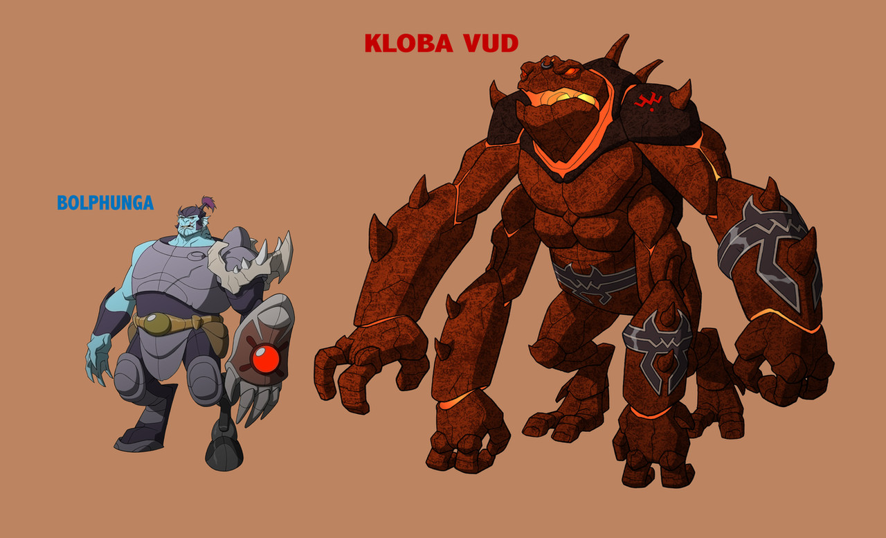
WB Animation, Character Design, GREEN LANTERN: EMERALD KNIGHTS, "Abin Sur," Atrocitus. Pencil, Digital color.For the segment called "Abin Sur," based on the comics story, "Tygers," by Geoff Johns, this is the original design interpretation for Atrocitus before it was ultimately tweaked for the screen version. Initially, the direction was to depart from the DC Comics version of the villainous character. Executive Producer Bruce Timm, and Producer Lauren Montgomery wanted to push things to make some of the interplanetary cast more outlandishly alien, and less humanoid. However, somewhere along the line after I moved on to YOUNG JUSTICE, the decision was made to scale back just a bit, and Atrocitus was given more normal feet. It's my guess that this was done to facilitate the animation process. In any event, I'm presenting my original design here, which I think is a bit bolder, and a lot more fun. Haha!
Okee-dokey! I was inspired this time by various insects, and crustaceans. Despite the frail appearance of the slender areas of his body, I wanted to convey tremendous power, not fragility. And in low-gravity, otherworldly settings, ordinary rules need not apply. It's about having fun with the shapes, and the ominous characteristics of these shapes. I opted for hard edges, and lots of sharp, needle-like points which instantly make the character look dangerous, and mean, even evil. I returned to the double-thumbs theory, because it's extra-creepy. Giving him a crown made of bone added to the evil, even if it makes no sense. It just looked cool.
The original adapted script contained a scene depicting the character battling Green Lantern Abin Sur in close quarters, within a confined space. Atrocitus had to climb the walls like a spider, and so I designed these grotesque appendage/spikes that could sprout out of his back at the shoulder blades ( [link] ). Similarly, there are smaller spikes that can pop out and retract from his body up around the collarbone. These can be used marginally for defense, but primarily they represent a threat posture, much like a cat arches its back to appear larger and more menacing.
Finally, I added a metal harness with a shackled collar, and a broken manacle so that we get the idea that the character is an escaped captive of some sort, probably a prisoner. The color selections here, as always, are my own. The choice of gold was originally going to be used offensively against the Green Lantern's power ring, referring to its ineffectiveness against anything yellow.
Designing monsters is fun! Thanks for viewing! Cheers!
*Green Lantern, and all related characters are the legal property of DC COMICS, and WARNER BROS. All rights reserved.
Related content


Comments: 52

👍: 0 ⏩: 0

👍: 0 ⏩: 0

He looks like a insectoid red lantern that a monster ")
👍: 0 ⏩: 0

It's a very interesting take on Atrocitus, I have to say. While I still prefer his more traditional designs, I do like this and wouldn't have minded at all if it had been used.
However, I really wish the writers for these shows would portray Atrocitus as less villainous and more as the antihero that he's supposed to be. In the comics he has a code of honor, cares about his (loyal) subordinates, and defends the innocent. Not to mention his absolutely adorable relationship with Dex-Starr.
")
👍: 1 ⏩: 0

For what it's worth I really liked this Atrocitus design.
👍: 0 ⏩: 1

It's worth a sincere Thank You.
 (Smile)")
👍: 0 ⏩: 1
Just so you know. You made me smile. Thanks.
👍: 0 ⏩: 0

I do love this concept for Atrocitus, awesome job!
👍: 0 ⏩: 0

Is this the same Atrocitus who becomes the founder of the Red Lanterns?
👍: 0 ⏩: 2
👍: 0 ⏩: 0
There's only one, right? Haha!
👍: 0 ⏩: 1
It's a pretty unique name.
👍: 0 ⏩: 0

This is awesome!Its really better than the version in the comics,this one makes him look more montrous and powerfull.
👍: 0 ⏩: 1
Thanks! I'm glad you like it.
👍: 0 ⏩: 0

Aww man, when I first saw this dude, it was LOVE at first sight, I dunno how that happened lol But I have a huuuuuuuuuuuge crush on that dude in Emerald Knights XD

👍: 0 ⏩: 1
But he looks vastly different from this version.
👍: 0 ⏩: 1
Yeah well I only got into comics just a few months ago so I don't really share the same sentiment as the rest of the hardcore comic geeks out there, then again, it's the sudden influx of DC animated shows courtesy of Warner Brothers that spurred my soon to be permanent interest in the western comic culture.
I'd probably share the same outlook and perspective as the rest of my comic peers once I get further into the history of said DC characters, but until then, let me just say that I really, really, REALLY love you and Phil Bourassa’s works, Young Justice ROCKS XD
And I dnno man, I just love Atrocitus in this getup, it just happened :/..…*favesmoreofyourstuff*
👍: 1 ⏩: 1
Thank you, kindly.
But I meant that this design differs from what they finally went with in the animated feature. As described, they couldn't handle the radical anatomy, so they made Atrocitus more humanoid from the waist down.
It was intentional that we deviate from the design used in the DC comics. Although some fans raised an eyebrow, I was never aware of many complaints.
👍: 0 ⏩: 1
Oh, oh wow, now that you mentioned it, he DID have clawed legs in the animated feature instead of the pointed arachnid ones you got up there.
Sorry dude, I just couldn’t look away from his face here or from the final animated one, he’s just too sexy ;A;
*ahem* In any case, I can’t wait for more of you and Phil Bourassa’s work, you guys are seriously an inspiration to many an aspiring artist and I can’t wait too see more of what Warner Brothers has to offer from it’s creative animation team.
Thank you so much for replying to my post dude, it means a lot
👍: 0 ⏩: 0

I honestly got to say your Atrocitus is a million times better than the comic book version.
I was so upset to watch GL:TAS and see they didn't use your design because it is the superior design.
It looks alien, it looks creative, it looks like someone tried effort as opppsed to just take a human and pain them RED!! (looks angrily at geoff johns) I respect Geoff to some degree that the man can write pretty damn well and has some great stories under his belt, but this design is just vastly superior.
I don't expect every alien character to look extremely alien but this is a case when a being of rage should look more monstrous.
👍: 1 ⏩: 2

👍: 0 ⏩: 0
Thank you very much.
But it is what it is, isn't it? We do the best we can, and try to keep the line moving. Haha!
👍: 0 ⏩: 1
True enough man, true enough.
I know that I am always pushing forward with my projects, like my review show. jsut one step after the other ya know.
👍: 0 ⏩: 1
Only way to do it. Keep pushing forward. No matter what, you never really fail.
👍: 0 ⏩: 1
Yeah, I got through the first seaso of my review show and I got to say I do feel a real sense of pride. Not argonace or anything but satisfaction that I did move forward that I did do review after review nothing stopped me.
👍: 0 ⏩: 0

Someone got a sreious overhall... BRING ON THE RED LANTERNS
👍: 0 ⏩: 0

Realmente asombroso, seria bueno que en otra oportunidad desidieran mandarte a hacer al Atrocitus pero con el Red Power Ring.
APLAUSOS
👍: 0 ⏩: 1
¡Gracias, gracias! Pero por favor no aplauda. Sólo dinero de tiro. ¡Haha!
No sé si otra oportunidad vendrá alguna vez para mí para diseñar Atrocitus. ¿Pero quién sabe qué el futuro trae? ¡Salud!
👍: 0 ⏩: 0


I'd love to see how this version would look in a Red Lantern costume. I think he looks more badass like this then the one they decided on for EK
👍: 0 ⏩: 1
Thank you.
As I indicated, because I stopped reading comics regularly some time ago, I am ignorant of all the doings in the DC Universe (which, at this writing, stands to be undone very soon with their substantial restructuring). And so, I know little about the whole Rings saga, and Atrocitus' role in it. As is often the case, there is an upside and a downside to this. I designed this creature primarily from a fresh viewpoint, and a relatively free rein. I would have to reconsider things if ever I were to render him as a Red Lantern, in costume.
👍: 0 ⏩: 1
I'd almost say don't reconsider. the one thing I wasn't a big fan of with Green Lantern was how all the aliens looked like humans with different color skin or wings or something...not everything should have two legs and two arms. your Atrocitus, while still have two legs and two arms, doesn't look like a big red human and that is what I love most about him. he's alien, you can tell just by quickly looking at him and even before they said who he was I instantly said "that's Atrocitus!" so kudos on your version of him.
👍: 0 ⏩: 1
I'm honored.
Of course, as I think I described on the "Bolphunga" page, it was Bruce Timm's edict that we design aliens in a less conventional way. Admittedly, there's really nothing new under the sun. We can only add a different twist on what has gone before, or we create something based on elements from the world around us. Such are the limitations of human imagination.
In defense of my peers in the comics industry, most instances there is very little time to mull over a new alien design, or a character design of any kind, for that matter. The demands are to conceptualize new characters, maintain an appealing visual style with the protagonists, illustrate a variety of environments in clear and pleasing angles, possibly include vehicles and special effects-- all of this while managing to tell an exciting story. In animation character design, I usually have the luxury of a more honed focus.
👍: 0 ⏩: 1
I completely agree with you, and you're right about the time someone has to think of new characters or designs so we can't really get something so alien. thank you again for sharing with us your concepts for GL and your other great work! we all love every time we get new messages saying you posted.
👍: 0 ⏩: 0

This is pretty amazing. I just don't get how you can draw these characters and such in such a short period of time with not so much practice for the one character... it's amazing how you can do that. Wonderful work, I especially love the chest-plate-guard-collar-shackle. The shine and shading on it make it look awesome. And yeah, I think I've been noticing this 'Gaussian blur' that you've been using a lot, recently. It looks nice usually, but I guess some people don't like it much. Maybe if you toned the blur down, people wouldn't complain as much. Maybe make it 60% as much blur. Just a suggestion, you're the amazing artist here.
Awesome work with this! It would be so cool if I could do this kind of stuff like you do... :c
Oh, and that long reply you sent me before about how you said you deeply appreciated my kind words--I'm not replying to that message because it's just so inspiring that I don't want to get rid of it any time soon by replying to it. So, cheers!
👍: 0 ⏩: 0

man this is freaking awesome!!! would love to see him in his red lantern uniform ... so different from what i normally see in the comics this is what he should look like. Hopefully they use a this or a similar look when they reboot all the GL titles.
👍: 0 ⏩: 0

So much Gaussian blur...! Do you use it solely as a style choice? ...Or for another reason?
I usually find it rather hard to concentrate on your most of your awesome work with the blur layer on top.
x~x;;;
👍: 0 ⏩: 1
It's a religious choice.
Kidding.
My Photoshop Sensei taught the effect to me, and now I use it whenever I think it adds a little sumthin' sumthin' that is lacking in the ordinary flats. I realize it doesn't always work, though. Sorry if you disapprove.
")
👍: 0 ⏩: 0

that. is. LOVELY~~! I can't wait to see him (even a little altered!)
👍: 0 ⏩: 0

Okay Damn. O.o while I am a fan of this character and liked his original design. This...this is nice. His name finally fits his looks. This looks like a beast of rage.
👍: 0 ⏩: 1
I confess that I don't really know very much about the Atrocitus character. I stopped reading comics regularly a long time ago. But I was aware that DC had injected a whole lot of complexity into the Green Lantern storyline, perhaps excessively so. There are green lanterns, and red lanterns, and yellows, and blues, and almost every color of the bloody spectrum. And the retroactive history rivals something J.R.R. Tolkien may have written.
All due respect to the original creators of the Atrocitus character (I have no idea how much time and thought went into his design), but honestly, in the comics his appearance is okay, but fairly conventional. He's much like a dozen or so other super-bad guys with inexplicably huge muscles, filed-down teeth, and a permanent scowl. At first glance, he looks a bit like a mixture of Spawn, Venom, Darkseid, The Red Skull, and any other typical beast-man reminiscent of Satan. Sure, it works. But I was glad when they encouraged me to go in a slightly different direction. But again, as I described, I managed to go a little too far. Hahaha! Ah, well...
Thanks a lot, Seanfall!
👍: 1 ⏩: 1
Your welcome. From what I understand Atrocitus is, or was, an age old enemy of the Guardians. Some sort of massacre of his sector and most of his people and family was either done by or covered up by those Guardians. The Red Rings stop's the user's heart making the ring the one thing keeping them alive. All red Lantren's also spew their energy which looks like blood. The reason why they can't form it the way Green or Yellow Lantren's can is cause they don't really control their rage as much as they just direct it.
👍: 1 ⏩: 1
That's gross. So, they vomit their energy blasts? Haha!
👍: 0 ⏩: 0


Fan boys would complain none stop about this for awhile...
👍: 0 ⏩: 1
Some people are only happy when they have something to complain about. No big deal.
👍: 0 ⏩: 1
Hopefully the reboot would dort them up for a about a year if not a month... though it does shatter my dreams of writing for Superboy...
👍: 0 ⏩: 1
I include myself among those who like to complain, by the way. Rarely is anything good enough, which inspires even more changes, and still more complaining. It's an endless cycle. And it can be fun and constructive as much as petty, and negative.
👍: 0 ⏩: 1
| Next =>