HOME | DD
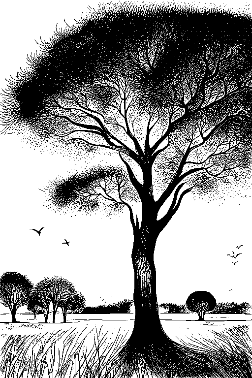
 JeSSanchez — Old Convent2

Published: 2007-04-03 19:23:24 +0000 UTC; Views: 4388; Favourites: 89; Downloads: 68
Redirect to original
Description
This is a new version of the old drawing named "ex convent" [link]I dont remember exactly how much time spent, around 20 hours in a week.
2B, Hb and 2H pencils used on letter sheet.
Related content


Comments: 18

Este dibujo me apetece como para estar ahí dentro dibujando o leyendo.Le has impreso una paz que sóloo en un convento la pudes sentir.Oye,que exconvento es?Deveras,que has hecho un excelente trabajo.
👍: 0 ⏩: 1

Gracias. Si, la verdad que la sensacion dentro de esta clase de construcciones es de paz y tranquilidad, así se encuentren en los concurridos centros historicos de las ciudades, este en especifico es el exconvento de la cruz en tepic nayarit.. [link]
👍: 0 ⏩: 1
El exconvento de la Cruz en Tepic,no lo conocía.Por un momento creí que era el exconvento del Carmen,pero como no se me hacía conocido.
👍: 0 ⏩: 0


great work! lovely shading and details and your precision is amazing!
👍: 0 ⏩: 0

Wow, you have patience.
I like the leaves on the trees.
")
👍: 0 ⏩: 0


 (Wink)")


thats really awesome.
your use of hatching is outstanding.
such detail.
i agree with jggrl, maybe a bit of 4b to darken some of the back up a tad.
but amazing.
i wish i was this technically good.
👍: 0 ⏩: 0

I'm liking the feel of it, but perhaps squeeze a 4B or 6B into the darker areas? I think it would help really seperate the fore, mid and backgrounds of it.
Keep it up!
👍: 0 ⏩: 1
Maybe. In the fact the original drawing is weaker , almost without contrast, I will consider that in next works  (Smile)")
👍: 0 ⏩: 0
I'm liking the feel of it, but perhaps squeeze at least a 4B into the darker areas? I think it would help really seperate the fore, mid and backgrounds of it.
Keep it up!
👍: 0 ⏩: 0