HOME | DD
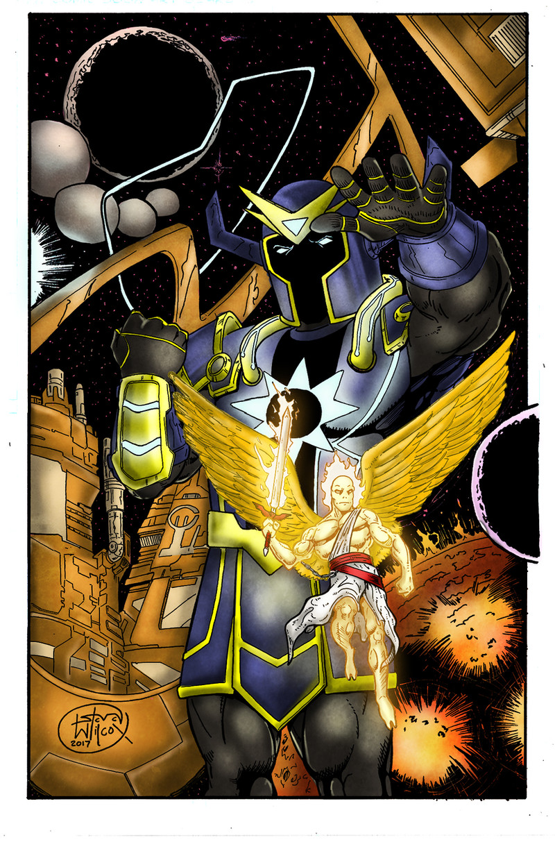
 JessHavok — Eclipse: issue #1 page 20

Published: 2013-03-28 01:34:27 +0000 UTC; Views: 953; Favourites: 28; Downloads: 10
Redirect to original
Description
This is the original day time version of the page I colored, the final page I changed to night, you can see here: jesshavok.deviantart.com/art/E…You can also see the black&white line art here: petewraymond09.deviantart.com#…
Other pages for this upcoming comic can be seen here:
Issue #1 promo poster: jesshavok.deviantart.com/art/E…
Issue #1 page 3: jesshavok.deviantart.com/art/E…
Issue #1 page 19: jesshavok.deviantart.com/art/E…
Issue #1 page 20: jesshavok.deviantart.com/art/E… (night version)
Issue #1 page 21: jesshavok.deviantart.com/art/E…
Issue #2 page 1: jesshavok.deviantart.com/art/E…
Credits:
Written & Created by Trevor Talbott & Scott Meier
Pencils/Inks by Pete Raymond
Coloring/Lettering by Jessica Jimerson
Product of S&T Comics
Official Eclipse twitter: eclipsethecomic twitter.com/EclipseTheComic
ECLIPSE IS NOW ON KICKSTARTER!!! Check it out: www.kickstarter.com/projects/e…
Get your copy of the comic book here: comics.drivethrustuff.com/prod…
Related content


Comments: 6

colours look really nice, I like the soft blending a lot. The foot looks a bit odd, but you didn't do the inking, so that's not your problem
")
👍: 0 ⏩: 1

Thank you, I ended up making the lighting a bit stronger on the final nighttime verison of this page. But I'm still found of this one myself too... But thank you for your comment.
 (Smile)")
👍: 0 ⏩: 0

Very sharp image! I do have to ask- I am pretty sure- that you colored the piece only not inked? I am preyy sure I am correct so I will do the crit.
I think the coloring is realy good. I think the bg is handled perfectly- you get the bg but its not overbearing. ( however, at first glance I did not see the sun/planet there, however, I dont think it could have been handled differently)
For the coloring on the character- I am wantign to know what it would look like with some more darks... I think you are almost there- but there are some spots that I think would push back better if there was a darker shadow on it ( teeth- where they go back behind the lips)
The hair could be more defined with darks too, or color it in a way where it feels more strandy.
I think its colored in very well tho. Nice dynamic pose and great color choices!
 (Wink)")
👍: 0 ⏩: 1
Thank you for the detailed critique, much appreciated! And I agree with your points, I will keep a watchful eye for stronger contrast areas with future works. For things that get printed though, can't go too dark because what often looks perfect on LCD/computer screens will be just on the too dark side when printed. So I have to be mind of that, but again much appreciated and I will try out refining hair for the next page a bit more.
👍: 0 ⏩: 0

Love the dynamic pose of this, and the lighting is good too!
👍: 0 ⏩: 1