HOME | DD
 JesusIllustrator — Architecture?

Published: 2007-02-27 12:03:00 +0000 UTC; Views: 19914; Favourites: 129; Downloads: 0
Redirect to original
Description
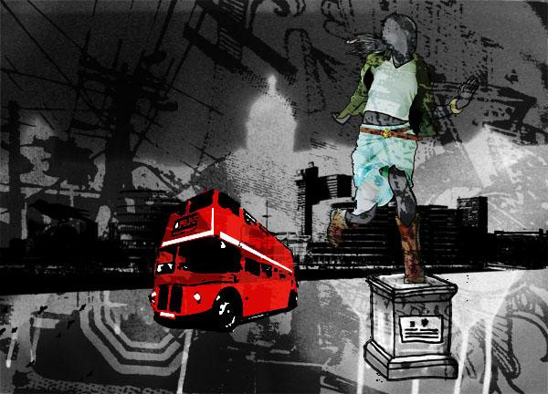
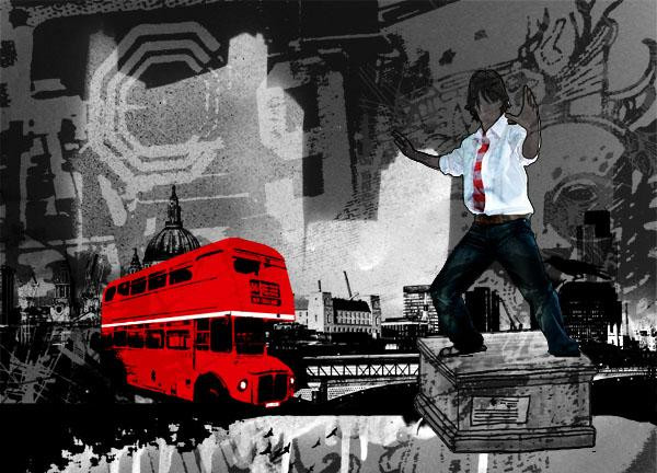
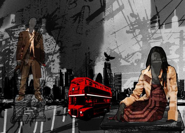
This image, titled 'Architecture' is my 3rd image from a series created for a Digital Imaging project in my Illustration course. i have been exploring human culture and civilization and I looked at the urban architectural culture.I created this by using stock photos in Photoshop, creating brushes and experimenting with the composition. Feel free to comment.
Related content


Comments: 12


 (Smile)")


its a good composition, as it really holds the axis.n u can see th image is been lifte up..nice way of presenting
👍: 0 ⏩: 0

of course! always architeture. this is an interesting image
[link]
👍: 0 ⏩: 0


I like it, but i think it's better if you take off the rainbow, all its a monocromatic composition and with it you call all the attention... i mean it's like the rainbow it's the most important thing in the image... making the rest of the image like a simple background.
👍: 0 ⏩: 0

question:
do these architectural gestures fit together, are our cities a collage of ideas and styles?
does the bike have any relevance to the style and times of the architecture shown?
👍: 0 ⏩: 1

~Stuartsjaw: I believe this was meant to be a new composition. Remember architecture is a process. One must first arrive at one idea to go on to the next. I don't believe they need to have relevance in terms of time period styles, etc.
~Jesusillustrator: Well done! Yes, as previously stated, the monochromatic scheme binds the composition as a whole. The random black ink spots perhaps allude to the subconsious mind and how everything naturally makes sense without thought in words but in visual. It connects the piece as well and adds contrast to an otherwise bland collage. The rainbow, perhaps and idea from Le Corbusier and his polychromatic scheme at one of his le unite de habitation projects? (sorry forgot the building name). The man on the bicycle is well positioned and his perspective lines collide into the main, central area adding a dynamic element as well. Hope this was a helpful critique or analysis of what you were trying to convey.
👍: 0 ⏩: 0


This piece is very appealing. I like the composition; the buildings in the center create a wonderful diagonal that pulls the eye through the entire piece. The rainbow adds to the monochromatic scheme that you have going, instead of being a distraction. The man on the bicycle also adds instead of detracting from the work. He has a way of unifying this piece and connecting the architecture to humanity. To me, it says that such edifices are not simply cold, impersonal buildings, but are the products of human necessity and imagination.
👍: 0 ⏩: 0