HOME | DD
 JezabelPheonix — Sporkman Poster

Published: 2010-06-04 01:59:18 +0000 UTC; Views: 1713; Favourites: 22; Downloads: 0
Redirect to original
Description
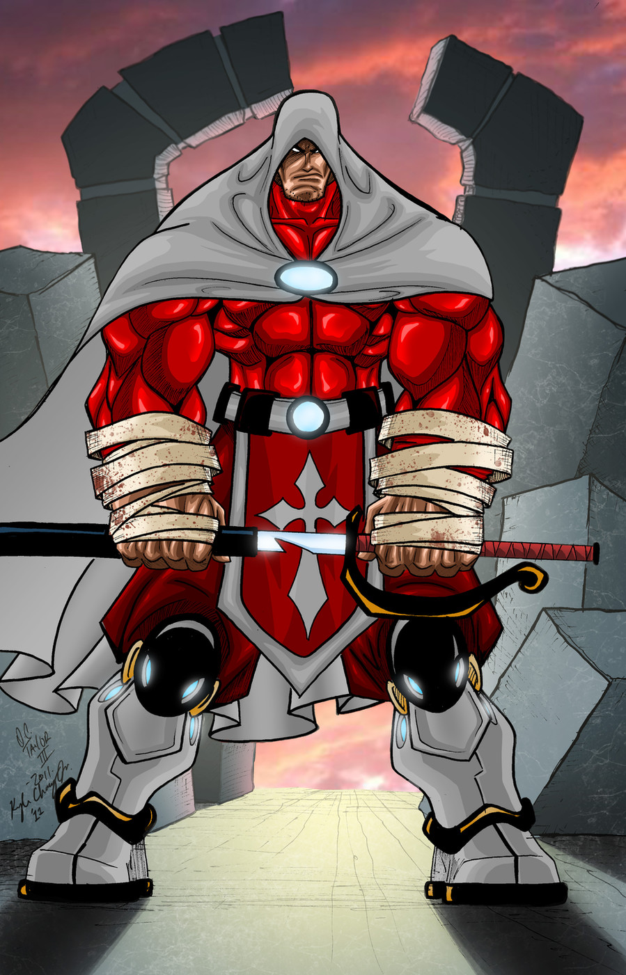
Sporkman poster design I did for the Sporkman Group. Hand drawn and colored in Photoshop. The Sporkcycle and Sporksword are my creations for this piece. Poster should be available soon at [link]Sporkman character and comic were created by Eric Berry and Chris Sylvia and is an independent, self-published comic book you can get from the above link.
Related content


Comments: 22

LOL! Cool, really cool. He looks like viewtiful joe a bit though.
👍: 0 ⏩: 1
 (Smile)")
got any mo' superheros?
👍: 0 ⏩: 0


Yes! He's so brilliant that I wish I would've created him. Spork, the ultimate utensil.
")
👍: 0 ⏩: 0


His arms and legs seems too short for the length of his body, his feet too little, too.
You should study more anatomy or at least use more reference for the drawing.
Beside that I liked the colors and composition, you just need to be more careful
👍: 0 ⏩: 2
Btw, keep in mind his legs are also in the knee-high boots. His legs measure a bit longer than the rest of his body, which is supposed to be correct for human proportion.
👍: 0 ⏩: 0
I used lots of references, I wonder if he looks funky because of the resizing I did to shrink if down for the web...thanks for the suggestions!
👍: 0 ⏩: 0

Hehehe, yeah he kinda does, doesn't he? I wasn't his original creator, but with a name like Sporkman, how could I say no?
👍: 0 ⏩: 1

o.o He reminds me of a Kamen Rider. <3 I love the mask/helm design but I think you should spend a bit more time studying human anatomy. The proportions and musculature seem to be kind of off. Also be leery of using random lines for "details". Clothing and muscle detail are much easier when you spend the time to full understand the biology and physics behind them, for example creases/wrinkles in cloth tend to form at the inside of joints. As for other bodily detail, again I advise looking up human muscle diagrams and studying nude models in various positions (it's an inevitability of art, if you really want to get good and drawing things realistically you have to study some nude models so that there is nothing hindering the natural details and tendencies of the body).
👍: 0 ⏩: 1
Studied lots of nude models, was required for my art degree, lol. Thanks for the suggestions. I actually did use Kamen Rider Black as part of my visual references because like you, his character design does kinda echo Kamne Rider imo, and Kamen Rider Black is just the best there is in all of Kamen Rider Universe. I wonder if he looks funky because of the resizing I did to shrink if down for the web because the full size, now that you bring it to my attention, doesn't quite look this way...again, thanks for the suggestions! I will definitely give them some thought!
👍: 0 ⏩: 1
Btw, keep in mind his legs are also in the knee-high boots. His legs measure a bit longer than the rest of his body, which is supposed to be correct for human proportion.
👍: 0 ⏩: 0


