HOME | DD
 JGood8 — Possible ID

Published: 2009-04-12 21:01:19 +0000 UTC; Views: 1974; Favourites: 6; Downloads: 17
Redirect to original
Description
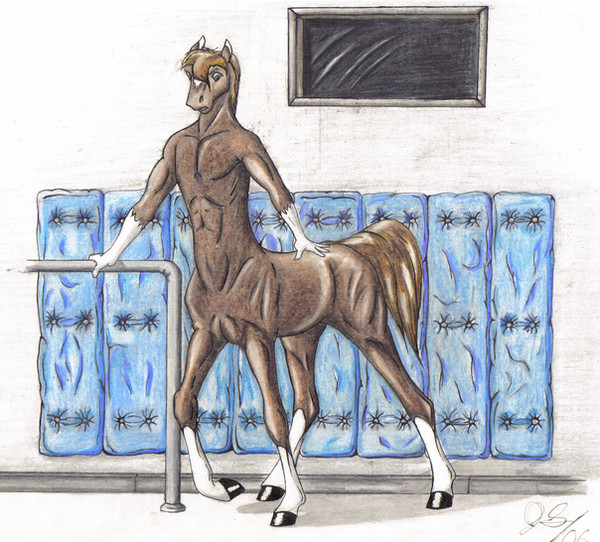
I was going to use this as an ID, but I decided after i did it i wanted something more dynamic. Ill have the sketch done soon. Stay tuned.Related content


Comments: 7

Overall

Vision
Originality

Technique
Impact
I think this is pretty good! You’ve colored this image, which I find to be nice just because most of your works are in pencil. The highlighting of his equine portion is well done and follows the contours of the horse body. However, I’ve noticed the horse body seems to be a bit too short in relation to a typical horse body in this particular image.
By no means am I stating that I am an equine master here—I only seriously started drawing horse bodies the second part of my senior year, which was about a year ago, so I still have much to learn. Stretching out his horse body by a bit will make him seem less stout and squeezed in, so to say. Similarly, I’ve noticed you tend to make the horse bodies of your centaurs/equitaurs very thin. Of course, that may just be the style you’re going for, and if it is, do disregard the next sentence. If you’re going for a more realistic horse body, I suggest thickening the horse belly.
Now, I see that the horse legs appear to be a little thick in comparison to a typical horse—though again, it may be the style you’re shooting for. If you’re wanting a more realistic-looking horse, thin out the lower portion of the legs. Horse legs tend to really taper (and in my opinion, it always makes them look as if they can’t ever support their weight, but they do!) towards the bottom and their knees (on their forelegs) tend to jut out.
I like how you’ve meshed the human torso and the horse “neck” together—that looks spot on. It doesn’t appear as if you’ve just stuck a human torso and overlapped it on a horse body, but rather integrated both parts of the bodies together. Concerning his human part, though, it appears as if his neck is a little too short and thick. One of his eyes are a bit higher than the other, as well. Practice is what I can suggest for this—usually, using the typical plus-sign/cross in the middle of the face to “anchor” the facial details works, but I’ve found just positioning the nose first in the drawing tends to anchor it just as well for me.
His wrists don’t seem very pronounced—it’s as if his lower arms and hands meld together. Tapering his lower arm a bit would give him a more pronounced wrist. I remember from a recent dev that you stated why you didn’t color things more often, but personally, I think the coloring job on this came out pretty well!
👍: 0 ⏩: 1

Very astute. I agree with the face. I normally do not do human faces at least on that scale. If it were larger like i should have done, i may have been able to reel in that eye you were talking about. However, my scanner does not do a good job of portraying the color, because it is completely different on paper. But yes, the eye is a tad bit off.
As for the body, I have an idea that not only should the human body conform with the equine portion, but the equine portion with the human as well. When you have two hearts, lungs, kidneys, and double of other organs, they can afford to be rather smaller because of the double effort. But when I was working this in photo shop, I had to re-size it, which probably contributed to its "stoutness" but when I draw my actual ID, I will consider those things.
Thank you very much for helping me out and taking the time to write this. It helps a lot.
👍: 0 ⏩: 1
Yeah, with my centaurs, I tend to go with a more traditional equine body, so I can't suggest much if you're going for another kind of style in that sense.
But no problem! I'm glad I could help.
👍: 0 ⏩: 0

2 of these guys posted on my bday. omens...coll pic though
👍: 0 ⏩: 0

Awesome job! I love the colours and shading.
👍: 0 ⏩: 0

freaking sweet man, looks like he's ready for a jog
👍: 0 ⏩: 0

 (Smile)")