HOME | DD
 jimkimjat — Flowance

Published: 2009-06-08 13:58:21 +0000 UTC; Views: 1837; Favourites: 35; Downloads: 120
Redirect to original
Description
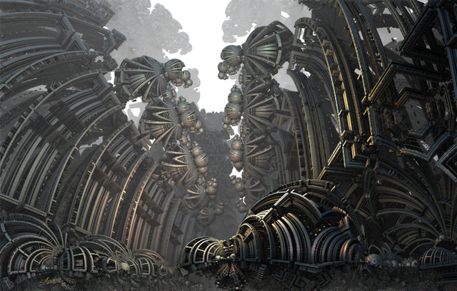
*Click download for the full-sized version of the image*Flower + Dance = Flowance
I like this piece a lot


It didn't took me a lot of time though. Finished it around 5 hours or so. Rendering took 24 minutes, so I made a drink and play around with my cutie niece (almost 2 years old now).
Then I opened up Photoshop and dA for inspiration. I cleaned up the shadows from Cinema4D, I fixed some shadow errors.
Added lines around the render using the much loved pen tool woot! Go go pen tool! And some brushing for some minor highlight and to fix upper part's ugliness


Then a colour balance layer and a simple typography. I'm not an expert with typography, so I made it simple just to be safe =]
Related content
Comments: 32

Great render, love the perspective, looks great man
👍: 0 ⏩: 1

You need to stop being so damn good.
of 600 uploaded deviations I need to comment on, I seem to just be clicking all yours lol.
Hot piece though dude. Seriously loving the colours.
👍: 0 ⏩: 1

loved it.... but the bg is kinda empty...
but still, i wanna rip it wahahhaha
👍: 0 ⏩: 1

It's mainly because I wanted to show focus and clean shapes
Thanks though!
👍: 0 ⏩: 1

good thinking... usually, i get pissed off when some1 told me that my vector tag's background is empty lol
👍: 0 ⏩: 0

Pretty sexy. I'm not really liking the empty-ness though =/
👍: 0 ⏩: 1

I've just realised you were the 3rd person to watch me here in dA. And it has been 1 year+ this account is.
<3
👍: 0 ⏩: 1

I've always loved your art, and I look up to you for inspiration and as a role model.
👍: 0 ⏩: 1

I rarely add to favorites, yet, this deserves it! Congrats. Only thing lacking in this piece is the C4D going off the composition. If you could somehow squeeze that right part in more, it would be perfect. Keep it up!
👍: 0 ⏩: 1

I try to keep it balance between the right and the left part with the mini typography. The left part having a little bit of empty space and having a little bit more colour. While the right part taking up more space and a bit darker colour.
I tend not to bring up the right part, so the mini typography can get a little bit of attention
👍: 0 ⏩: 0

Fucking love this! Seriously! Probs one of my faves
👍: 0 ⏩: 1

I like it, but maybe you should sharpen it up a little bit, to give it a tiny bit more detail
👍: 0 ⏩: 1


