HOME | DD
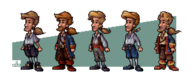
 JINNdev — LeChuck SE edit

Published: 2011-08-15 02:51:47 +0000 UTC; Views: 9546; Favourites: 140; Downloads: 249
Redirect to original
Description
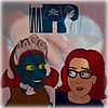
That's my edit of how LeChuck should look in Monkey Island Special Edition.With the originals for comparison. Hope you like.
See also:
www.patreon.com/jinn
Related content


Comments: 69

nice lechuck edit, you look like you worked with lucas art
👍: 0 ⏩: 0

I wish all of your edited versions were the ones used in the games. Especially the MI1 Guybrush.  (Smile)")
👍: 0 ⏩: 1

Thanks a lot! Maybe someday we'll have the Special Edition we want!
👍: 0 ⏩: 0

Oh, you're great. Me and my friend always were complaining the SE version of LeChuck, because that new team made him kinda muscled looking, but he should be rather fatso type, just like you did here. Good job!
👍: 0 ⏩: 1

This was the most annoying character change they made to the SE's in my opinion ")
P.S my fave is your "remake" of Guybrush in MI2. Perfect!
👍: 0 ⏩: 1
Thank you very much, pal! I really wish they had more care in the production
")
👍: 0 ⏩: 0


Another win! Absolutely fantastic, would love to see this swagger in motion as per original. Reminds me of the original concept paintings for Monkey Island, and that's a good thing. The fella on the right has proportions pulled out of the wazoo, and none of the threatening mass the sprite had
👍: 0 ⏩: 1
I'm really glad you like it, pal!
👍: 0 ⏩: 1
I like it as much as that Commander Keen helmet.
👍: 0 ⏩: 0

Very good work, it also called my atention how dissimilar to the original he looked in the remake
👍: 0 ⏩: 0


Why in the hell nobody is trying to do a patch, mod or somnething to play with this model!!!!?????
Only needed one do the patch or mod with all the sprites of lechuck
You can see them all here:
[link]
👍: 0 ⏩: 1
Well, this is not an easy task anyway.
👍: 0 ⏩: 0


Awesome, but technically your edit of of the MI EVA version.
👍: 0 ⏩: 1
hehe, thinking of Evangelion, huh?
👍: 0 ⏩: 1
Kinda. ")
👍: 0 ⏩: 1

I like your version. It looks more ghost-like. Nice job combing the original SE version and the EGA.
👍: 0 ⏩: 1

OH MY GAWD! WHY THANK YOU SO MUCH!
that is EXACTLY what he should look like! why thank you so much. man i cant even believe the one on the RIGHT is the RIGHT one. how could they just do that? what botheres me even more is that i constantly complain about how shit the special edition art is and yet I know a lot of people who fap to it. they just dont understand it and dont see any problem with the shitty art.
seriously i cant sleep at night because of how shit the art is. get this straight: there are artists who did this lousy job and they got PAID for it. its an honour to do graphics for one of the best games ever and they fucked up so badly and GOT AWAY WITH IT! argh just makes me get so emotional when thinking about it and looking about it.
so lets point out what you did right and what they did wrong.
your colours are beautiful- their colours are boring, pretty dull and just a lame choice. its not warm, its not cold, its just like: oh right he needs colours.
LeChuck is a fat ghost pirate. Their version is way too skinny. Their bones are way too white and shiny. His face doesnt look like a grumpy daemon pirate but some really creepy monster especialyl with the white eyes also he looks super young like 30 instead of the old pirate he is. it just doesnt capture his personality at all and ive to admit he quite scares me especially with those white eyes. also if you draw his face in skin tones why the fuck would you do his hands in green- it just makes no sense at all?
also whats with the feather on his hat. thats not what feathers look like. its like someone went slipped with the brush tool when drawing the beard. its just so awful. also look at that flat and dull belt they farted out. man the more i look at this the more i hate him. so thanks a million again. id love to email this to Lucas and tell them they used to be good and used to hire awesome artists while nowadays they just suck big time. You rule!
👍: 0 ⏩: 1
Thank you very much, Mark. You just said everything that was stuck in my throat! I wish LucasArts take the MI fans more seriously. ;/
👍: 0 ⏩: 1
i dont get the fact they completely reinvented the point and click system. i've been playing adventure games my whole life and all different systems that had been around worked GREAT- also on console ports and then they come along and do this awful system. i have a hard time solving some puzzles because of their awful system so i switch back to classic mode.
i am really annoyed you can NOT play classic mode with voices and music. the audio is the only thing i like about the special edition. also i think all the graphics look like awful macromedia freehand tutorial graphics (you know that program that died years ago when adobe bought macromedia and killed it so there is only illustrator).
what makes me so angry besides them raping one of my favourite computer games (its like george lucas raping indiana jones in that south park episode) is the fact: what do you do for a living? i hope you have a super job. there are those people who go to work at LUCAS ARTS and they do graphics for MONKEY ISLAND and they get PAID and do a shit job. they just do the worst job ever and they get away with it. if i do crap at work i would get fired and they would hire someone else. those people dont DESERVE that job yet they land art jobs- how?! and i bet you dont have a super job at a big company like lucas while YOU deserve it. people who DESERVE it get ignored or dont get such jobs. why? stuff like that just makes me question the world. sorry to sound so dramatic but this is really something that bugs me so badly. otherwise i keep quite (most of the time).
👍: 0 ⏩: 2

Not fair IMHO.
There is something I'd like to hightlight, this is an artwork built, a posteriori, upon an already defined artwork, made by an individual who has time to redefine, fix and adjust even the smallest detail. Now, comparing this, with the work of a group of individuals with deadlines, compromises, pressure and no possibility to change things after the job's done simply seems not fair to me.
👍: 0 ⏩: 1
welcome to the working world. of course you always have tight dead lines and all this but if there is a team behind it you would HOPE they all KNOW monkey island and have played it. first you do some RESEARCH and then you start drawing. if they had just looked at the original characters everything would have been fine. look at the original characters and redo them.
i know tight dead lines suck but there is a difference between a good artist and a team that did a good job or a team that did a horrible job. just look at all the graphics they did for the remake. they did a horrible job. if you dont want to blame the artist blame the creative director because he is the one who says YES thats nice and totally recaptures the feel of monkey island or he could have said: NO that does NOT feel or look like monkey island. this is some cold that looks like a cheap vector tutorial you guys got from deviant art. i cant see monkey island in this.
so who ever is responsible they did a bad job and it isnt fair to the FANS of monkey island to give is such crap. its an insult. its as if someone had worked on it who had never touched monkey island but just saw $$$ signs in their eyes because "the fans will buy it anyways".
👍: 0 ⏩: 1
Honestly, I don't treat these graphics as "horrible", I don't think they are graphically loyal to the first episodes either, that's why I'm faving the JinnDemonEvil version of Lechuck.
I regard the Special Edition, on the chara design topic, as a misinterpreted version of MI, I could say the same thing for Curse of MI, even if this last one's not pretend to be a remake. I feel like they missed the point but I highly doubt that this was accidental or a matter of incompetency.
Now, what was their intent behind the scene ? I have no idea.
👍: 0 ⏩: 1
yeh i agree. it does indeed look like a misinterpretation. i've to admit i LOVE the art style of the the curse of monkey island. the backgrounds are so detailed and everything. i saw some fan art of the scumm bar from outside done in the style of curse of mi. i just loved it! now talking about remakes of old games they are REMAKING larry 1. im really wondering and AFRAID how this will turn out. i mean there was the EGA version of larry 1 and then they remade it in 1991 and I think those 1991 graphics are great. im really afraid of what the game will look like NOW. its just so weird to have the same game in 3 different graphical styles then. i just HOPE for the love of god they will stick to the style of lsl 7 and wont do any 3d graphics. that would make me cry.
👍: 0 ⏩: 1
Well, my point on Curse of MI is mainly on his chara design even if background artworks may fall under the same POV. Clearly, CMI's developers both dropped pixel aesthetics and realism in favour of a cartoony approach which is something I do not enjoy much, but the developers clearly stated (source: [link] ) that this new aesthetics was not necessarily an art direction in itself but more a consequent choice motivated by technical constraints.
Now, for the "remake wave", I think that artistic choices, again, might be biased by the same technical constraints and by how editors analyse, anticipate the global taste of customers.
👍: 0 ⏩: 0
Thanks for these words, pal. And I have to agree, I'd give a kidney to work in LucasArts or Blizzard and so, but as a Brazilian artist I'll probably never be in their aim, sadly.
All I can do is wish they change their minds and take good care of the other games we all love.
Oh, and by the way, I heard someone is making a mod that put voices in the original game: [link]
👍: 0 ⏩: 1
oh i dont know. i think there are a lot of foreigners from all over the world working for those big studios. just because you arent american doesnt mean you wont get a job / will be trapped (if you dont like brazil that is). just keep up your great work and post them on forums and maybe try to just apply at those companies.
here is a story: there once was that GIRL who did this simpsons fan art here on deviant art. she redrew most of the characters from springfield sitting on the couch in anime style. it was super popular on the net. so popular that bongo comics found out and she got a job working for the simpsons comics now.
just do your shit and send it around and hope important people will see it. i hope this will work out somehow for you
👍: 0 ⏩: 0

I like all your versions of the SE charakters, but this the most. The LeChuck in the game was to different from the original one, but yours looks exactly how he should have look like.. Fantastic!
👍: 0 ⏩: 1

Your version is much, much better. I just hate the SE designers for what they did. The only good things in that game is adding the voices.
👍: 0 ⏩: 1
You know, when I was watching the comparision between old and new LeChuck's Revenge... I think that even animation is better in original version 0_o. I don't know how they did it, but actually the 1991 game is better animated than 2009 remake, which looks like puppets theater! How the hell they did it!?
👍: 0 ⏩: 1
The water effects and glows are fine, but just it.
They kept the numbers of frame the same for some reason, and looks awlful to see an "HD" graphic with limited frames.
Did you saw the SE2 trailer? [link]
it's very fluid! I wish the game looked like this.

👍: 0 ⏩: 1
Oh yeah, animation in that trailer is so... alive... Not like in the actual game >.< But I'm gonna to play it some day anyway - just to change graphic to old one and play with the voices
👍: 0 ⏩: 0


Oh the greatness! I love how you get them to actually look like themselves, in contrast to LucasArts! Very nicely done!

👍: 0 ⏩: 1
| Next =>