HOME | DD
 jishdafish — DG cover
Published: 2008-03-12 10:02:33 +0000 UTC; Views: 68; Favourites: 0; Downloads: 3
Redirect to original
Description
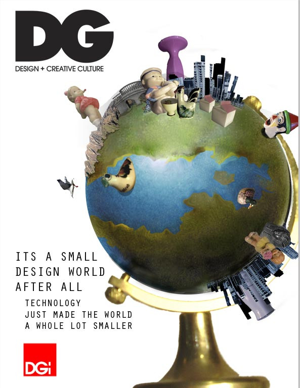
a uni assignment... not handed in yet so any comments or suggestions welcomeRelated content


Comments: 2

hey, like the concept.
few issues with it though.
first, the globe isnt straight, looks odd at the base how one side is higher, id rotate the whole thing so it sits flat, itll be more aesthetically pleasing, people eyes pick up on little things like that and it will force attention to somewhere its not wantd before they even see the rest of the image.
second, the type, it looks boring, same typeface, same colourm, only size changes. pergaps make the subheading smaller or use a more standout font for the first heading. not too keen on the indent either. also dont be afraid to merge text with graphics, you can have the type go in front or even behind the picture, so long as its still readable, if you lose the top of the L in small, it will still be noticeable as an L. other magazines often do that, usually with the mag title, but the wording isnt lost.
thirdly, experiment with backgrounds, the white will probably still work and does create a great contrast, but perhaps a very faint desaturated colour could soften the image up a little, or a photographic background taht does attact too much focus. as i said, white works, but try a few things out before you make a decision.
also, check your brief, i think youll find you need issue #, price, barcode, etc. its good to get these things in early, if you add them in later it can destroy your original if you havent thought about where to put them, a simple clean design turns into a cluttered mess after these elements are added if your not careful.
On that note, nice concept, looks good, and good luck with the comp.
👍: 0 ⏩: 1

hey thanks a lot, really good feed back. ill have to re look at it
 (Smile)")
👍: 0 ⏩: 0