HOME | DD
 jkypow — logotypes pack
Published: 2008-03-10 20:17:23 +0000 UTC; Views: 6205; Favourites: 38; Downloads: 195
Redirect to original
Description
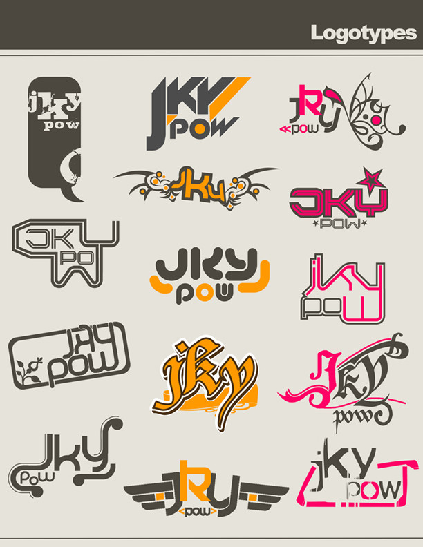
ahora si! aqui estan todos!!comments????
Related content


Comments: 44


this is amazing!!!!!!
I don't know Illustrator alas and I would like to make myself logo...;(;(;(
👍: 0 ⏩: 0


")


a q chulos estan los q mas me gustan son el 8 y el 12
👍: 0 ⏩: 1

graaaaaaaaaaaacias!!! ^_^
👍: 0 ⏩: 0
a q chulos estan los q mas me gustan son el 8 y el 12
👍: 0 ⏩: 0


hummm.... i used freehand (macromedia) for the mayority ...
only for a pair i used Photoshop... ^_^
👍: 0 ⏩: 0

buenisimos buenisisisimos... exelentes ideas...
inspiradoras además... fijo favo
👍: 0 ⏩: 1

yo ya te dije cuales me gustaron ")
👍: 0 ⏩: 1
jijiiji "cuchilla" jajajaja ok!! anotado!

👍: 0 ⏩: 0


")

madre esta dificil la decision, pero veamos te digo cuales me gustan  (Smile)")
el primero me gusta aunqeu talvez el globito mas chiquito porque tiene mucho espacio de arriba al final.
Tambien el tercero de la primera fila esta muy bonita la composicion, aunque parece que lo que pesa es la flor
Y el segundo de la segunda fila, podria quedar bien con rosado o aun el negro en gris
pero me gusta mucho todo tu proceso
👍: 0 ⏩: 1
muchas gracias eh!!
si sta dificilin vdd +_+
gracias x los consejitos...
👍: 0 ⏩: 0

 (Wink)")