HOME | DD
 JNRedmon — Color Experiment - Stone Beast

Published: 2013-11-03 18:34:08 +0000 UTC; Views: 798; Favourites: 26; Downloads: 1
Redirect to original
Description
So, I tried coloring again. And it didn't really work out, but I still feel like I've made progress.This didn't come out how I envisioned it - the colors are garish and too bright, and no matter how many times I tried, I could never get the exact color I wanted.
This is only the second time I've ever tried to do full digital coloring, so I would really like some criticism/advice on this one, if that's okay. I know I'm not good at this at this point, but I really want to learn.
Oh, and to answer your question, no, I have no idea what this thing is or what the heck is wrong with me.
Related content


Comments: 17

Decent work on the drawing man. Some feedback, as you specifically wanted it, it depends what you want first, I would advise that you decide at the beginning of the painting what style or 'look' for the painting that you want. Then research and paint according to that objective.
👍: 0 ⏩: 1

Okay, I'll do that next time. Thank you!
👍: 0 ⏩: 0

Oh yeah, adding the colours brings like this whole new dimension to your works. Subtle but it fits so well.
👍: 0 ⏩: 1
Thank you! Still trying to learn.
👍: 0 ⏩: 0

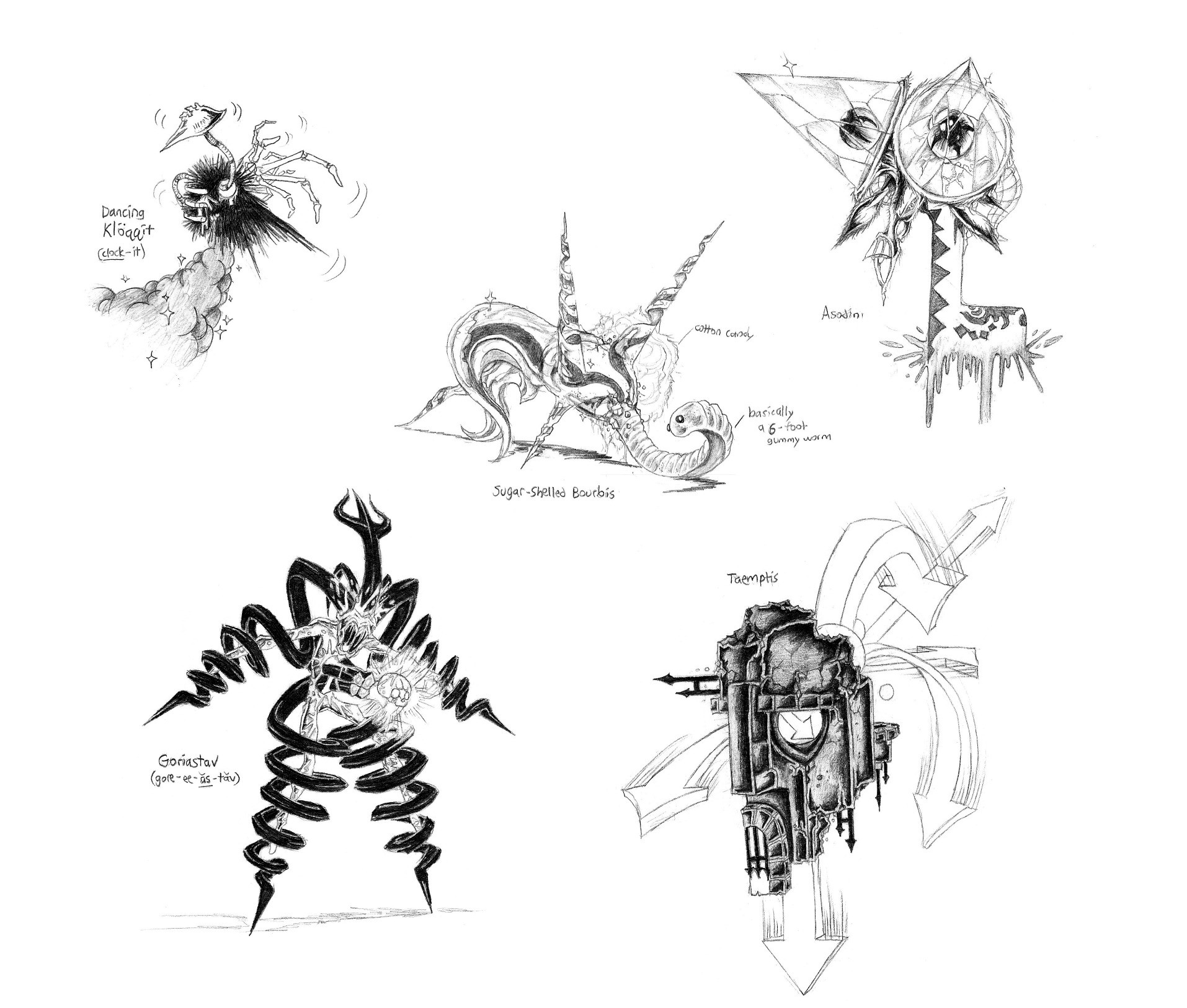
Its a great design, but I feel that the organic parts take away from the whole. if it was an abstract stone version of the organics, blockier and golem-like, or if they were absent enitirely, then it would be a bit more solid in my opinion. Ah well, in the end it is just my opinion.
👍: 0 ⏩: 1
Interesting; I might have to play around with that idea! That was helpful; thanks for the feedback!
👍: 0 ⏩: 1

Woah. This sure makes for a great late halloween picture!
👍: 0 ⏩: 1

This is really interesting, if you ask me. I definitely like the creativity with this one.
As for the coloring, I'm happy that you're trying more. I'm also happy to see that you're adding a bit of color here and there. I like to see that in your drawings.
Although you may think as if it isn't good enough (your coloring), I think it's fantastic! It really brings your drawings to life. c:
👍: 0 ⏩: 1
Thanks, that means a lot!  (Smile)")
👍: 0 ⏩: 1

Wow, I really love the design! The stone tentacles (?) look absolutely brilliant!
I find digital colouring of traditional linework hard in general...it tends to turn out very weird for me as well, which is why I've switched to all-digital at one point. ^^
👍: 0 ⏩: 1
Wow, really? Thank you! That means a lot.
Yeah, the two don't always seem to mesh very well. To remove the white from my original scan, it reduced the picture to 2 bits so the black lines got all thick and harsh. So that was causing problems right away. Trying to draw all-digital might be a better idea. Thanks for the input!
👍: 0 ⏩: 1
You should definitely give it a try.
👍: 0 ⏩: 1