HOME | DD
 joeakkawi — .The Line of Defense

Published: 2006-03-29 14:59:49 +0000 UTC; Views: 946; Favourites: 21; Downloads: 67
Redirect to original
Description
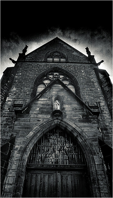
Religion has always been a point that people believed defended them from Evil. Over time and till today a lot of individuals practice religion as a way to fight urges of evil and sin and try their best to justify their good acts through their beliefs.I took this photo baring in mind the difference in lighting on both ends of the church. Looks kind of like a barrier protecting the light from darkness.
Photo taken at a Church in Sussex Gardens, UK.
Nikon AF 28mm f/2.8, 1/8000 sec, ISO 800. Sepia Editing and Contrast + 5 in Pixmantec Rawshooter Essentials
Related content


Comments: 47

 (Smile)")

Oh my god. I actually love this. I love the concept of it. I love the colours and the how the branches are so defined. Love the colours and how the chruch looks slightly imposing. Amazing - people should aspire to you xD
👍: 0 ⏩: 0


love it 
I feel like a vampire will just pop up out of their *scary* lol
👍: 0 ⏩: 1

haha. Don't worry. No Vampires in London
 (Wink)")
👍: 0 ⏩: 1
")


loving the gothic feel to it. the branches add a foreboding atmosphere to it, and the redness of the skies give it an ominous sense. beautiful composition.
👍: 0 ⏩: 1
I'm happy you like the branches as they're my favourite bit too. Thank hun and cheers for the fav
👍: 0 ⏩: 0

Thank You very much man. Much appreciated
👍: 0 ⏩: 0

I cant help but see churches as an ominous source of evil; kind of like those evil wizard towers in fantasy novels. They actually look scary with gargoyles and gray stone. Then the christian symbol which is a torture instrument; ... mmmmh scared of churches lol
")
👍: 0 ⏩: 1
I can't help but agree with you. The church today is not based on the original foundations of christianity. It's not even close really. I couldn't think of a better structure to emphasize the point though.
Thanks for taking the time to check my pages out. Youre 
👍: 0 ⏩: 0

I love all your works... you have great contrast on your art and the composition is always amazing!
👍: 0 ⏩: 1
Thank you very much. You're a star!
👍: 0 ⏩: 0

It's all in the details.
I'm amazed at the details your camera picked up in this shot.
The branches all look fantastic. It almost looks like it was added into the photo.
The tones work very well.
Definitely a good concept to have thought of. Your mind works in wonderful ways.
👍: 0 ⏩: 1
Thanks honey. I'm really glad you see the importance of the trees.

👍: 0 ⏩: 0


Great angle,
The color effect is excellent for such matter...Reminds me of the movie From Hell
The details are remarkable...!!!
Keep it up
👍: 0 ⏩: 1
Thanks man. I swear if I lived in London, you guys would hate me. I would pretty much submit something everyday haha.
Regards
👍: 0 ⏩: 1
HAHAHAHAHAHA....bas in the end you'll get used to it...
👍: 0 ⏩: 1

I love how the trees at the top and the negative space on the bottom form a sort of horizontal frame. The symmetry of the church is nice, but also contradicting when you see the difference in lighting and tones of the skies on the right and left side. Could be interpreted in many ways. The description is also great, and I think the theme suits the image very well. Great work Joe!
👍: 0 ⏩: 1
Finally! Someone noticed the importance of the trees! haha
I'm glad you like the description since without it, I think the image has much less impact.
Thanks hun.
👍: 0 ⏩: 0

Wonderful shot. Great description. The branches give a great effect
👍: 0 ⏩: 1


stunning photo i love the colors and the contrast just gives the whole photo justice. I think if u lighten it a bit on the bottom it would be pretty amazing
👍: 0 ⏩: 1
I actually like the negative space at the bottom. Acts as a breathing space for your eyes.
👍: 0 ⏩: 1
never thought of it that way , makes more sense now when i think about it
👍: 0 ⏩: 1
Glad you like it and can relate to the description.
👍: 0 ⏩: 0


awesome pic!!
love the sepia!
and the tree at the top!
love everything about it..
👍: 0 ⏩: 1
Thanks you very much. Really glad you like it.
👍: 0 ⏩: 1