HOME | DD
 joejoesmoe — Inspired

Published: 2004-08-17 02:56:05 +0000 UTC; Views: 705; Favourites: 19; Downloads: 67
Redirect to original
Description
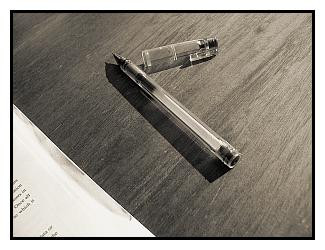
So much to sayRelated content


Comments: 35

I'm wondering if this was actually a planned shot or you just saw this and thought..."OH!...wheres my camera, that could look great!" as so many of my shots occur that way. I would think that this shot would add that extra 'something' if it was an old looking fountain pen...hmmm I do like this shot, good vision, well spotted
👍: 0 ⏩: 1

Thanks so much. Iactually created the look myself
 (Wink)")
👍: 0 ⏩: 0

 (Smile)")
")


dont you just find blank space inspiring....it just asks to be filled with something.
👍: 0 ⏩: 1

so simple yet says so much. like every photo should. as a writer ive fallen in love with it; if i wasnt a poor college student i would buy a print... but since im ill just praise you and add you to my favorites.
👍: 0 ⏩: 0


that's what i mean...very minimalstic...
...and this time you've chosen the composition right!

👍: 0 ⏩: 1

very nice work with simplicity here, even the grain works, gives it a classic feel
dan

👍: 0 ⏩: 1

the fotos with the pens or sth similar are always great- as we can see these one is goo too
👍: 0 ⏩: 1


Great shot... the comment realy adds to the shot nicly.... exelent work!!!!
👍: 0 ⏩: 1

Very nice. I think it was a very smart move to make it in BW.
Good job.
👍: 0 ⏩: 1

I love the composition, how the pen is off to the corner, how you can barely make out the lines... the blank paper - permanent pen, not pencil.
Very cool
👍: 0 ⏩: 1
Thank you so much for the comments and the favs. It means a lot.
👍: 0 ⏩: 0


really nice compo but maybe there is not enough contrast!
👍: 0 ⏩: 1

I really like this idea... looks great in black and white.
👍: 0 ⏩: 1