HOME | DD
 Jomadis — Sunset on a Beach
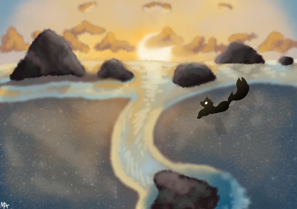
#beach #painting #paradise #huru #jomadis
Published: 2018-08-10 04:28:21 +0000 UTC; Views: 583; Favourites: 61; Downloads: 0
Redirect to original
Description
Trying to get better at backgrounds/scenery hahaI found this picture on Google so I tried to paint that (I didn't save the pic oops)
I think it looks okay? There are things I wish I could do better, but I just don't know how :/
Huru might be chillin on there
Critique is highly welcome!!
Related content


Comments: 27

Overall
Vision
Originality
Technique

OKAY first of all this is gorgeous. I love the overall look of it, and the water looks really appealing!
However, since this is a critique, I'll be pointing out some flaws.
The sky looks overall... lazy? The clouds look quickly done, without much effort put into them.
The rocks also look odd. They do not look like they are coming out of the water, they rather seem to be floating on top of it. The shading on the biggest, far left rock looks very nice! And the shading on the other rocks is very good as well, but the brushes used makes it look odd where the rock meets the water.
However, the water itself is amazing! It looks a bit too blurry and somewhat "fuzzy" and too soft, but it is still very good!
The land, where the character is sitting, looks oddly like glass reflecting a night sky. It's a very cool effect, in fact, I love it! But since I don't think it was intentional, I wanted to point it out.
Lastly, the character looks out-of-place and strange. The sharper edges look odd in comparison to the paintlike effect of the background itself.
Overall, though, I really like this art! The colors work perfectly together. ^w^
👍: 0 ⏩: 0


Vision
So, man, this is amazing, the sand looks...like sand. I can never do that XD
The clouds look great! I would suggest maybe making the horizon line a little more defined??? And the water a bit less blurry, I guess, but every time I try to do that it looks like crap so maybe no lol
The rocks look pretty good, too, the shadows are all in the right place, but I would suggest making everything a bit more dark behind the rocks and Huru to give off that sunset vibe. or sunrise idk XD
Also a future tip, maybe, is to use the same brush (pretty much) with everything to help everything look more seamless, i guess?? idk i've never tried iiitttttt
I would take my opinion with a grain of salt because I don't even do backgrounds ha ha but hope this helps anyway :'D
👍: 0 ⏩: 0

ooh boy I don't write critiques often but here we go. Apologies in advance if I sound very negative
Let me start off by saying that this piece is very well done! I love the lighting and the shading, and the overall mood it gives is very, very well executed! It's like you can almost hear the sound of the waves. Honestly it just looks so cozy and I love it.
I also love the texture of the sand. Like that's a good texture right there. The added white glowing dots looks very nice indeed
While this piece is very well made, I do feel that there are a few things that could need improvement. These are mostly small things though, so it'll be a pit nitpicky on my part.
Let's start with the water. Now the water in itself looks really nice! I really see no issue with the blending and color choice, so good on that.
However, I do feel that the water could have sharper edges. Right now, it looks kinda blurry, which looks out of place when you compare it to the rest of the image, which (like the rocks and Huru) has pretty sharp edges. It also makes it a tad bit hard to focus over a long period of time.
This can be quickly fixes by either repainting the edges (like where the water touches the sand) with a hard brush or erasing the top of the edges with a hard brush. Of course, both will give a bit of a different effect, but it'll fix the issue.
Speaking on not so clear edges, the rocks. Now the rocks are also very well made! The shading is very nice, and it actually looks like rocks instead of just round blobs that tries to pass off as rocks.
When I look closer at the rocks, I can see that there are a ton of small, round edges. I don't know if they where here from the start or if they came about with the shading, but it does make the rocks look a little blurry, given that the very round edges are slightly transparent and some are blurry. This gives off a similar effect with the water, albeit a lot less intense (because apparently the water's effect is incredibly intense lol)
The way to fix this is the same as with the water: either repaint the edges with a hard brush, or erase the edges with a hard brush. This will give clear cut edges and do that bit extra to make the piece look more finished.
If the blurriness came about because of the added shading, I can recommend either locking the rock layers and do the shading, or make a clipping mask on top of the rocks layer and shade there. Both will give the same effect: you will not be able to draw outside of the layer (or the layer that the clipping mask is attached to).
The blurry effect works for the clouds btw. It's clouds, clouds can be like that. No need to change that in my opinion (unless you wanna experiment with sharp edges on those, which I think is something completely fine to do? Idk clouds exist in many different forms, so maybe sharp edges on clouds is like, sonething you shouldn't do. Idk man I suck at clouds.).
I'm not too sure if I'm the right person to ask if the blurry edges of the landscape clashes or works well with the sharp and clear silhouette of Huru, btw. That comes down to personal preference, and the only opinion I have on that would be that some sharper edges on the water and rocks could make any potential clashing happen less. Idk if there is clashing, is what I'm trying to say
one last tiny nitpick I have is that the ocean is not horizontal. It kinda sways a bit, and in the left hand corner it dips. Now this dip could work very well if it was the ocean seen from a high angle, if where Paradise (which is where I'm assuming this is taking place) is on a round surface, but I'm getting the feeling that this is not from a high angle, so it looks a little strange.
To fix this, you could use that square shape tool thingie I don't know the name of but I'm pretty sure FireAlpacka has? and use that to color in the ocean. This way you'll have a neat horizontal line.
Now what will all of these things work towards? Well, it'll make the drawing look more finished, and a biiit more pleasing (not that the drawing isn't pleasing, it is, it's just that it could be a bit extra pleasing).
Yeah, they're small things, but they can really add up overall.
But again, since these are small things, it's not like it ruins the drawing (I'm sorry if I may have phrased it and made it come off that way), because again, the drawing is very well made and definitely well executed. There's just a few small things that, in my eye, could use a bit of work.
TL;DR: great drawing! Lovely mood and shading! The edges on the water and rocks could be a little more sharper though. Otherwise it's great!
The more landscapes you do, the better you'll become. There's not doubt in my mind that you can become awesome at landscapes and backgrounds, especially when this is what you present.
oooh boy that was a lot of nitpicking, sorry
👍: 0 ⏩: 0

Impact
So imma go from top to bottom on it cause :V Easy?
The clouds and the lighting looks really nice! The only thing I see that could be worked on is how dark the yellows are on the clouds. Usually, they get lighter as you go out but hey :V its your style and it looks nice. If you didnt want to do that, then maybe use lighter colors? The mountains (er rocks) and the water look really nice! I really ove the depth that the drawing shows ;w; The only thing that could use a lot of work is that it looks a bit blurry, I dont know if thats what you were going for. But if you werent doing that, maybe try different textures and pens?
👍: 0 ⏩: 0

alright ill go down my list and anything i say is just to help you! ^^
vision i would give almost 100% but i lowered it because i fell i would want to see a little bit of huru more you know? maybe instead of making him a shadow add a little color to him! other wise the background is blowing me away!
its very original! i dont see this style to much!
the technique is pretty cool! and i would love to see how yall do it!
a pretty big impact on me. i think it really shows more of huru!
👍: 0 ⏩: 0


All of it looks really good! The blobby texture makes it look nice and soft! But I think the contrast between the soft background and the sharp edged character and it's shadow throw everything off.
👍: 0 ⏩: 1

Thank you for the critique!!
👍: 0 ⏩: 0

the colors are really satisfying! only thing I would do is make just a tiny tad less blurry?(tho maybe that was a stylistic choice.)
👍: 0 ⏩: 1
Thank you for the critique!!
👍: 0 ⏩: 1


This is fantastic!! I especially love how you did the sand!
👍: 0 ⏩: 1


This looks really good, but I think that the clouds have a strange texture, too close to the rocks in the water. Personally, I use airbrush at 50% opacity and then smudge with see blur to make clouds, it looks really well. You should try it.
Also, the character's shading is kinda a bit wrong, but that's not a big deal.
Otherwise, this is some really good job, keep it up!
👍: 0 ⏩: 1

It's really nice! Except the character is very clear cut against the background so if you made them softer like the background it would work better. they look kind of like they were just added on as an after thought. You could also try lightening up the sky a bit on the horizon line because the further away it is the lighter it tends to get. Remember that you don't have to stick purely to the picture and also that you can add more colours to help with contrast
👍: 0 ⏩: 1
Thank you for the critique!!
👍: 0 ⏩: 1
np! you can also try looking up tutorials and stuff on backgrounds if you want more tips
👍: 0 ⏩: 0