HOME | DD
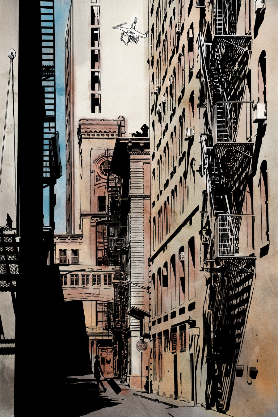
 JonathanWyke — Little experiment
by-nc-nd
JonathanWyke — Little experiment
by-nc-nd
Published: 2016-02-04 15:12:19 +0000 UTC; Views: 510; Favourites: 23; Downloads: 0
Redirect to original
Description
Just experimenting with throwing on some very loose colour...Related content


Comments: 10


Cheers mate! The loose feel of it is growing on me.
👍: 0 ⏩: 0

I have to agree. The black and white had such graphic punch and I feel the colour just softens that. Stunning draftsmanship as usual!
👍: 0 ⏩: 1
Thanks, and I think you're probably right. For this story, my plan is to have the occasional page in colour, but I'm still not sure if this is going to be one of them. I'll decide when I see the lettering I expect.
👍: 0 ⏩: 0

Damn, this looks really amazing. I like the loose colors, feels really natural like a sunny day in the, City maybe afternoon. Luv the drone  (Wink)")
👍: 0 ⏩: 1
Cheers! I like the looseness myself. I don't know if I'm going to go with it or keep it just greyscale yet, but I do think it's interesting
 (Smile)")
👍: 0 ⏩: 0

nice but i like the black and white better.
IMO
Color gives it a completely different feel. much less neo-noir.
the color looks unfinished ..rather than what i think you were going for... loose light watercolor maybe?
👍: 0 ⏩: 1
I think you're right. I'm going to leave it here for a few days to see if it grows on me. I quite like the looseness, but I don't know if it's too unstructured.
👍: 0 ⏩: 0