HOME | DD
 JonCausith — WackyGamingUnleashed - 5

Published: 2010-12-02 01:59:31 +0000 UTC; Views: 7673; Favourites: 149; Downloads: 22
Redirect to original
Description
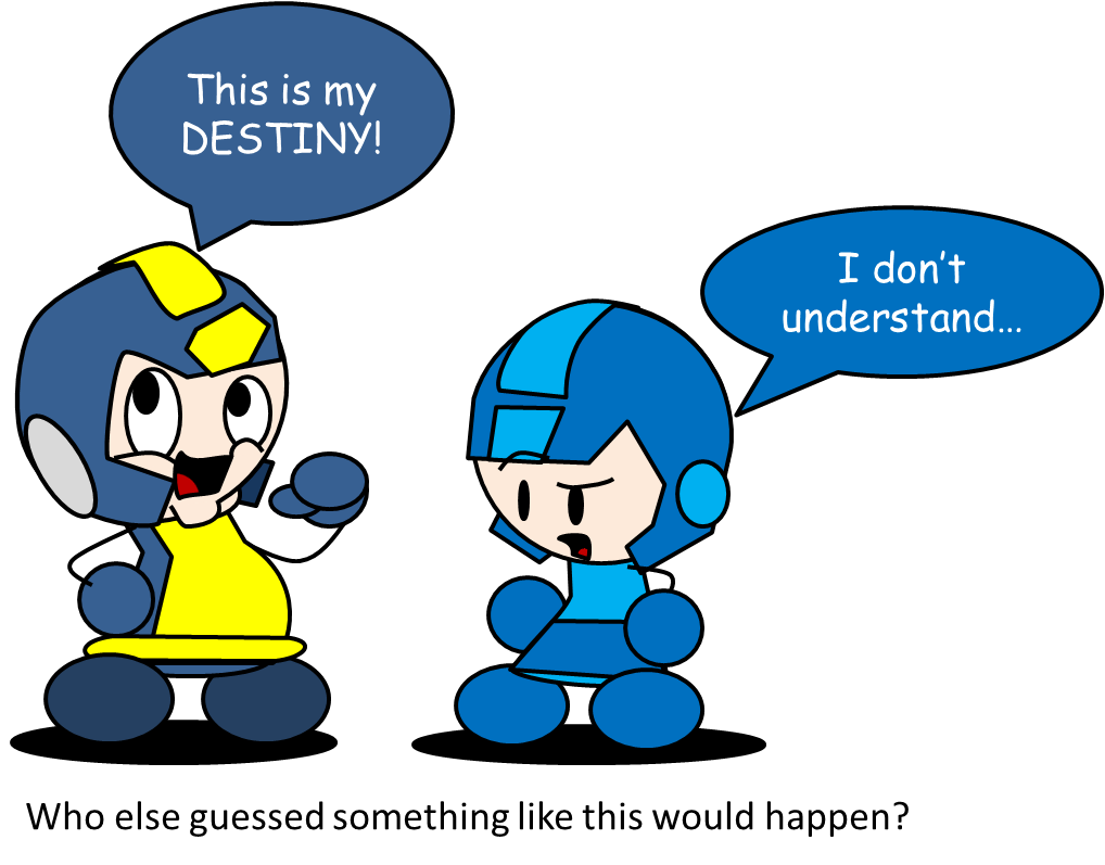
Entitled: "Super Corkscrewed Robot."After a small art hiatus on November (Hope everyone had a happy turkey!), I return with the new installment of the gaming madness with the help of !
 For those of you who know me for a while now, you know how big of a Mega Man/Rockman fan I am!
Now if there's one thing that most people get steamed about when it comes to Mega Man, it's the different art styles/adaptation's he's had back in the early days. I've personally haven't watched the Captain N cartoon back when I was a kid (...but I've watched all three Mario cartoons and the Ruby Spears Mega Man show.), and I wasn't introduced to the Mega Man I box art until much later.
Needless to say, they didn't appeal to me to the least, but they didn't ruin my love for Mega Man!
 Truthfully, the best art styles were either the ones from Mega Man 4-6, 9 and 10 and the Ariga Megamix manga.
 Gemma and I hope you enjoy this one! We had a blast with this Mega crazy gag!

Mega Man/Rockman is © to Capcom.
Original concept, colouring, and partial inking done by me.
Doodle polishing, dialogue polishing, inking, and shading done by . (THANK YOU SO VERY VERY VERY VERY VERY VERY VERY VERY VERY VERY VERY VERY VERY MUCH WITH THIS, GEMMA!!
 )
)
Related content


Comments: 118

I'm with the original; "Who the heck are these guys?" Megaman must be weirded out to see those versions of him.
👍: 0 ⏩: 1

Hehehe, yeah definitely. Compared to the Ruby Spears and Mega Man MegaMix incarnations of him, I'd think he'd be begging to see more of them than the Captain N or MM1 boxart designs.
👍: 0 ⏩: 1
Agreed. The Ruby Spears incarnation is a lot more tolerable than either the American box art designs and that god aweful Captain N incarnation. He was annoying with his scratchy voice along with his tendancy to say "Mega" in everything he says. He repeated that word endlessly like he was a freaking Pokemon character! Plus he was a total wimp!
👍: 0 ⏩: 1
Ugh, you're telling me... I barely saw Captain N, but from what I've seen, I was horrified and disgusted.
My favourite has been, and always will be, the design that was given in the MegaMix/GigaMix manga. He looks a lot more robotic, yet at the same time has an awesome charm to him.
The Ruby Spears incarnation, as Americanized and corny as it is for the most part, I cherish the nostalgia and find him slightly appealing. That, and unlike these chuckle heads, he's actually blue and uses an arm cannon like the game.
👍: 0 ⏩: 1
Tell me about it. I mean who could stand Captain N Megaman's annoying voice or even bare the fact that he was the comic relief who got his ass kicked half the time? Hell, he was more of a mere punching bag than he was any help to the team. In fact, in my point of view he was not Megaman, but just a poorly designed and poorly voiced knock off of the original.
You have a point about Megaman's appearance in the manga. In fact, that, and the Ruby Spears incarnation look to be two of the most well designed and fleshed out versions of Megaman I've ever seen. In fact, those two designs were not only more appealing, but I like how they differ from the original Capcom designs. Cuz sadly, Capcom has NEVER updated Megaman's design except for the numerous spin offs which are in no way connected to the original or the X series with the exception of the Zero series. But anyway, I always believed that Megaman should evolve like most other franchise do.
Anyway, just in case you're interested (just in case) I have some Megaman fanart of my own in my gallery. If you'd like, I could share some of them with you.
👍: 0 ⏩: 1
You couldn't have said it better: That is THE worst Mega Man incarnation EVER.
Oh definitely. While I love the artstyle that Mega Man has in 4-6, 9 and 10 the most in terms of the official games, the manga definitely makes him look more appealing and more robotic. I guess there are some ways you can evolve your character, and there are times when the style just looks too durn good to evolve. Heck, take Mario for example. While these days Mario looked like how he did in Mario World, he did get a few updates in terms of making his clothing slightly realistic, and so forth. They may tweak a character once in a while, but I guess if it's good as it gets, then go for what's best. (Though the manga design still dominates the field~)
Oh yes! I took the liberty to look at them. You drew them all in an interesting style! (Snake Man couldn't have looked any cooler~)
In terms of spinoffs, I still love Battle Network the most, due to its interesting plot and nice take on the future if it was more internet-based instead of robots.
")
👍: 0 ⏩: 1
Agreed. And about character appearances. Well I think the artwork from the official games were great for their time. But nowadays its too simplistic for my taste. I agree with you about the manga designs. And I'm glad you like my style. It is essentially a mix between the Ruby Spears style (without the exaggerated muscles) and the classic late 80s early 90s anime look with the eyes, nose, ect. I try my best to depict Megaman in the way I always pictured him. But some of my inspirations come from such anime like Gundam, Robotech, and stuff like that. So I guess that's where I draw some of my inspirations for drawing Megaman and Megaman related characters. And as for Mario, well I don't have a problem with the way he looks really. Though I did notice some of the few changes they made on him in recent years. The most realistic he looked was in Brawl with the realistic clothing textures. Now Link from Zelda on the other hand has changed tremendously since his debut. And he's never looked better. Anyway, I hope to make more Megaman based fanart sooner or later. Wish me luck.
👍: 0 ⏩: 1
Hehehe, you got a point there. Link definitely has come a long way, and has evolved into something awesome! I may have a soft spot for the Oracle series incarnation, due to me loving that game so much, but yeah, Twilight Princess Link is probably the coolest incarnation!
You can do it, bud! If you manage to get some artwork done for Mega Man, let me know, and I'll zoom right there! (Two Robot Masters I'd love to see are Fire Man and Flash Man, but that's just me.)
👍: 0 ⏩: 0

Hehehe, glad you enjoyed it! ")

👍: 0 ⏩: 0

This is awesome! XD
But what happened to RS Mega...?
👍: 0 ⏩: 1
Hehehe, thanks!
Oh, he's the least of Mega Man's worries. Compared to the other two "Mega Men," the Ruby Spears Mega is practically a dead-ringer to the official art.
In all seriousness, despite the cartoon's cheesiness, I do love that cartoon series. I have a soft spot for that Mega Man, so I couldn't bring myself to derp-ifying him like the other two.

👍: 0 ⏩: 1
The cartoon was indeed cheesy. But still really great. ^^ Some bits were so bad they were good, and then some bits were just plain good, and there was evil Proto. :3
Plus, nostalgia, because most cartoons I even bother to take a look at these days are made in Japan and translated and have far too much plot. Not that that's a bad thing, but I miss the older cartoons when you could just shuffle them together in any order and they'd still make sense. XD
👍: 0 ⏩: 1
Hehehe, yeah. Personally I love Scott McNeil's take on Dr. Wily and Gary Chalk's take on Guts Man when it comes to all voice-acted media.
So yeah, one of the many reasons why I loved that show was that their voice acting was pretty convincing compared to other shows in the 90's. Another reason is... Eddie! (A lot of people say he's annoying, but I've always laughed and enjoyed almost every moment with the... somehow green little guy.)
👍: 0 ⏩: 1
Eddie was hilarious. And green. XD
I think the only thing that really annoyed me about the cartoon was Rush's voice. Too... Scooby-Doo-ish and overdone. But I liked everything else. ^^
👍: 0 ⏩: 1
Hehehe, I remembered it was a bit silly back when I was a kid, but Rush being Scooby Doo-ish kinda irks me now. 
To be honest, the best take on Mega Man in any media has to be the Mega Man MegaMix/GigaMix manga sets!
👍: 0 ⏩: 1
Well, we still have to wait for the Archie comic one to come out.
👍: 0 ⏩: 1
I really hope that comic series is decent to say the least. I wasn't too pleased with their work on Sonic and Teenaged Mutant Ninja Turtles. Who knows? Maybe Mega Man will be their adaptation masterpiece...
👍: 0 ⏩: 1
Personally, I didn't mind Sonic. It wasn't the best thing possible, but I still liked a lot of what I read of it.
As for TMNT... I haven't read that, so I can't form an opinion either way. XD
I do hope they make a good Mega Man series though.
👍: 0 ⏩: 1
Reason why I didn't like the Sonic comics from Archie (Everyone has a right to like/dislike, so if you disagree, that's fine.) is because of the combination of the SatAM characters with the actual game universe. That, and there are times in which it can go from kiddy corny to brutal in a very uncomfortable swing-set fashion.
The Teenaged Mutant Ninja Turtles one just has the cutesy cartoon characters and puts them in a VERY brutal fashion. In other words: they don't know when to say it's a kid's comic and an adult's magazine.
I really hope so too... though if not, I'm happy enough with Mega Man Megamix/Gigamix.
👍: 0 ⏩: 1
Hmm. I didn't read that much of them, so maybe I just didn't notice that? Or maybe I just didn't mind it as much, so it didn't register? Not sure.
Urgh. Those kinds. (But still, nothing can trump Novas Adventures De Megaman. O.o)
👍: 0 ⏩: 1
Not a big fan of MegaMix/GigaMix? 
...ugh. Novas De Rockman... That was just bloody awful. Never have I seen a fan comic that was so... revolting...
👍: 0 ⏩: 1
Actually, I like what I've seen of Megamix and Gigamix, but I haven't managed to read much of it. Sadness.
Well, you have to admit it was sort of amusing... in a horrible way... okay, nevermind...
👍: 0 ⏩: 1
Ohh! I see! 
👍: 0 ⏩: 1
Sadly I don't have enough money to spare to buy manga volumes now, although I'd like to buy the first Gigamix one when it comes out... *grumbles about being broke*
I did read the chapters on Mangafox though. XD I think what impressed me the most was the art.
What about the Dreamwave comics? Personally I loved the bully who whirled the volleyball pole like he was a ninja. And he was somehow Wily's nephew. XD
👍: 0 ⏩: 1
Yeah, me too, since I really want to read Asteroid Blues and find out the true origin of Mega Man 3 as told by Ariga. It's not that I can't afford it... it's just that I can't find it in any of the shops I go to.
Oh yeah, the art was extremely phenomenal! They made Ice Man look more adorable, and Elec Man more intimidating!
I didn't read too many of the Dreamwave comics, but I did get to see the first one. It was interesting to say the very least. (Yay for nasty nephews!)

👍: 0 ⏩: 1
I don't think it came out yet. Or at least not in English. Don't remember when it's going to though.
I read all of them, although that's not saying much as there were only 4. XD I think I found a download link to read them at first, and then I managed to get the Pocket Edition with all of them.
👍: 0 ⏩: 1
No, it won't be until May 17th. I love the comics, and since Asteroid Blues is based on Mega Man III, I REAAAAALLY can't wait to read that bit!!
All in one, eh? Nice grab!

👍: 0 ⏩: 1

I think the US box art for Mega Man is one of the best examples of bad box art back in the 80's(and even the 90's had some bad ones). I do love how Capcom made fun of that with the mock-up art they made for Mega Man 9 and 10.
And oh man, Captain N Mega man's voice...I can't get it out of my head!

👍: 1 ⏩: 1
Yeah, that voice is quite crazy... thank god it wasn't the same in the Ruby Spears cartoon. Personally the best Mega Man voice was either the one from Powered Up, or Mega Man Volnutt's voice in Legends 1.
And I'm glad that Mega Man 9 and 10's mock-up box arts referenced those!
Thanks for
👍: 0 ⏩: 0

hahaha, the Captain N MegaMan. Bobby Hill in a craptacular green robosuit.
Good stuff. xD
👍: 0 ⏩: 1
See?? Even I'm not the only one who thinks Captain N Mega Man looks like Bobby Hill in green spandex!
Thanks!
👍: 0 ⏩: 1

Hehe, as I always say "the original is always the best"

👍: 0 ⏩: 1
I totally agree with you, Luife!
I think the Megamix manga artstyle done by Ariga has to be one of the best interpretations of Mega Man, but the original's always awesome!
Thanks for commenting!
👍: 0 ⏩: 1

Haha poor Mega Man. XD The art style is really amazing. 
👍: 0 ⏩: 1
Heehee! Indeed!
Thanks, Phyro! 
👍: 0 ⏩: 1
Haha..... XD Yeah I heard Mega Man had some pretty weird American / European box art.
You're welcome!

👍: 0 ⏩: 1
Mega Man 1's box art in Europe looked pretty durn decent, but good lord was 2's art weird. U.S. of A. didn't do too well on the art until Mega Man 3.(even if his face was a bit... deformed.)
Heehee! Indeed!
👍: 1 ⏩: 1
Yeah the US usually has the worst box arts for some reason. XD They usually overthink marketing strategies and stuff.
👍: 1 ⏩: 1

Wow. Now there's a different way to display the different generations in one wacky crossover here.
I kinda did one too, although only the bad boxart Mega Man is not in my version.

👍: 0 ⏩: 1
Heehee!
Thanks for
👍: 0 ⏩: 1
Actually, i only did one crossover of that, man.
And you're welcome.
👍: 0 ⏩: 1
I know. I saw that one, and Mega Man's look toward his Captain N counterpart is pretty amusing!
👍: 0 ⏩: 1

| Next =>