HOME | DD

jonrod — Dosis Logotype

Published: 2006-10-26 18:51:35 +0000 UTC; Views: 13460; Favourites: 134; Downloads: 69
Redirect to original
Description 
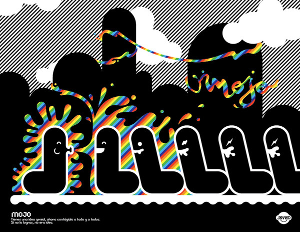
This one's a logotype for a t-shirt company. Had to look eclectic, different and irreverent, so I combined things such as a very bold an straight type with some soft and thin lines, or a geometric type with a very curly decorative pattern around. Since it had to be totally different I drew the typographie too.
Please let me know your favorite.
Related content
Comments: 35

Amuse73 [2008-08-05 11:53:01 +0000 UTC]

bottom right.

👍: 0 ⏩: 0

mausienna [2008-07-07 08:58:37 +0000 UTC]

great!!!

👍: 0 ⏩: 0

luxipher [2008-06-11 16:58:09 +0000 UTC]

Nice.. i like it..

👍: 0 ⏩: 0

woweek [2007-11-18 12:40:39 +0000 UTC]

amazing handmade! ^___^

👍: 0 ⏩: 0

buzveatesh [2007-08-22 13:06:58 +0000 UTC]

i love bottom right!

👍: 0 ⏩: 0

manza-xL [2007-08-20 18:52:10 +0000 UTC]

WOW!!

awesome

👍: 0 ⏩: 0

rootout [2007-08-19 20:49:35 +0000 UTC]

right one rockss!!!

👍: 0 ⏩: 0

gomedia [2007-07-24 15:27:00 +0000 UTC]

i like this, i should get some graph paper now haha

👍: 0 ⏩: 1

jonrod In reply to gomedia [2007-07-25 18:18:45 +0000 UTC]

hahaha... well it helps, but I don't think you need it

👍: 0 ⏩: 0

MysteryofAlbesila [2007-07-24 00:05:05 +0000 UTC]

Great work!

👍: 0 ⏩: 0

saynt [2007-07-05 06:28:56 +0000 UTC]

Nice one. i also use graph pad!

👍: 0 ⏩: 0

lakartz [2007-06-22 09:27:08 +0000 UTC]

WOOOOOOOOOOW this iz just awsm maaaan....plz cn u du me a logo like this i mean 4.............LakArtz......plzzzzzzzzzz,...

👍: 0 ⏩: 1

jonrod In reply to lakartz [2007-06-22 18:18:31 +0000 UTC]

yeap sure
just make a $500 transfer to my account

👍: 0 ⏩: 0

spystyle [2007-05-03 07:33:29 +0000 UTC]

i like the must the first one (from left) and the graffiti one

👍: 0 ⏩: 1

jonrod In reply to spystyle [2007-05-03 14:49:50 +0000 UTC]

oh right great!

👍: 0 ⏩: 0

ENOTSdesign [2007-02-18 17:10:32 +0000 UTC]

thanks for making such good work!

👍: 0 ⏩: 1

jonrod In reply to ENOTSdesign [2007-02-19 15:39:26 +0000 UTC]

Thanks to you bro

👍: 0 ⏩: 0

Tcheely [2007-02-05 21:12:12 +0000 UTC]

uuuaa, this is realy good, man!

👍: 0 ⏩: 1

jonrod In reply to Tcheely [2007-02-06 19:07:31 +0000 UTC]

Thanks bro, yours are great!

👍: 0 ⏩: 0

Ylys [2007-01-31 20:20:48 +0000 UTC]

creazy start

👍: 0 ⏩: 0

cberry240 [2006-12-06 23:27:41 +0000 UTC]

I like either the middle one on the left-hand side or the 2nd from the bottom on the right-hand side. I agree with =nedw that it would be nice to see a concept or idea coming through.

👍: 0 ⏩: 0

dame-one [2006-11-30 21:24:04 +0000 UTC]

great work man
it's cool you made some sketches before
and the results are fine too
respect

👍: 0 ⏩: 0

poxsai [2006-11-23 17:16:31 +0000 UTC]

cool
great accent
nice to meet you...

👍: 0 ⏩: 1

jonrod In reply to poxsai [2006-11-23 18:10:31 +0000 UTC]

THX! nice to meet you too

👍: 0 ⏩: 0

kniso [2006-11-01 14:43:50 +0000 UTC]

good work

👍: 0 ⏩: 0

lefthand-design [2006-10-31 03:21:18 +0000 UTC]

These all look great but my favorite is the bottom left one.

👍: 0 ⏩: 1

jonrod In reply to lefthand-design [2006-10-31 14:30:08 +0000 UTC]

Thanks

👍: 0 ⏩: 0

jonrod [2006-10-27 21:18:45 +0000 UTC]

Thanks !

👍: 0 ⏩: 0

wilsoninc [2006-10-27 20:16:59 +0000 UTC]

holly shit! i love people sketches! nice one te second (vector) is the best

👍: 0 ⏩: 0

dawe55 [2006-10-27 07:16:52 +0000 UTC]

nice logo but i love your sketch.

👍: 0 ⏩: 0

russoturisto [2006-10-27 00:50:34 +0000 UTC]

nice one man
i usually doing a same work before starting new logo
right version is absolutely cool (i mean vector vers)

👍: 0 ⏩: 1

jonrod In reply to russoturisto [2006-10-27 15:10:05 +0000 UTC]

Thanks bro! you have very cool logos !

👍: 0 ⏩: 0

vertoo [2006-10-26 22:51:51 +0000 UTC]

very very nice!

👍: 0 ⏩: 0

nedw [2006-10-26 21:47:55 +0000 UTC]

I really like the bottom right, produced one. It seems like these are all very aesthetic, which is fine... but it would be nice to see a message, or a concept coming through.

👍: 0 ⏩: 1

jonrod In reply to nedw [2006-10-26 23:01:21 +0000 UTC]

Thanks a lot!
Well I think that the final two actually respond to the"eclectiness", the basic concept I'm looking for, but your opinion makes feel I wasn't clear enough with my expl. upside,...or exposing the concept in the logo,...or maybe you're saying that it needs somethig more than typography?

👍: 0 ⏩: 0