HOME | DD
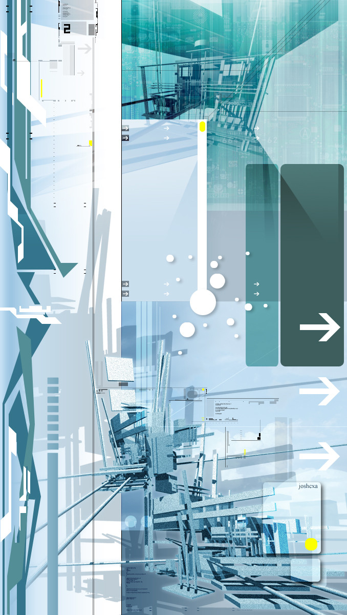
 joshcxa — Fonyx

Published: 2002-11-21 04:39:14 +0000 UTC; Views: 452; Favourites: 2; Downloads: 45
Redirect to original
Description
thinkin of addin more typo....what do ya reckon?Related content


Comments: 10


looks so dreamy and nice..! i like the simplicity of it.. but maybe some more typo.. i dunno.. its great as it is anyway..! keep it up..
👍: 0 ⏩: 0

red looks great here. i think you will know wat to add just ponder.
👍: 0 ⏩: 0

Sorry to be negative josh, but in mah opinion, ya see one 3D explosion you have seen em all...Very nice though
👍: 0 ⏩: 0

:drools: simply beautiful, I love the contrast of this image, you do some of the neatest abstract renders out there.
👍: 0 ⏩: 0


very nice...i like your square looking flares going up....and i like the color you chose and the typos add a good feel to it...good job
👍: 0 ⏩: 0

It looks good, it has a nice use of red. As for typo it does look alittle aloen as it is, maybe lose it altogether or add to it.
👍: 0 ⏩: 0