HOME | DD
 jpdguzman — Kite Square Website Study 2a

Published: 2009-09-24 18:42:36 +0000 UTC; Views: 7724; Favourites: 45; Downloads: 355
Redirect to original
Description
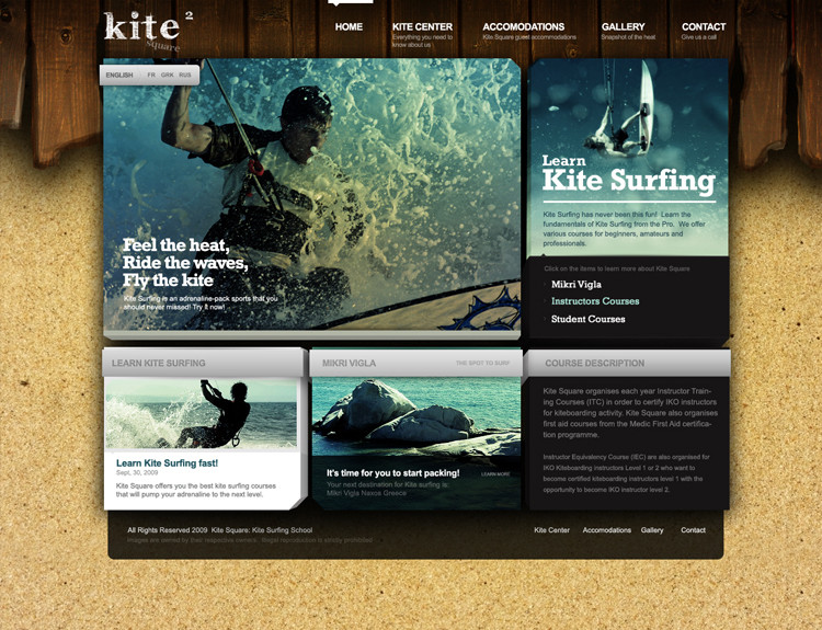
Here's another design study for the series of design for Kite Square website. Photos are owned by their respective owners.This study focuses more on structural composition following a grid to achieve the effect.
However, listening and reading all the comments takes me to explore the other side by adding sand to achieve a totally different effect. The wooden panel is a client's idea so I still incorporate it but add some attitude and contrast to the boxy effect of the site.
Related content
Comments: 7

Nice.. Awesome Work!!!!
may I ask 2 questions please?
1) how you did the 3D effect of the boxes please?? Is it all CSS3 Based or all photoshopped?
2) The lines over the Links (Home / Kite Center..) Is that an imported jpg image and then changes position when you switch page.. or again all CSS?
Also is it all HTML/CSS based or is there external languages? thanks a lot
Thx a lot.
👍: 0 ⏩: 0

Love it, but curious as to why you went with the grey when it's begging for an orange hue.
👍: 0 ⏩: 1

grey actually separates it great. orange hue would've conflicted too much with the yellow color of the sand and brown/orange of the wood. color in the right places is ideal.
👍: 0 ⏩: 0

i think its really but it will be great if you can give some organic feel to the footer too
👍: 0 ⏩: 0


