HOME | DD
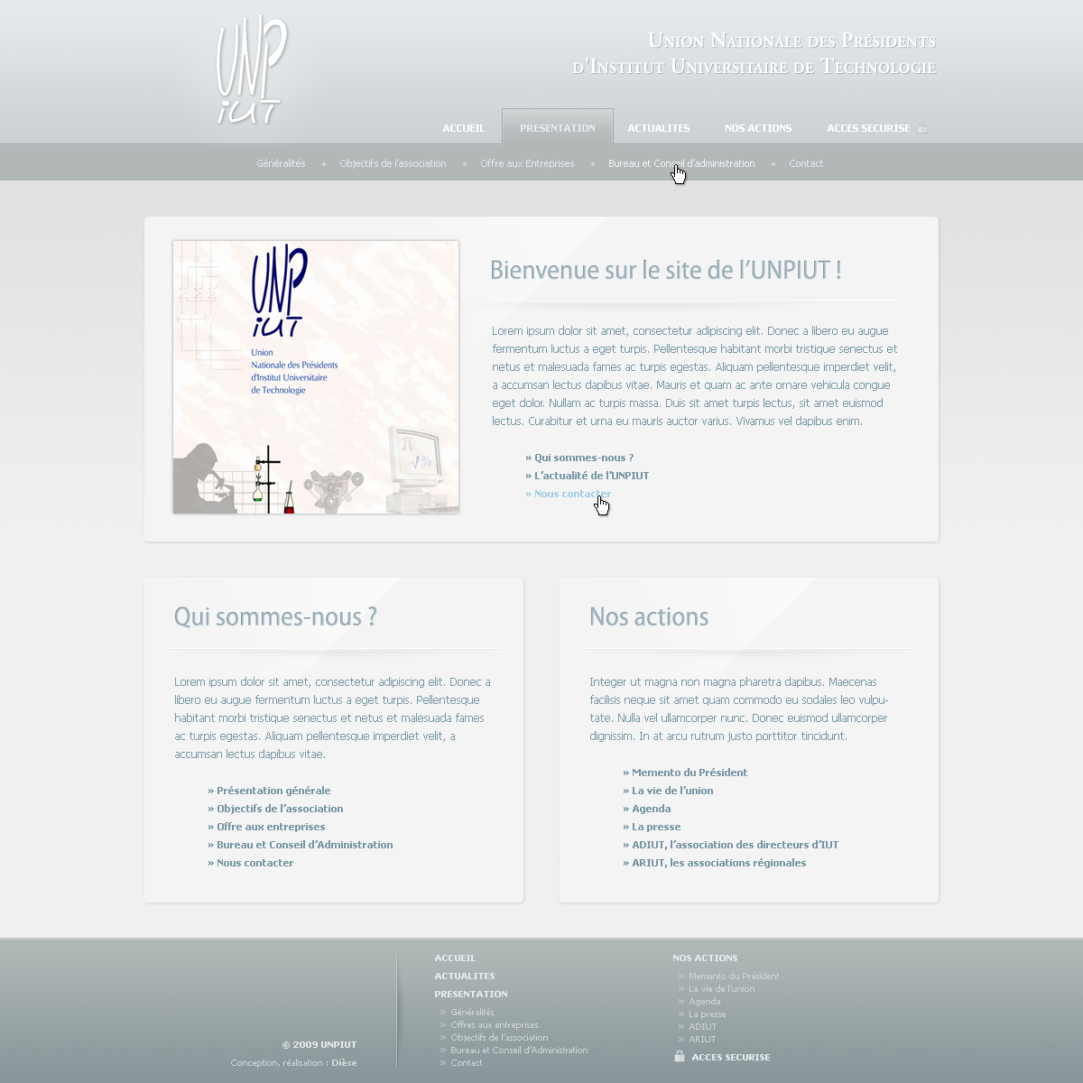
 jsw1tch — UNPIUT Design beta
Published: 2009-06-07 21:06:03 +0000 UTC; Views: 226; Favourites: 0; Downloads: 0
Redirect to original
Description
this is the homepagei need advice, is there something i should change ?
UPDATE : changed the footer and adjusted colours a little bit
Related content


Comments: 3

Hm... looks too bright
You could make menu bar and footer with more "juicy" blue colour, and the boxes bright up a bit, because the text is not readable, or make the colour of the text darker instead. Last thing, the logotype looks quite modern and innovative, but the text on the other side is exactly opposite - formal and more traditional. Their themes bite each other and that makes a little chaos.
Other than that.. very good
")
 (Smile)")
👍: 0 ⏩: 1

Thank you for the comment.
I completely agree with you about the contrast issue, I'll try to darken the text and use more intense colours.
About the logo, I didn't design the one on the left and the client wants to keep it, so I'll try to change the text on the right
Again, thanks for the constructive comment, I appreciate it.
👍: 0 ⏩: 0

looks kina neat, i like how the boxiness repeats throughout and the menu structure seems to work.
the colours work well for me,
but my boss (age 50) would say: 'it's all so bright, i can hardly read it!'
consider your target audience and design around them
👍: 0 ⏩: 0