HOME | DD
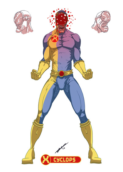
 Juggertha — Cyclops re-design
Published: 2010-06-04 11:16:32 +0000 UTC; Views: 8142; Favourites: 75; Downloads: 358
Redirect to original
Description
Well, I've redesignedBatman
and Ironman
So, why not Scott?
Any sugestions before I submit this tomorrow?
Related content


Comments: 58


Cool artwork. I like what you were going for with this one, making him look more like an "actual" cyclops. Still, aside from the visor, it doesn't seem like too much of a departure.
👍: 0 ⏩: 0


thanks - that's what I was going for.
👍: 0 ⏩: 0


hehe cool. Not a fan of the inner yellow on the inside arm, but everything else is a nice twist.
👍: 0 ⏩: 1

I like the costume, but I'm not a fan of the side-views. You made the poor guy ugly as sin
")
👍: 0 ⏩: 1


Yup, the Kirby Krackle in full effect!
👍: 0 ⏩: 1


I can't see him as the solid leader in this design, he looks more like a loose cannon like most cyclops are depicted, a bit crazy and unpredictable. nice job (Smile)")
👍: 0 ⏩: 1
Agreed - reminds me a bit of Havok.
👍: 0 ⏩: 1
👍: 0 ⏩: 0

Love the double helix logo, absolute genius the asymmetrical costume is nice too. You sort of hit on the John Cassidy vibe with the simplicity of this one. I couldn't see him switching to the round lens tomorrow but it does sell the name Cyclops quite well. The only thing I'm not really into are the ringed boots and gloves, looks a little too Jetsons for me.
👍: 0 ⏩: 1
Lots of people seem to dig the Helix
👍: 0 ⏩: 0

Cool now I just wanna see the rest of the original X-Men done...
Cyclops...check
Marvel Girl...
Beast...
Angel...
Iceman...
Looks like you've go some work to do...lol!
👍: 0 ⏩: 1
Iceman might be next.... he seems like he'd be a cool challenge.
👍: 0 ⏩: 1
Cool...pun intended...lol!
👍: 0 ⏩: 0

I never understood why it was a flat optic lens. Round looks much cooler!
👍: 0 ⏩: 1

I like this very much Jugs. Really portrays the "cyclops" much better with the round visor over the thin rectangular one. Nice work here.
👍: 0 ⏩: 1

First of all, full marks for creativity and execution on this concept. I feel the big red "eye" takes away from his humanity as it is so prominent, but the result is a much more intimidating Cyclops which is good I think!
If I would have one "issue" it would be the questions surrounding the practicality of the large round "eye". For one, it covers his nose which just cannot be comfortable!  (Wink)")
Anyways, do more of these please! They are really fun to see!
👍: 0 ⏩: 1
I'm glad you caught the dehumanization with the larger eye
👍: 0 ⏩: 0

very cool man! Scott was one of my favorites as a kid. This looks like somethig I an see him wearing in the comics.
👍: 0 ⏩: 1
")

I really like the approach that the eye is huge and round. I'm figuring that the energy stored in his eyes, or how ever it works, has either enveloped the entire upper portion of his head almost eating away at his face, or not quite destroying it but starting to expand thru out his head, thus the giant eye helps subdue and contain the energy, until needed. Looks very cool. It's daring. Only issue I have are the feeble looking ankles that look like they'd snap after one step. But I suppose that's just a drawing style and not to be taken to literally.
👍: 0 ⏩: 1
yeah, those ankles are my lame style.
👍: 0 ⏩: 0


Sorry,my brain was being loony when I typed that,so I didn't know what I was thinking about(it was almost midnight)
About the pic itself,it looks really good
Maybe what I was trying to say back there was 'Draw your version of Deadpool'

👍: 0 ⏩: 0

I love the X, it looks like a broken double-helix. Maybe something about the redeye. It seems rather dark, but then it's a good red. Then the hood seems to be shaded, perhaps to fade into the background behind the eye, but contradicts the shading elsewhere. Perhaps it's the pink of the shoulders, but there's other lines that make it seem dark overall. I guess the beam would be blood-red, instead of scarlet, which is unusual. I like the white dots. If they were slightly larger then they could have a dark-red iris, each iris looking away (perspective-wise) from the center of the head. Might overcomplicate, or might suggest white reflected backlighting of round red balls? All just wild speculation. But it does look pretty cool, far less human.
👍: 0 ⏩: 1
people seem to dig the double helix.
👍: 0 ⏩: 0

hmmm...diggin' the costume is the red circle on his belt a carry over look from his eye. The eye kinda bugs me maybe more of an eye look or maybe an eye lid (is eyelid one word lol) kinda thing or maybe half open to show the beam comin' out of it, the eye lid bein' a visor...just sayin'...but I do like the concept ya got goin'.
👍: 0 ⏩: 1
I was hoping it gave it an odd vibe... something a little warped.
👍: 0 ⏩: 1
I really like the "warped" feel to it Jug...I think someone posted thats how a "cyclops" should be
👍: 0 ⏩: 0
Favorite character...visually.
👍: 0 ⏩: 0
| Next =>