HOME | DD
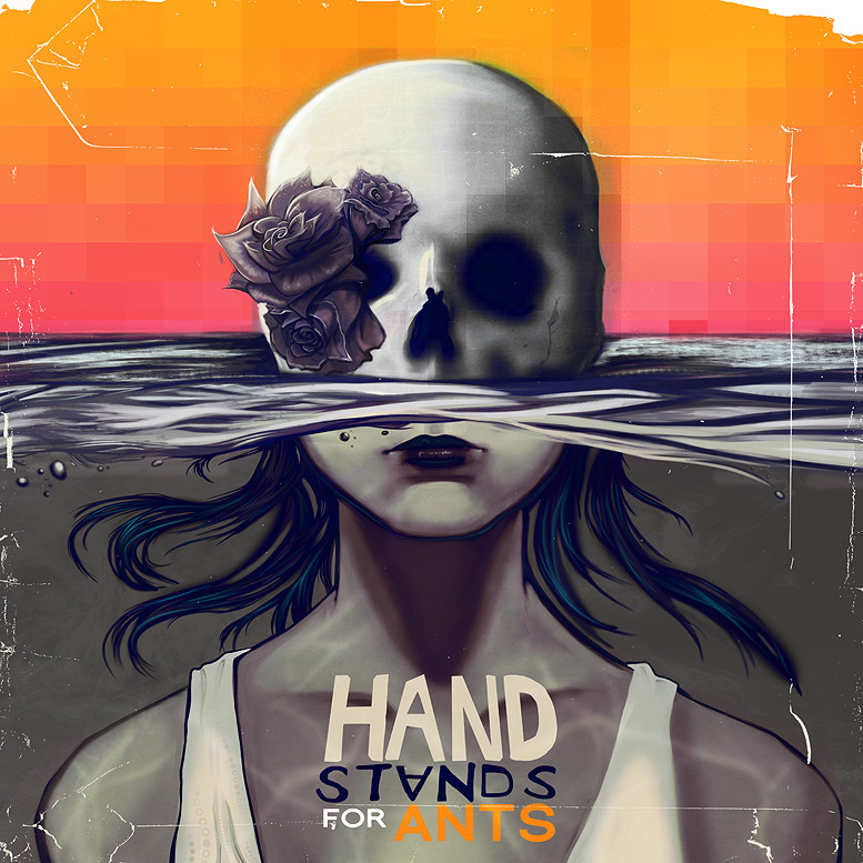
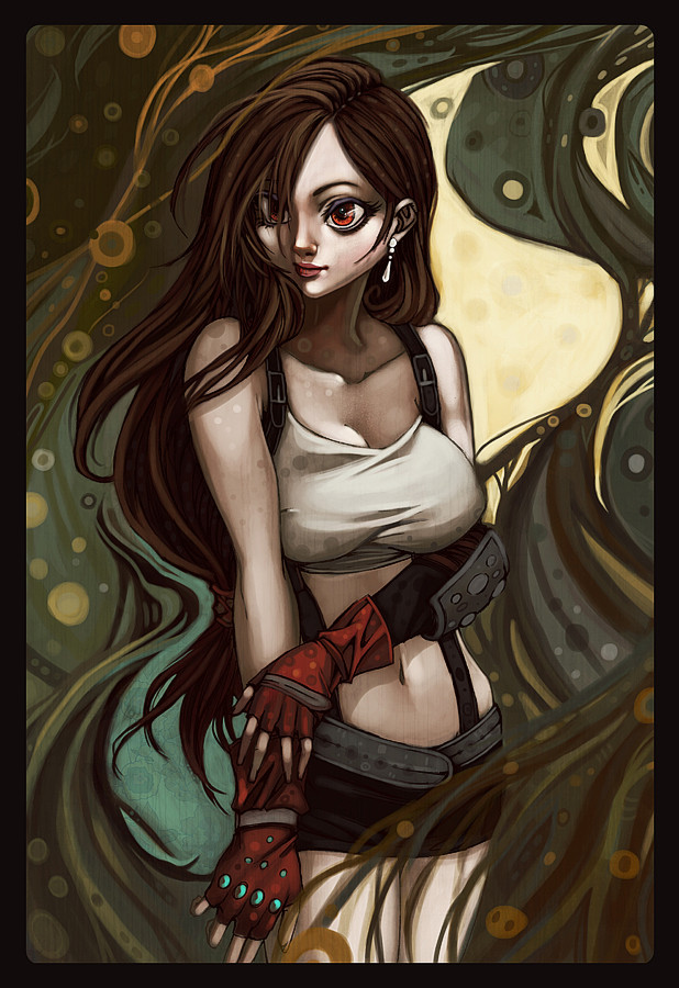
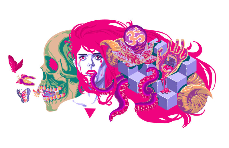
 Julia-Alison — Hand Stands for Ants
Published: 2011-04-26 12:09:23 +0000 UTC; Views: 3363; Favourites: 187; Downloads: 113
Redirect to original
Description
EDIT - Got some feedback from the band and my teacher this is hopefully the final version. You can see the other promotional work I did here - [link]An album cover done for local Freo band Hand Stands for Ants. Done part as a graphic design assignment, we were assigned a band manager to do promotional work for a local band. However I'm still waiting to get feedback from the band memebers on this final design. Still not happy with the type, I need feeback from my teacher once I get back to class. The band didn't have nor do they want a logo.
I drew up three concepts and this was the one they liked. The theme of the album was 'change' and they wanted something creppy yet fun. They're music is really good i listened to a fair bit of it while working on this. They're new album is more electronic so I tried to incorporate that into the design as well.
Website | Blog | Store (Crystal Flight)
Behance | Facebook | Commissions | The Eariee Project
Related content


Comments: 25


awesome...wish it was done for my band...  (Smile)")
👍: 0 ⏩: 1

I wish the band I did it for appreciated it as much as you do
👍: 0 ⏩: 1
can you still do similar work?
👍: 0 ⏩: 1
shoot me an e-mail at juliaalisond@gmail.com
I do a lot of album artwork for bands
👍: 0 ⏩: 0

Beautiful, I love the direction your work is taking (:
👍: 0 ⏩: 0

This is beautiful, I love her lips and the overalll use of colours. There's no doubt I'd buy this album just for the cover.
👍: 0 ⏩: 1


Nice! Reminds me of a 70's horror film poster- maybe a foreign flick that would creep up late on cable and scare the crap out of someone who turned to it unaware of what was going on until a body part went flying off...
👍: 0 ⏩: 0

Gorgeous.
The style, the colors, the font, i love pretty much everything about this.
It really catches mt eye and makes me want to learn more about this band. So good work really.
👍: 0 ⏩: 0

This is incredible! The change in colors makes it really pop. And I see what you did with the digital part. I like that a lot.
The typography is pretty cool, but meh ;___; there's something about it I don't like.
👍: 0 ⏩: 0

I LOVE THIS UPDATED VERSION EVEN MORE. REALLY GRRREAT WORK ")
👍: 0 ⏩: 0

I don't enjoy the typography, but the illustrator and concept is amazing!
👍: 0 ⏩: 1
thanks, yes the typo is a bit of an eye sore
👍: 0 ⏩: 0

this is awesome caesar! fantastic concept and it's been carried out wonderfully
👍: 0 ⏩: 1

Love this one, it's really interesting to look at! I would definitely want this as the cover if I was in a band.
👍: 0 ⏩: 0

its great
👍: 0 ⏩: 0

Holy crap! It looks reallyyyy good so far. It must not be easy to draw stuff like this but you did a great job! But the thing in the bottom right seems not enough '3D', maybe it's supposed to be like that ? Anyways, love it. <3
👍: 0 ⏩: 0


Great work, if this was my bands album cover I'd be incredibly happy!
👍: 0 ⏩: 1