HOME | DD
 Jums-Archives — Between Good and Evil

Published: 2009-03-26 18:38:54 +0000 UTC; Views: 1433; Favourites: 72; Downloads: 45
Redirect to original
Description
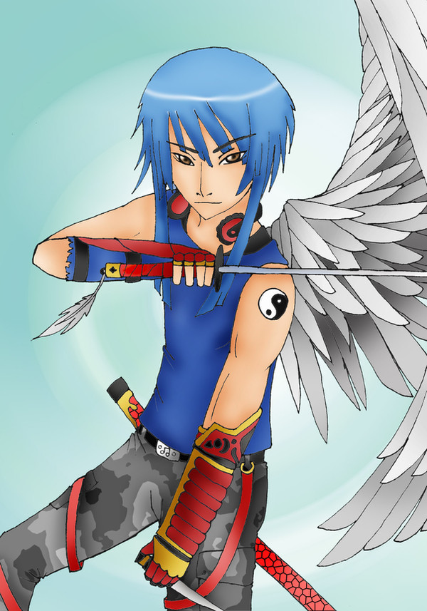
Hey, I heard from =Memokkeen that you guys wanted to see this finished - so I actually went and did it!Downloading it would do us all good.
Art & Character (c) ~Scalier
Related content


Comments: 18


Hmmm.... Well, I definately enjoy seeing the detail, and a clean transition from good to evil, very precise... Not seeing a representation of the green-hued background on the male figure.... perhaps slightly on the right leg, but other that, everything is exceptional.... Bravo
👍: 0 ⏩: 0


xD Ja se ite oli sillen "nooh, emt.... siitä tuli nyt vähän mikä tuli.."
👍: 0 ⏩: 1

I like this picture. Few comments to tell you why.
I find details in this picture interesting, like feathers in angel wings and scales or thorns in that bat wing. I like simple complexity in some surfaces like folds in his trousers and wrinkles in bat wing. Another good area in this picture is good perspective. It makes this situation interesting.
Perspective also supports division in good and evil. I think it is good to see clear division in coloring but his hair and clothing has same texture which keeps the character in one piece. It is nice to see evil in the foreground for a change after seeing dozens innocent puppy eyed teenage girls.
However, background is missing. This is now a digital image and adding simple texture or good coloring behind this character would give a finishing touch to this picture. I don't like anime style that much so I'd recommend either finding a strong story where anime puppets act or digging into more personal style. There is only one technical flaw, person is cut from ankles. I can't tell if he is flying or standing.
With a big gray circle as a background I think this is good enough to be in some magazine. For example '
There are two things which could bring more expressiveness in the future: add facial expression (avoid zombies) and give him personal features like nose, lips etc (avoid animeism).
All in all, good picture.
 (Wink)")
 (Smile)")

👍: 0 ⏩: 1
Looking good. I want to see next one. Or actually five next pieces to see how much he improves.
")
👍: 0 ⏩: 1
Well, the deviation "A pretty smile" was made last weekend.
")
👍: 0 ⏩: 1
I tossed a small note about that picture - how I see it.
Bit more extensive story from author would have given answer to some of my toughs and doubts.
👍: 0 ⏩: 0

That is wicked! i love the difference between the good and evil side. Rock on!
👍: 0 ⏩: 0


