HOME | DD
 Junedays — Balmoria the Diviner

Published: 2012-09-22 22:53:50 +0000 UTC; Views: 16225; Favourites: 672; Downloads: 0
Redirect to original
Description
Copernicus VerseRelated content


Comments: 23

")


 (Smile)")


Hello,
Your beautiful work is featured here : [link] 

👍: 0 ⏩: 1


I think I owe you some feedback though. I can't just request something of you and not give a little back in return.
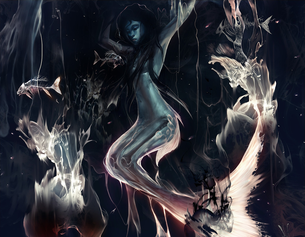
Her nose is very nicely polished. I noticed your crosshatch method of highlighting and that you didn't blend much except her face. I bet that's a midsized brush.
Assuming you're starting with a humongous document, I'm also wondering how you are able to zoom in and fill in certain essential details without losing your position or place in the whole painting, and end up painting everything entirely out of scale?
Facial symmetry can be tough, especially when one is expected to draw an oval for the frontal head, draw the centerline, then learn that one side of the face is larger than the other. I often spend hours correcting symmetry and flipping the document when I could be moving onto the other parts of the painting. Which is probably why I almost never end up uploading anything because it's never perfect. Anyway, I digress.
I can see you made light outlines for the feathers. Had you continued working on them, would you have simply covered them with finer details, or erased those outlines when you were done working on the feathers? I can understand keeping bolded lines for lighting effects but since you seem to have a more photorealistic style going on here, I guess you eventually erase them and then adjust the edges to look convincing without the outlines, like maybe you would have added slight shadowing under each feather or on the edges to instill a sense of depth on each one.
That energy ball...um... it looks like something Vincent Van Gogh would paint, if he lived in this modern age and did digital painting. Don't get me wrong, this is not a compliment, it's just an observation. I can see where you were going with it though. If I was working on this painting I would have refined it to appear more spherical and glowy. I like glowing objects, personally.
I can see the brushwork you did with the hair. Each.... uh... group of hair strands is an individual brush stroke, combining together to create a delicate symphony of flowing hair. I see what you did there!
The gold thing on her head is clearly in its basic stages because at this moment it's impossible to tell how thick it really is. Had you kept going, you probably would have kept going with curved brush strokes along the gold thing at the right places until it had a nice convincing metallic luster. Were you struck by a sudden bout of OCD, you might even inscribed small shadowings in the gold object's design, accenting the engravings and giving people even more reasons to write lengthy comments about one of your paintings.
Overall, my thoughts are still the same - I need to learn from you.
👍: 0 ⏩: 1

I usually paint in documents around 5000 by 9000 pixels. The Angel in the Machine painting was actually only 2000 by 3000 ish because it was more sketchy than most works I do. I use the navigator in Photoshop to navigate. It shows a smaller picture of what I'm doing so I never get too lost in things. I also constantly zoom in and out.
As for blending, I use a speckle brush, the kind that comes in most photoshop packs. If not, pretty much download from any artist offering their brushes and you'll find it in there.
As for the feathers, haha, I feel like my style is getting messier and messier. I would probably paint right on top of the edges since I only use one layer and can't really erase anything.
The energy ball is a cute trick. Just use the shape tool to make a circle on top of the painting, fill it, and paint with a few color dodge tools, then paint over and over.
The gold thing was never meant to be fleshed out. I don't like to paint everything through, so some things are just meant to be patterns if I think they look good.
Hopefully I'll upload something some day. You'll see I'm a very messy painter XD
👍: 0 ⏩: 1
Do you think you could record yourself painting? I would love to learn from you, or anyone who paints similarly.
👍: 0 ⏩: 1
Livestream slows down my laptop like crazy but one day I really really hope to. Right now I'm a bit busy with college so I can't set things up, but maybe this summer! Or at least I'll churn out some kind of quick tutorial
👍: 0 ⏩: 1
Hey I'm busy with college too, no rush! I'm just glad I had time to look in my DA watchlist and look at your stuff. A quick tutorial would be excellent!
👍: 0 ⏩: 0