HOME | DD
 Jurryt — Reality

Published: 2008-01-28 22:06:17 +0000 UTC; Views: 7999; Favourites: 226; Downloads: 554
Redirect to original
Description
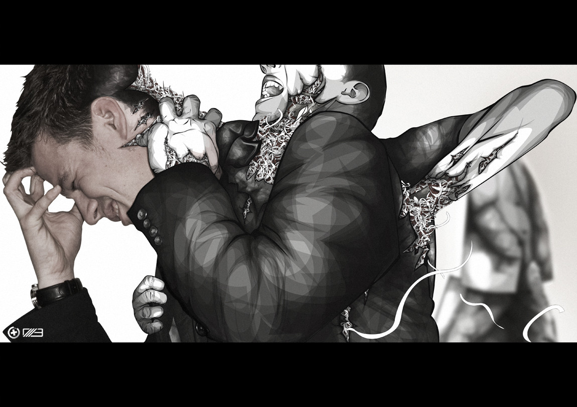
Jumping out the Reality. The person is jumping out of a painting into the real world. He becomes a real person, away from the black and white.though, how good will the real world be?
/EDIT;
Quality change
Related content


Comments: 65

I really like this, so does my girlfriend.
She said she'd 
But anyways....I think I'm gonna see if I can do anything close to this on photoshop.
Yours is A.W.E.S.O.M.E. though!
👍: 0 ⏩: 0

")

Wow. Thought provoking. I like your style a lot, and look forward to seeing great things from you.
 (Wink)")
👍: 0 ⏩: 0

Ah, what a great idea!
A thing I think would have been cool, and would have worked better, would have been if the "painting" looked well, like a painting, not vector. So it'd be like going from painting -> vector -> real life. Because a painting doesn't look realistic (Unless you're actually doing realism, ha), and then you're going to vector, which isn't realistic but is "crisp" like real life is, and then finally to realism, which is self explanatory.
It looks great as it is though, otherwise.
👍: 0 ⏩: 1

Thank you.
Well, at the time I designed this one, I couldn't do real '
[link]
However, I do not think those 2 principles blend nicely together.
👍: 0 ⏩: 0

that dancer has got really popular xD, great work!
👍: 0 ⏩: 1
yea, but I started using this one at the end of 2007 ^^
👍: 0 ⏩: 0


This stock is overused I think, and I don't really get it, but keep trying
 (Smile)")
👍: 0 ⏩: 1
:_D
See the date when it was made. I was like the first who used this stock x).
I do agree, however, that the stock is overused. That you don't get the piece, that is up to you. What you mean with keep trying?
👍: 0 ⏩: 0


I saw your article on PSD tuts and recognized it straight away so I came back to dA.. I can't believe I didnt' fav this when I left my first comment.
Great work and congrats you're a great artist
👍: 0 ⏩: 1
Thank you very much! I really appreciate you checked back on me!
👍: 0 ⏩: 0

Hey 
I've featured this deviation in my journal, keep up the great work!
[link]
👍: 0 ⏩: 1

")
great work... I love the transition from color to b/w. Awesome vector!
👍: 0 ⏩: 1


nice man!
alleen geen grote fan van de softbrush achtige/dropshadow achter de stock zegmaar.
👍: 0 ⏩: 1
thanks! en heb je helemaal gelijk in. Check nieuw ontwerp!
[link]
👍: 0 ⏩: 0


this is cool.. it's the same guy used for one of his deviations
👍: 0 ⏩: 1
| Next =>