HOME | DD
 K-Johnson —
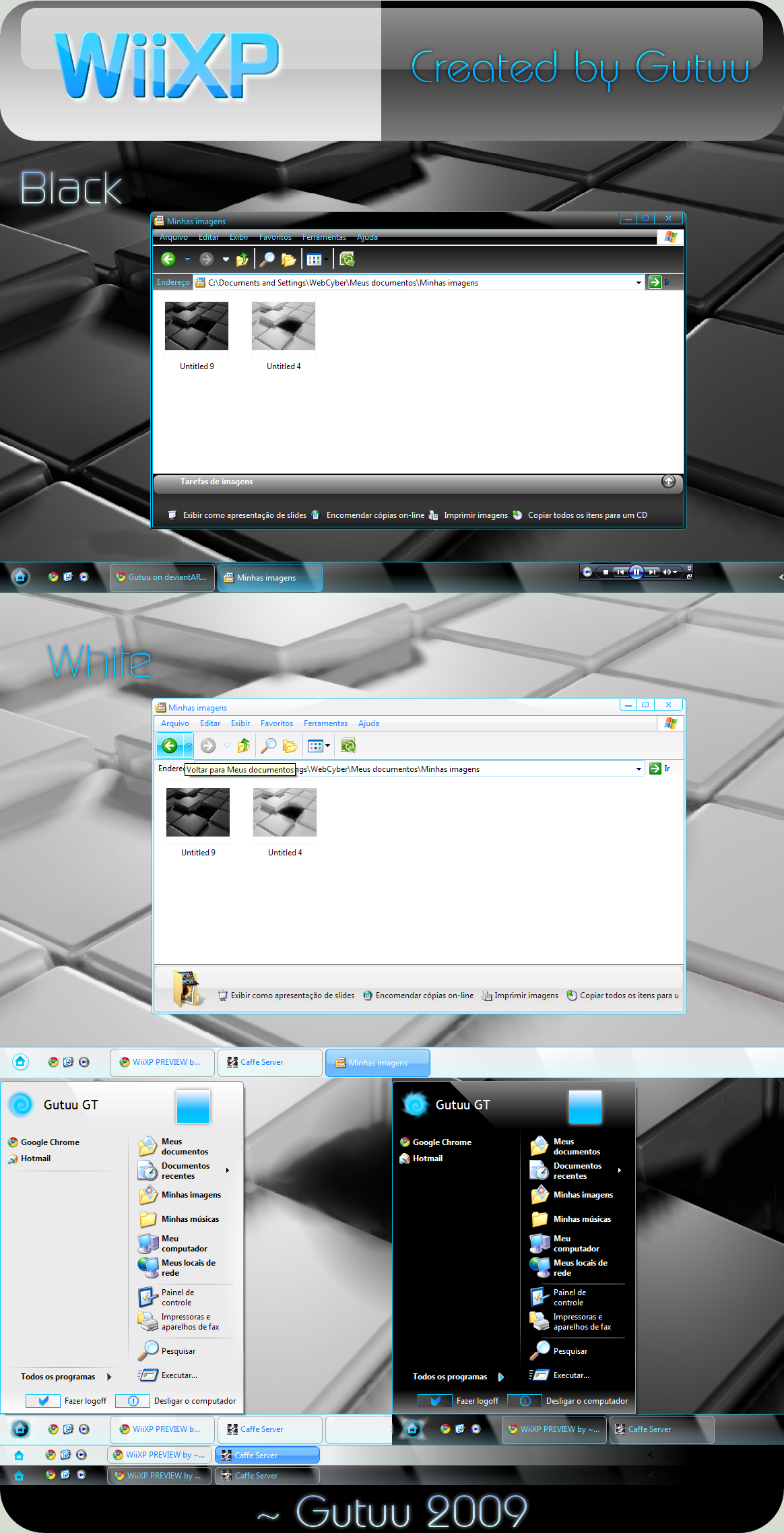
Clearscreen Sharp for Windows7
by-nc-nd
K-Johnson —
Clearscreen Sharp for Windows7
by-nc-nd
Published: 2009-10-25 01:51:16 +0000 UTC; Views: 941925; Favourites: 1946; Downloads: 218439
Redirect to original
Description
THANKS fediaFedia FOR THE DAILY DEVIATION and I'm glad that people out there still enjoy using this theme! (Smile)") )
)--
Note: For current news regarding Clearscreen Sharp for Windows 7, please view: [link]
--
Hi all,
Here is the Clearscreen port for Windows 7. Much has been polished and much had to be redone, thus some things have been changed -- some compromises here as Windows 7 shares even more resources between different parts of the theme. So expect some details to be lost (like the etched look on the group sorting headers -- Windows 7 ignores the property and only allows a 1px height for the seperator), or the unique "New Application" button state for the Start Menu (that image is shared and grossly distorted in another area), amongst other things.
You may be wondering where the navigation buttons and other resources are -- I am having trouble replacing my resources in System32. Replacing Explorer.exe works fine, but as soon as I replace a .dll file, things go to crap. I had to repair my OS 8 times yesterday and don't feel like having another go for a while. I'm taking the same steps as I had on Vista x64, and I had no problem on Vista, so this is very strange. Any help is appreciated
I am working on Clearscreen Round, which shouldn't take as long, as the base that these two themes share is now complete. Won't give an ETA; it'll be done when it's done.
Known Bugs / Limitations:
- Because of the nonstandard frame and padding size (both set to 1) of this theme, you may see the frames distort in some areas... unfortunately, there's not much I can do there as Vista's default Aero also has problems when scaling it down to this size; fidelity of the edges and corners are lost. [limitation]
- Aero Wizard dialog uses the bodytext color property (which is set to black in my theme) for the titlebar text for whatever reason (coding laziness?) -- basically, black text on black shadow == difficult to read... [limitation]
Volume mixer line goes a few pixels too far -- this is because the padding size is low, which allows for more vertical and horizontal space, allowing the vertical seperator to come into view and cross the horizontal volume mixer line. [limitation]- Resource Monitor accordion text color is white and sits on a light gray background. [limitation]
- Start Menu may show up blurless near the top when you first open it, but it fixes afterwards. This is because DWM assumes that there is a solid graphic there like in the default Aero, so it doesn't blur it. Unfortunately, there is an intentional gap up there to fit the style, and I don't want to change it. It's not a big problem, but a minor annoyance for some.
Updates
- Fixed x86 white/blank graphic bug (Systray, IE8 Search)...again.
v3.2 (November 1, 2009):
- Fixed Start Menu's Userpic in Top Superbar orientation.
- Revisted the Superbar Thumbnails section, still not sure about it, but I think it looks better than it did.
- Improved Start Menu blurless area limitation (seen when you first open it, DWM fixes it afterwards) by expanding the white area (Programslist) horizontally to cover it. I can't fix the top part, unfortunately, or that would mean that there will be no gap up there, and I like the gap
- Removed Fading Animation in Explorer Documents section/template. It was an experimentation that I forgot to remove.
- Fixed Vertical taskbar graphics to stretch proportionately
v3.1 (October 31, 2009): Bug fixes & Polishing
")
- Fixed x86 white/blank graphic bug (Systray, IE8 Search)
- Fixed SIZINGMARGIN property for progress bar left and right edge -- edge retains fidelity when progress bar is stretched or shrunken.
v3 (October 30, 2009):
- Fixed Treeview bug (Seen in CCleaner, Regedit)
- Fixed Start Menu panels from distorting in Large Icons mode
- Fixed Shadowless frames (left and right) to match top and bottom frames
- Optimized frames for current padding/sizing border (1)
- Added a bit more contrast to highlighted text (highlighted text now set to #000000; highlight fill = #CDCDCD)
- Fixed Disabled SplitButton Dropdown graphic
- Updated Explorer.exe to current version [6.1.7600.16404] (x86 & x64) -- thanks to ~drake04 !
- Fixed Large Icons view in Start Menu from distorting the menu panels.
v2.5 (October 26, 2009):
v2 (October 25, 2009):
FAQ
- Q: Where can I get the green wallpaper in the preview?
A: Sorry, that isn't a wallpaper. It is a background made for presentation purposes. Maybe when I have the time I can create a wallpaper like it. - Q: What about the ones in Explorer? Where can I get those wallpapers?
A: I do not remember where I got them from, so out of respect to the authors I won't share them.
I think the ones in the preview came from Flickr. You may be able to find them in some of my favorite photographers galleries and shrink them down to your resolution yourself:
[link]
[link]
[link]
[link]
[link]
[link]
Q: Are you going to make a large triangular Start button?
A: Sure, when I get the time. The reason for its current absence is because the triangular Start button is shared in all four Superbar orientations.
Q: Help! I can't make out the text in X program!
A: Programs that rely on their own graphics or font colors along with resources from the theme (colors, font, images) for their GUI will often have usability issues (black font on black background, for example). This is unfortunately out of my hands. Programmers design their program around the default Aero theme as that's what the overwhelming majority would use.
Related content


Comments: 708


This is the best Win7 theme on dA by far! Awesome job!
👍: 0 ⏩: 0


I'm loving this theme...It's so crisp looking. I can't wait for you to work out the rest of the bugs.
👍: 0 ⏩: 0

there have been many theme releases for windows 7 so far. but this remains my favourite! most usable and good looking visual style for win7!
im looking forward to the release of the nav buttons!
👍: 0 ⏩: 1
I attempted to port the browseui.dll from the vista version into explorerframe.dll of windows 7 ysing restorator 2007.
size turns out different. and it does screw up explorer.exe...
👍: 0 ⏩: 0

Can you change the progress bar color to blue? Lime green doesn't really fit/match the Windows 7 UI.
👍: 0 ⏩: 1
thats the whole point of it being a theme and all...its supposed to be different than the usual win 7 ui.
👍: 0 ⏩: 0

First amazing new skin for Windows 7, amazing work. There are a couple out there that look nice, but are variations on Aero, this is new. Keep it up!
👍: 0 ⏩: 0

gorgeous theme man!!!
wondering whether you could tell me which programms you use to create such a beauty?!
looking forward to hear from you soon
and do not stop on reached!

👍: 0 ⏩: 1
Sorry, have just seen that you used VistaStyleBuilder....
Sorry
👍: 0 ⏩: 0


I love this theme. I'm having a hard time between this, soft7, and X2. The one thing that stands out for me the most in this theme, is the dark taskbar and light window borders. I really think that's brilliant, I'll be sticking with this for awhile. I even gave up the "sliver" start orb that I use in EVERY desktop shot for your small taskbar windows flag. What are you doing to me
No really, great job.
👍: 0 ⏩: 0
mmm a better hover animation would be appreciated. I don't really like the little circles. Maybe you should try square borders that represent the regular caption buttons. Take a screencap if you want.
👍: 0 ⏩: 0

This visual style is absolutely beautiful. It is by far the most refined and in-depth adaptation of Aero I've seen for windows 7 (and vista for that matter).
The ass-kissing out of the way, there are two issues I have. One very important, the second not so much.
1. Might there be a way to change the text shadow on window captions? When I have a windows over a white window, the black blob behind the active window caption is hideous. In general, I hated the "smudge" shadow when Microsoft did it in the first place.
I noticed that in the window previews you use what could actually be called a shadow. I think this would look much better on the window captions themselves as well.
3. Is there any chance of there being some more of a gradient between solid and transparent?
👍: 0 ⏩: 0

Great theme.
I've just set it. It looks amazing.
👍: 0 ⏩: 0

Hey, is the tiny start menu included? If so, where is it? I can't seem to find it :<
👍: 0 ⏩: 1
Oh, nevermind. Sorry I found out how to do it. I adore your VS by the way! Excellent work!
👍: 0 ⏩: 1
It's kind of needlessly complicated, but the SlanXP VS has a good visual tutorial on how to get it working: [link]
He says in the description that you have to do that every time you turn on your computer, but I haven't had to do it since I applied the theme.
👍: 0 ⏩: 1

:l I thought you were talking about the actual startmenu, not the taskbar. What I want is to make my startmenu small like in the preview. Compare mine [link] to the preview.
👍: 0 ⏩: 1
Yes that's exactly what I'm talking about? Unless you mean the program files area (which looks exactly the same)
👍: 0 ⏩: 0


Why exactly do you have to replace the explorer.exe?
And how do I change the WIndows Orb in the start menu to another one???

👍: 0 ⏩: 1

You have to replace explorer.exe to change the Start Orb.
For some reason or another Microsoft decided to place the Orb images within explorer.exe in Windows 7...probably just to make it difficult for us  (Wink)")
👍: 0 ⏩: 1
I already managed that. I should have deleted that comment before, sorry. But thanks anyway.
Brilliant Visual Style I have to say, thanks so much for posting!


👍: 0 ⏩: 1
You're welcome
👍: 0 ⏩: 1
You have a high opinion of me I have to say
No, seriously, thanks for the effort my friend

👍: 0 ⏩: 1
I'm glad I could offer any help, and thanks
👍: 0 ⏩: 0

i would love to use this style, its awesome
any chance to get it work on win 7 retail 64? it will not work for me (using the visualstyle-file klicked in the ress-theme folder) system is patched
👍: 0 ⏩: 0

wow, this is awesome mate!
i don't think my graphics card will support areo [even if forced] but i'll check it out.
if not, maybe a vs to suite us basic users?
👍: 0 ⏩: 0


i was just wondering could someone tell me if its possible to make the task bar and start menu the same color as the the rest of aero items or maybe just not so dark
👍: 0 ⏩: 0

Just wow man, you've done a fantastic job, i love it!
👍: 0 ⏩: 0

Great theme! 
")
👍: 0 ⏩: 0

Sorry for a silly question, but how can I achieve a triangular start button? I can apply this VS and it works, but with round STANDARD Win7 button / I mean 'blue with colorful windows logo'/ - not as on the screen - black with white windows logo.
Please reply and help mi to fix the problem and I'm sorry for my poor english.
👍: 0 ⏩: 1


Hey I was just wondering if anyone could tell me how to replace explorer.exe in win7 x64?
TY for the great theme btw!
👍: 0 ⏩: 1

Go to C:\Windows, find the explorer.exe . Right click go to properties -> Security tab --> Advanced --> Owner --> Choose YOU --> then click ok and on the security tab click Edit and give yourself full control. Then rename explorer.exe to like explorer.original then copy the correct explorer.exe from the theme in the folder then end task it in Task Manager and run it again.
👍: 0 ⏩: 1
Thank you
👍: 0 ⏩: 0

This style is nice but has one aesthetic problem: The white text on a black shadow looks weird and broken. I think sticking to the default black text on a white glow would have been smarter - the black spoils the airiness of the rest of the stream.
That's the reason I used CLS.round with Vista and hope you release the port to 7!!
👍: 0 ⏩: 0


Guys. Never replace the explorer.exe file. It's like asking for trouble! Explrer.exe is updated quite frequently from windows update aswell...
👍: 0 ⏩: 1
I'm sure if there was an update for explorer.exe it would get replaced.
👍: 0 ⏩: 0

Hi, I've recently installed this theme and it looks great on my desktop. Thank you for sharing it.
My only (tiny) problem occurred recently when i enabled quicklaunch toolbar on my taskbar.
[link]
It's not a big deal and it looks fine(no gap at all) if i drag the quicklaunch to the left end
and superbar to the right end. But I personally prefer the opposite way, so.
It'd be very much appreciated if you could tell me how i could get rid of this little gap. Thank you.
👍: 0 ⏩: 0
<= Prev | | Next =>