HOME | DD
 Kai-S —
WHAT IF? ASTONISHING X-MEN 1
Kai-S —
WHAT IF? ASTONISHING X-MEN 1

Published: 2009-10-15 10:35:00 +0000 UTC; Views: 105831; Favourites: 6227; Downloads: 4790
Redirect to original
Description
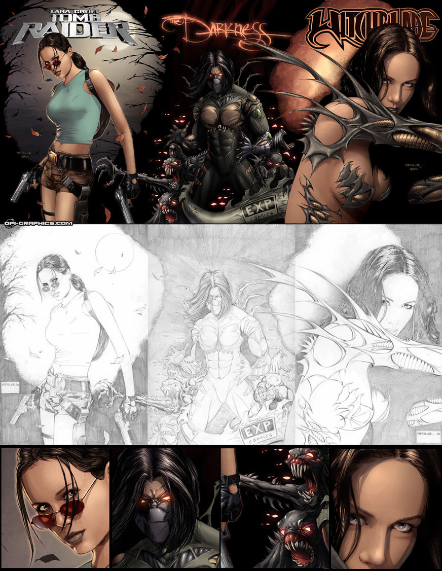
Cover for "WHAT IF? ASTONISHING X-MEN #1"coming December. [link]
Pencils: J. Scott Campbell
Digi Painting: me
Hope you like!
Before And After: [link]
Details: [link]
©Marvel
Related content


Comments: 265


i love jean grey's face here *_*
👍: 0 ⏩: 1

It should be very uncomfy to beat up bad guys in that outfit but it does look utterly awesome
")
👍: 0 ⏩: 1


We've featured your creation on our blog (Digital Painting Inspiration about Fire). [link]
👍: 0 ⏩: 1

very nice colour, i specially like the cold colour from the white
👍: 0 ⏩: 1
 (Smile)")

wonderful stuff - the colouring is just to die for. Very nice work
👍: 0 ⏩: 1


Wow, this makes a very dramatic cover. Simply gorgeous!
👍: 0 ⏩: 1

I'll answer your question as asked by your title as best as I can.
Crossing Emma Frost, a character I actually like quite a lot, with Phoenix, a concept a I rather despise, can really go either way EXTREMELY fast.
Of course, there is more destruction of Jean Grey who I can't stand on principle. And then there's the Scott aspect. I'm one of five people on the planet who likes Scott, and dammit, he just can't get a break with his relationships.
The image is great-just not sure that I like what it portends.
👍: 0 ⏩: 0


There is just so much to learn from this! Thanks for the great effort you put into it!
👍: 0 ⏩: 1

I thank you for your kind words!!
👍: 0 ⏩: 1
See, what I like about it is that the lines are used as guides to let the color go where it will. Rather than the color simply filling in the lines, the color BECOMES the separating factor. It really forces the colorist to rely on his/her skills to make that happen rather than simply relying on the lines to do it for him/her.
👍: 0 ⏩: 0


respect for your work, love it so much, its a little shame that the cover show to be a little darker on the printed version, that happened to me in my color pages with Getty in this issue too
best
👍: 0 ⏩: 1
Muchas gracias!! 
👍: 0 ⏩: 0

Great job, man! Can´t wait to see the interior art.
You´re amazing.
👍: 0 ⏩: 1

The flaming raptor in the background is spectacular.
👍: 0 ⏩: 1

Awesome, your work stands out even better on clean lines. Congrats man!
👍: 0 ⏩: 0


This is one of the greatest pieces i've seen. I've been a fan of your for long!
so glad to see u post something here once again!
👍: 0 ⏩: 0

amazing colors!! campbell is freaking amazing.
👍: 0 ⏩: 1

<= Prev | | Next =>