HOME | DD
 Kaisel —
Peace and War
Kaisel —
Peace and War

Published: 2012-06-12 16:14:37 +0000 UTC; Views: 15074; Favourites: 1447; Downloads: 212
Redirect to original
Description
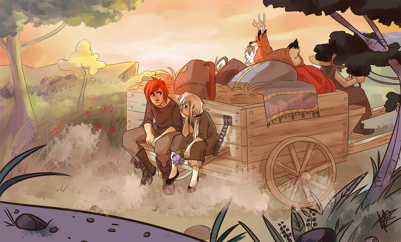
Watercolor & InkClass work again :3 hope you like it

I have to go back to work now...sniiiiiiiiiiiiiiif T____T
Related content


Comments: 116


but sadly peace cant win because they strive for peace and dont want to be violent when war is violent and see's that violence is key to getting through and can rip through almost any thing.
👍: 0 ⏩: 3

Yay! thanks a lot for your comment!!

👍: 0 ⏩: 0

Nor peace neither war can win, the same with good an bad, one thing cannot exits without its opposite... like it or not it is like this
👍: 0 ⏩: 1
yeah... glad someone understands
👍: 0 ⏩: 0


phew for some reason i was worried you would take offence
👍: 0 ⏩: 1


Que bonitoooo!! <3<3
Me encanta el contraste entre uno y el otro...yyyyyy....felicidades por la DD!!!!
👍: 0 ⏩: 1
Muchas gracias!
Cuando he visto lo de la D.D no sabia lo que era y me he quedado un poco en shock xD
👍: 0 ⏩: 0


Wow you can totally tell the sense of character in each of these
")
👍: 0 ⏩: 1


So cool! I wish the girl's face had a bit more expression, but still wow! I wish I had a bouncing of the walls icon!
👍: 0 ⏩: 1


 (Cool)")

Peace is feminine in nature while war in itself is masculine.
👍: 0 ⏩: 0

Powerful stuff, my friend. Powerful stuff.
Fantastic work. 


👍: 0 ⏩: 1


I really like these...they are very gorgeous...but to me, it feels a little incoherent because the bottom one looks so differenct than the top...I'm just talking about the character in the foreground. Even though they were meant to be opposites, design wise I feel they are a little too seperate. But it may just be me. I love love love love what you did wit hthe hair and the scarf. =]
👍: 0 ⏩: 1

The contrast in colors demonstrates the contrast of ideals very well.  (Smile)")
👍: 0 ⏩: 1

This is great! You worked with the water colors really well! Me likey

👍: 0 ⏩: 1


I really like the border around the lower portion of the image. Really great watercoloring!
👍: 0 ⏩: 1


I love this work,it is the best keep up the good works!!!
👍: 0 ⏩: 1

| Next =>