HOME | DD
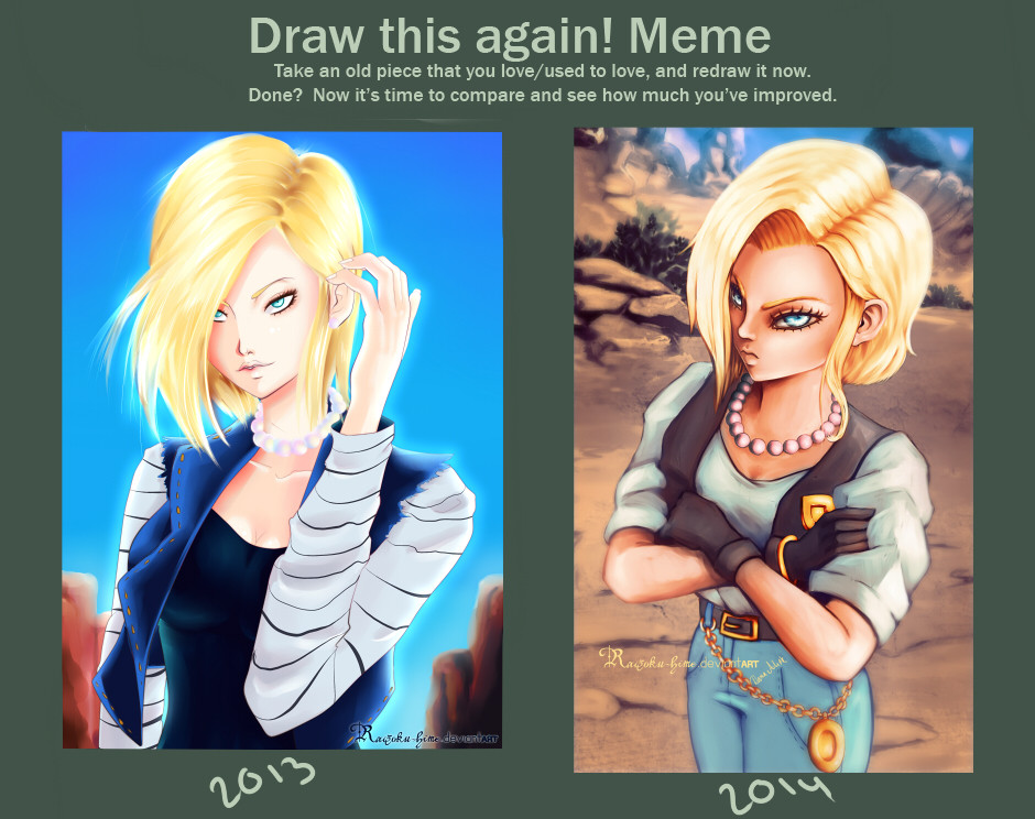
 Kaizoku-hime — draw this again: Android 18.
Published: 2014-07-01 22:31:28 +0000 UTC; Views: 3380; Favourites: 73; Downloads: 0
Redirect to original
Description
I just really really wanted to redo her as she used to be one of my favorite dragonball z characters gosh she is so badass!step by step: www.youtube.com/watch?v=RnY14i…
my facebook!: www.facebook.com/danaalink.art
Related content


Comments: 23

What I see from your DA page, I don't know if this is something that was a problem or not. But the previous one had a much better face propotions than the newer one. And as some else commented, the newer one show MUCH more personality. And the coloring is really great.
👍: 0 ⏩: 1

thanks for the feedback!=]
👍: 0 ⏩: 1

Both versions are good in their own way.
2013 made her look like a GODDESS, but 2014 showed more of her personality.
👍: 0 ⏩: 1
thank you so much I get what you mean about the 2014 one I am very happy you think so=]
👍: 0 ⏩: 0

No offense, but I like the previous version much better.
👍: 0 ⏩: 1
I'm glad. I'd hate to offend anyone!
👍: 0 ⏩: 0

the new one is much better then the old one. you can see a really big improvement in coloration ant details.
(and her hair looks way more awesome <3)
i love it!!
👍: 0 ⏩: 1

")


The new coloration style is cool but sorry i like the old lines more :S
But if you like it ,keep it up
👍: 0 ⏩: 0

its awesome but the first better and the color on the 2nd will done and keep it up
👍: 0 ⏩: 0

sooo, well, uhhmm, I like the first one better tho..
the anatomy seems to be better + the face is better on the 2013 one...
👍: 0 ⏩: 0

Absolutely love the new one - a lot more interesting pose, and the eyes is done a lot better although they have a weird angle.
👍: 0 ⏩: 1
thanks so much! haha and you're right I tend to overslent eyes... always done it been trying to get it more accurate but it still needs tweaking^^
👍: 0 ⏩: 1
Think we all got a few things to work on - personally i'm not really strong on any human features - especially not female faces and bodies.
👍: 0 ⏩: 0

I kind of like the first one better tbh. I think the bg though is better in the 2014 one.
Great job anyways
👍: 0 ⏩: 1
that's okay personal taste is always undebatable^^ thanks though!

👍: 0 ⏩: 1
