HOME | DD
 kaotickell — CommunityOps CSS ContestDesign

Published: 2011-02-10 23:15:33 +0000 UTC; Views: 432; Favourites: 0; Downloads: 16
Redirect to original
Description
So I've just realised that to actually enter this, I need to become a member of the #communityops group.


 Don't worry, that's being fixed now.


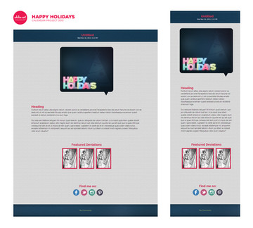
Everyone else seemed to be using the dA green, and while I do love the dA colours and all.. I like trying different things.


It's simple, clean, and I think that the dark blue has worked a treat on making everything else pop. What do you guys think?
As things stand right now, I'm going to have to leave the coding to the dA professionals (


 $Ikue
$Ikue 


 ) - college starts on Monday and as I have a few things going on at the moment, the design is going to have to suffice for the time being.


 Who knows, I may even get to code it yet!
Anyway, tell me what you guys think!


Related content
Comments: 13

Looks good!
And yay for letting Chris do the work
👍: 0 ⏩: 1


👍: 0 ⏩: 1

Haha, we both know that he loves to do it
👍: 0 ⏩: 1

Exactly! It's totally a compliment.
👍: 0 ⏩: 0

yay awesome!
i actually though about doing a second entry, with a dark base as well
👍: 0 ⏩: 1


👍: 0 ⏩: 1

haha, yeah we all went the bright direction, like in the icon
👍: 0 ⏩: 1

I contemplated using the same layout and design then changing the colours to something along the lines of the dA green at one point, and I may still try it yet. I don't know that I'll actually submit it as an entry though.
👍: 0 ⏩: 1

haha, yeah… id be that lazy too
👍: 0 ⏩: 1


👍: 0 ⏩: 1

I love it. I am a huge fan of the inverse theme in general. My entire OS is edited to be white on black instead of black on white.
I reckon you have used the cov-ops logo well, changing it slightly compared to the other entries. The styilised quotation marks around the paragraph box are an interesting touch too.
👍: 0 ⏩: 1

I love it. 
Thankyou! 

I had actually tried the quotation marks on another journal design I had made a little while ago, I figured they made an excellent way to distinguish a quote from a featured box of text.
👍: 0 ⏩: 0


