HOME | DD
 kaotickell —
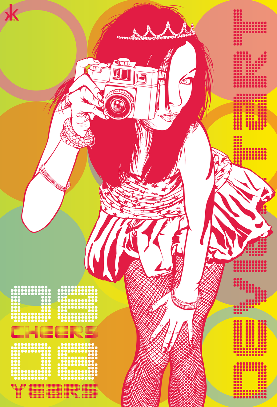
Project Inspire Journal Layout
by-nc-nd
kaotickell —
Project Inspire Journal Layout
by-nc-nd

Published: 2009-04-01 02:32:41 +0000 UTC; Views: 12031; Favourites: 47; Downloads: 64
Redirect to original
Description
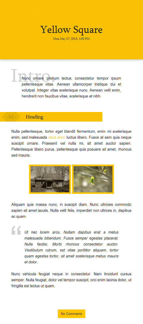
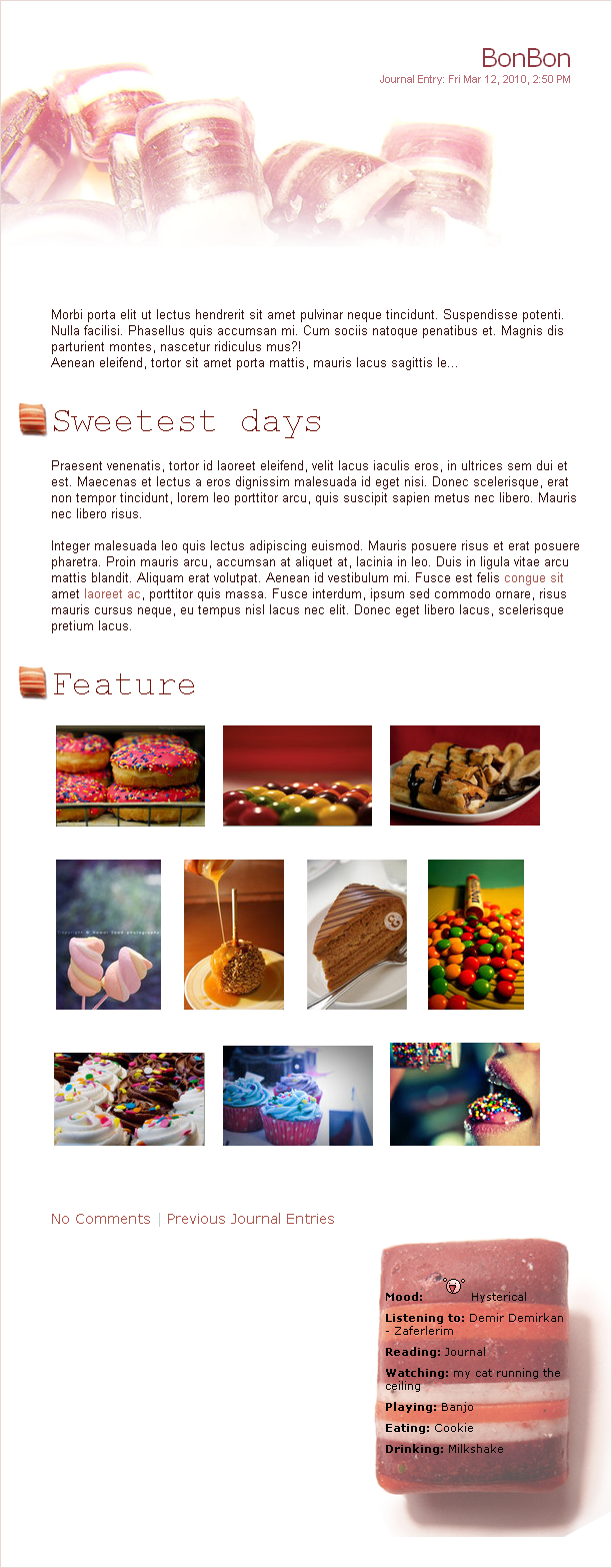
Here's the journal design, guys!Included in the zip file are written instructions as well as some basic instructions as an image - hopefully the combination of the two makes things easy to explain.

This design was alot of fun to make. And when I decided that I was going to put this up for everyone to use, it put an even bigger smile on my face.
")
If you choose to use this journal, send me a link - the aim of this at its simplest level is to feature people. But it can be expanded to be so much more if you want it to be!
I cannot wait to see how you guys use this.
If you're unsure of what you could do, have a look here
 [link]
 Technical Notes:
- I'm not 100% sure where this texture came from, but I think it was from dA somewhere - it's something I'm going to have to check
- The font used is called "Hand of Sean" and can be found at dafont.com
- Everything else has been created by me.
Related content


Comments: 112


n other words it says we have 99.9% of possibilities to loose,why would we even try it..?
👍: 0 ⏩: 0

Looks ok, but not enough for a DD (just my opinion)
👍: 0 ⏩: 3

FAQ #873: What do I do when I disapprove of a Daily Deviation feature?
Read it. Follow it.
👍: 0 ⏩: 1
n other words it says we have 99.9% of possibilities to loose,why would we even try it..?
👍: 0 ⏩: 1
You know what? I'm not even going to argue about this. I can already see it won't be worth my effort.
👍: 0 ⏩: 1
My point is why do you need to repeat your post like 999 times,i mean thats stupid,thats just why i answered all of yours too..
👍: 0 ⏩: 1
'cause they were 3 different people. I, on the other hand, am one person.
👍: 0 ⏩: 1
Well your point makes sense,but i still find it really stupid,and also why do you need to defend her,you must admit this isnt worth a DD,but anyway im not here to fight,newither to desmotivate the artist..
👍: 0 ⏩: 1
Why would I agree with that statement? This is truly worthy of a DD and no one has the right to say otherwise.
👍: 0 ⏩: 1
Then im sorry,but all my gallery would be worthy a DD then..
Also i have freedom to express what i think about this piece..
👍: 0 ⏩: 1
So basically, you're saying that you're jealous that this person got a DD and you haven't. And you have to take it out on someone instead of just hoping someone notices you. That's real mature of you. Really.
And no, you don't. Freedom of speech doesn't apply when you're badmouthing something someone worked hard on. It doesn't work like that so learn how to live in the real world before making such comments.
👍: 0 ⏩: 1
Im just saying that if a deviation like this has a DD then many many MANY deviations should have a DD,and no believe i do not design just to get the recognition,i design because i like it,if i then get recognition,well better..
I repeat,i can say whatever i want,if you dont like what i write then dont read,it cant be easiest..
But ok,i mean this DD is ok to what it wanted to transmit,BUT if this deviation was on the webinterfaces category it would never get a DD beleive me,maybe it got a DD because meaning or because she is helping other people giving it free or something,but as an interface is not worth a DD..
I hope you maybe get my point now,im not trying to insult the artist as i said,neither ,im just here giving my opinion,no because you like it it means everybody does..
Now have a good night,and i dont pretend to sound like a litle 5 years old kid,as i said just using my freedom of expression..
👍: 0 ⏩: 0

FAQ #873: What do I do when I disapprove of a Daily Deviation feature?
Read it. Follow it.
👍: 0 ⏩: 1
In other words it says we have 99.9% of possibilities to loose,why would we even try it..?
👍: 0 ⏩: 0

Same here,but theres no need to come complain to the artist page,he didnt take the decision..
👍: 0 ⏩: 0


i don't like it
but congrats for DD.
👍: 0 ⏩: 2

That's fair enough  (Smile)")
Thankyou.
👍: 0 ⏩: 0
If you're going to say that, make it constructive criticism.
👍: 0 ⏩: 1
Simple is not pretty.
Critique yourself and improve your work,
Best Regards
👍: 0 ⏩: 1
Dude. You obviously have no clue what constructive criticism means, therefore I'm going to link you to the faq you should've read before making such a comment.
FAQ #873: What do I do when I disapprove of a Daily Deviation feature?
👍: 0 ⏩: 1


Ah, gorgeous! When I get a subscription (someday...) I will definitely be using this!
Absolutely brilliant, great design and layout. Definitely deserves a DD. ^^ Congrats on that, by the way.
👍: 0 ⏩: 1

If I had a subscription I would definitely use this.
Lovely concept and design.

👍: 0 ⏩: 1


Pretty sweet design! It sure beats that blinding lime white color they chose to destroy our vision! Most excellent work and congratulations on the DD!
👍: 0 ⏩: 1


Nice color scheme! I like that font, too. It looks kinda like my handwriting.
👍: 0 ⏩: 1


Thanks Gracie
👍: 0 ⏩: 1
Hehe, yeah. I don't much like my handwriting, either. ")
👍: 0 ⏩: 0

Great, great, great! Love the colours!

👍: 0 ⏩: 1

wow *_* it's very bautiful! I love the color combination
👍: 0 ⏩: 1
| Next =>