HOME | DD
 karsten — Waytons.com Webshop Design

Published: 2010-04-20 03:17:42 +0000 UTC; Views: 10691; Favourites: 49; Downloads: 681
Redirect to original
Description
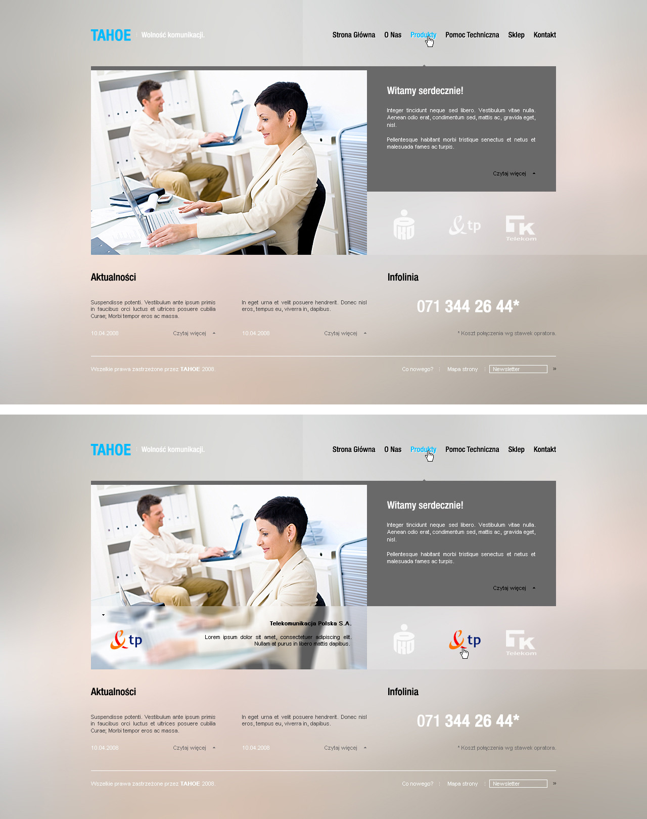
Complete branding and webdesign for the company Waytons.comWaytons offer e-commerce solutions and webshop templates for the e-commerce platform CubeCart.
The site is made in multiply languages (english and swedish).
Visit the live site at: Waytons.com
Related content


Comments: 13

Most of the feedback on deviantArt weights on the positive side, but I have a professional opinion about using no AA on copy text.
It's 2010 and I think it makes the designs look like shit.
For instance like this design...It would be so much better if there was some attention spent on the typography of the design.
You only see this kind of technique here on deviantArt.
👍: 0 ⏩: 0


 (Smile)")

Agree with what was said above. I like it for it's simpleness. The web shouldn't be too complicated.
👍: 0 ⏩: 0


Awesome and clean design, it support very well their logo style and color.
I love it.
++
👍: 0 ⏩: 0

input fields are a bit ugly, try adding a couple px of light gray inner glow. Other than that o/
👍: 0 ⏩: 0

I don't like it, it's so default-ish... but nice job
Tip
Add this to the main CSS:
input:focus{ outline: none; }
Why? Look at this: [link]
 (Wink)")
👍: 0 ⏩: 1

Hey man, thanks for the tip there, in what browser to you get that outline?
👍: 0 ⏩: 1

Nice work again my friend, good colors , clean easy to use layout structure, use of simple shapes works well in this too
👍: 0 ⏩: 1
thanks mate, always a hassle to design for with mutli multilingual sites
👍: 0 ⏩: 0