HOME | DD
 KazuAC — Ink Practice Exercise: Jim Lee's Batman and Robin
Published: 2012-08-06 22:06:51 +0000 UTC; Views: 8707; Favourites: 11; Downloads: 0
Redirect to original
Description
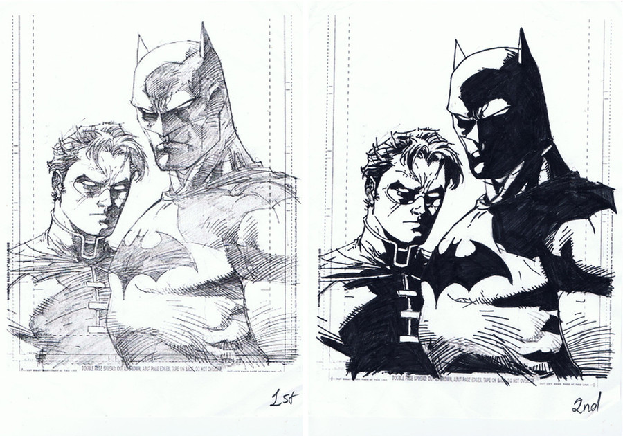
Jim Lee's pencil art of Batman and Robin.I do not own this art. Just wanna start practicing my inking skills.
Critiquing is welcome.
Inking tools:
Sharpies extra fine pen
Sharpies ultra fine pen
Pentel Sign pen
Related content


Comments: 6


In inking this piece, you missed some great opportunities to pick out some nice detail by filling in areas with solid black that Jim lee rendered for Scott to do some of his nice hatching and tech-grads.
Inking is learning about textures (discerning water from concrete, or tree bark), rendering depth with a variety of line weights. A pencil line--even from the best of artists, only carries so much variety. That has a a lot to do with the history of the medium where line rendering was easier to print for clarity. It also has a lot to do with deadlines and most pencilers not always having the time to render ever detail and attempt to imitate inks. Even when they do and simply blacken the pencils, there's a distinct difference. And then it's often left to the colorist to add depth. So when art goes to an inker, technically a finishing artist, to save time and add dimension that the pencil line did not, they often have to create textures only hinted at if the penciler roughed things out in a hurry. Deadlines will not always yield the tight, clean pencils we see when looking at the best of an artist in his portfolio. So you need to be able to draw...and you need to be fairly proficient at bringing those details and textures to life while inking.
Through time and practice, the inker learns to render with ink a variety of hard and soft lines, following the form of whatever shape, or texture, is presented. It takes confidence. So in practicing, don't be afraid to get your hands dirty, even make a mess to see what you learn from it. In the end, it becomes one part your own style over the penciler, one part being a good judge of what you think the penciler is aiming for, and finally...making the final product a good balance of light and dark space, easy to look at, while tickling the eye with interesting detail.
I've never had a penciler complain because I added detail to whatever was on the page, but they sure will complain if you omit lines they've busted their butts to draw. So over simplification, or filling in too many areas with a solid black where detail is rendered (Like Batman's ear, hints of cheekbone, highlights of cape folds going over B's shoulder etc.) will get you fired quicker than quick...if you get hired in the first place. We need to see these details if the penciler bothered to draw them--even if they don't seem to tightly rendered and perfectly clear as to how it all fits together. It's an inker's job to make sure it works on the finished page.
The good news here is that you didn't ruin the basic look of the drawing. A lot of would-be inkers will end up changing the style sometimes too much if it doesn't mesh with their own. However, your line weights are too similar for the most part. This is tracing, not rendering for depth. Tech-grad lines, for example, will often get thicker as the move further into a shaded area, giving a semblance of fading from light to dark. Look at some black and white art, study the variety of lines, notice how objects/people in the foreground will have meatier lines than those in the distance.
This might be more information than you're looking for. But if you're serious, it may be exactly what you're looking for.
Keep practicing and always follow your dreams!
👍: 0 ⏩: 0


Try using some india ink, and witeout. It'd improve this significantly!
👍: 0 ⏩: 1

Thanks for the advice! I'll do that.
")
👍: 0 ⏩: 0