HOME | DD
 Keiichisfuuma — Alone in the Revolution
Published: 2009-01-25 06:35:11 +0000 UTC; Views: 3269; Favourites: 28; Downloads: 11
Redirect to original
Description
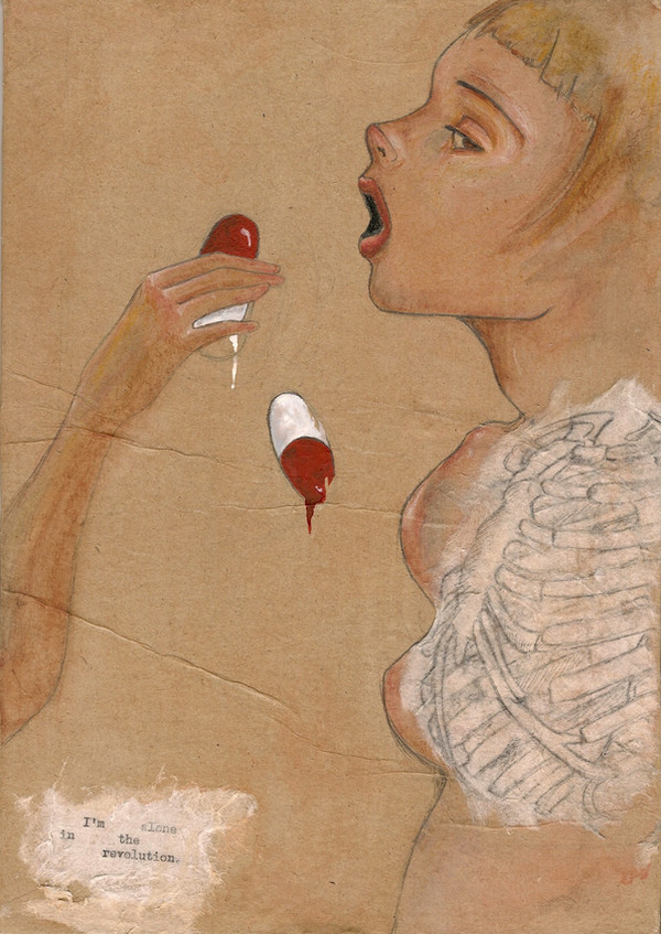
I think I am finished with this now. Didn't come out like I expected, but oh well.Oh man I love Audrey Kawasaki.
Watercolor on brown paper matted to wood. White rice paper, graphite.
Related content


Comments: 11

Absolutely beautiful ... its a wonderful rendering of the female form . I envy you
👍: 0 ⏩: 1

Thank you so much. There are some small things wrong with her face in this one, but, always learning!
👍: 0 ⏩: 0

I really like this but I think the alignment of the ribcage doesn't look correct. It's too high up. Anyway other than that I think this looks awesome.
👍: 0 ⏩: 0

I really love how the face is almost expressionless.
👍: 0 ⏩: 1
Thanks. I wanted there to be a little more expression, and after a lot of reviewing I am upset with how low her eye is, but Audrey Kawasaki (who's work this is based on) always draws her eyes really low, and the people end up looking like they have down syndrome. It is true to her style, but I really want to fix it. Anyway, sorry for the long reply! Haha. I guess I am thinking about it a lot. 
👍: 0 ⏩: 1
I like it the way it is, it sort of seems as if she is about to collapse. I personally can't see anything wrong with the eye XD. Long replies are better than short ones.
👍: 0 ⏩: 0

can i ask you what it 'means'? XD If not it's okay, I'll try to figure it out.. X3
I didn't like everything that Kawasaki made (LOL) but her style and technique is really amazing...
but I like this one a great deal! It's interesting and you did the skin color very well...
i think the melting pills are a bit too vibrant, but maybe that's the point of it! XD
👍: 0 ⏩: 1
Yea, I agree about the pills. In the end it still needs some work. I guess I wanted the girl and everything else to look really earthy and real, and the pills to look man made and kind of scary. The point of the painting is the dependency of people to medications, not people that really need it of course, but those that abuse it. Her face is supposed to look like she doesn't want to take them, but doesn't have a choice. They control her. That's why I put in the ribcage, to symbolize death a little in the piece. I don't think I made my point very apparent. But thanks! In the end I am very happy with it, even if the colors kept soaking into the paper.
👍: 0 ⏩: 1
oh wow! that's actually a really interesting meaning and it totally makes sense now, and the vibrancy of the pills makes sense too.
awesome!
👍: 0 ⏩: 0

 (Smile)")
Thanks! I had never really put much blue in skin before, so I tried it out and now I love it.
👍: 0 ⏩: 0