HOME | DD
 kennhyn — CIMB Annual Report 2005
Published: 2006-02-23 07:26:30 +0000 UTC; Views: 13423; Favourites: 35; Downloads: 839
Redirect to original
Description
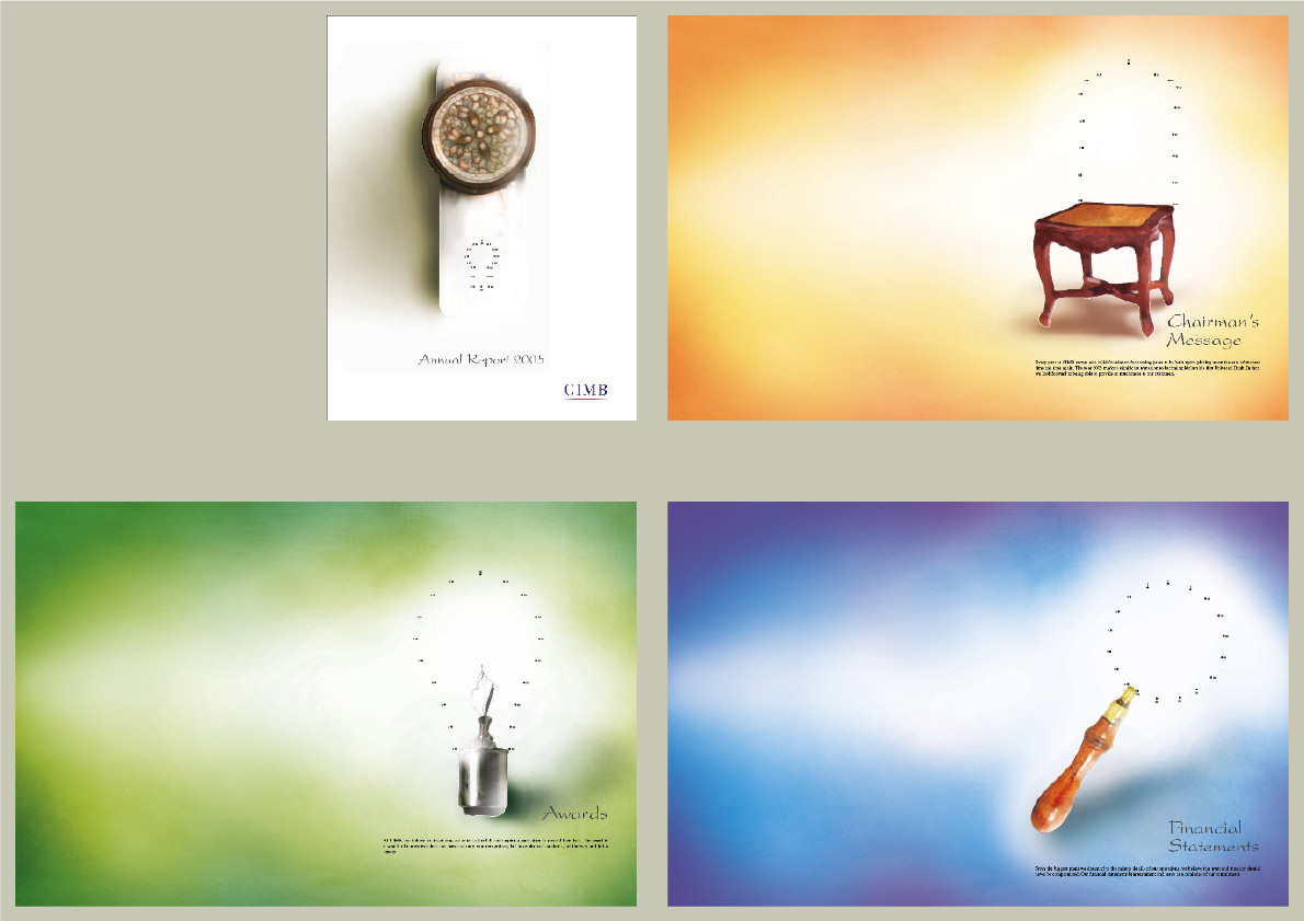
Using 2 simple technic to execute, joining dots and water colour. The idea is to show the joining and make it something even better. Using watercolour to get the feel of corporate.Related content


Comments: 21


 (Smile)")


I try to give water colour effect with my photoshop....haha
👍: 0 ⏩: 0

")


Beautiful layout.
Extremely clean.
I only feel not to understand the concept, therefore I do not know what about is the ad.
👍: 0 ⏩: 1
is not an ad....is a annual report cover and divider. By the way, they just choose. My collegue got the pitch. Both total contrast idea, he go for the bold clean energetic, while I go for corporate clean and old fashion look....haha.
👍: 0 ⏩: 1
It's a good work... and I like the look that you adopted.
👍: 0 ⏩: 1
 (Wink)")
