HOME | DD
 kerembeyit — The Silk Map Cover
Published: 2014-04-25 16:32:28 +0000 UTC; Views: 44980; Favourites: 1909; Downloads: 811
Redirect to original
Description
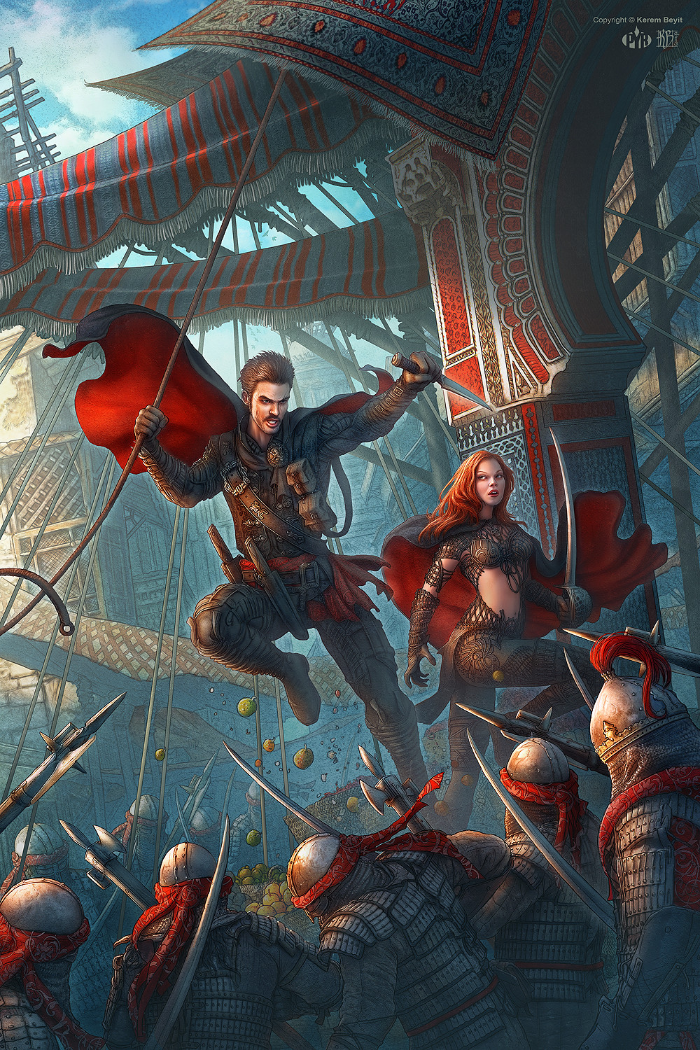
Cover art for the "The Silk Map: A Gaunt and Bone Novel"www.amazon.com/The-Silk-Map-Ga… by Chris Willrich.
This is the personal version.
--
Photoshop CS4
(Approx. 50 Hours)
Note: I had to delete the artwork I submitted yesterday.
It turns out the tcg project has not been announced yet.
Sorry about that
 (Smile)")
Related content


Comments: 70

Seconded.
Also bugs. Mosquitoes, flies, what have you. All up on that belly.
👍: 0 ⏩: 1

Mmmmmh. What a nice sensation that must be on her tummy. And what a nice view for anyone to behold.
👍: 0 ⏩: 1
and this is why people wore ankle to neck clothing.
👍: 0 ⏩: 0

Yeah, I totally feel petty for this 'trend'... It's retarded.
👍: 0 ⏩: 1
Let's just not begin a discussion of how women are objectified in contemporary media... There wouldn't be an end to it. *quietly slips out of the window*
👍: 0 ⏩: 1
Sure, let's not. It's been there for the past 10 years I've been around here.
👍: 0 ⏩: 0


Is the entire book written in present tense? That's unusual O_o
Great illustration!
")
👍: 0 ⏩: 0


Lighting is great, and I love your use of colour.
👍: 0 ⏩: 0


Wow... took a while to take into all the details! Love the rich reds against the muted blues. Amazing work!
Argh rats, now I have to wait to see the other one! ")
👍: 0 ⏩: 0

Not as good as your previous work I'll have to say. The colors seem odd. The contrast is attractive, but there seems to be a lack of variance. It's like the image was made as indexed (256 colors).
Also the female character looks a bit like she has down syndrome, it's odd that she's looking up while there's a ton of soldiers below her.
👍: 0 ⏩: 0


love the lighting and look. really nicely done
👍: 0 ⏩: 0
<= Prev |