HOME | DD
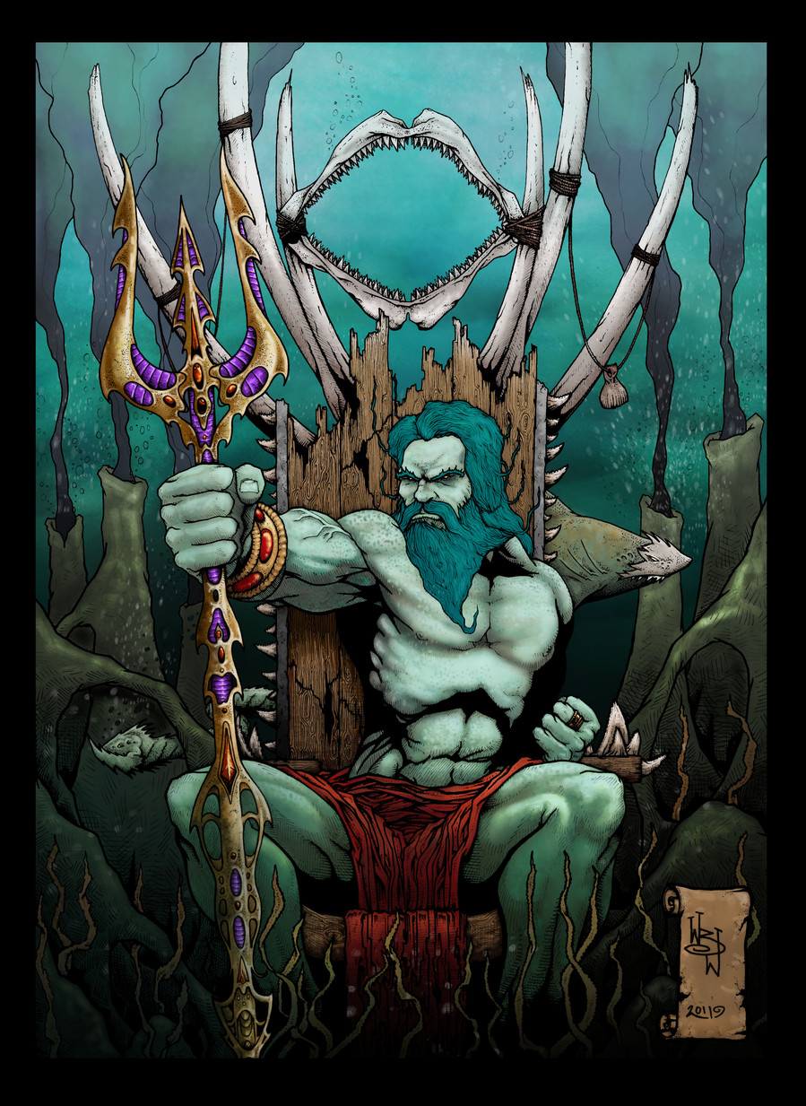
 KernoWarrior — King of the deep coloured
Published: 2011-07-26 20:05:46 +0000 UTC; Views: 596; Favourites: 24; Downloads: 13
Redirect to original
Description
Been trying to write and draw my own comic but have hit a wall, so thought i'd try colouring this piece..... practice, practice, PRACTICE. Any thoughts or tips muchly appreciated, good or bad.Related content


Comments: 7

I think the reds aren't working because they're distracting the eye away from the intended focal point. Maybe if his eyes were a bright glowy red that would help bring your attention back to his face. Maybe a red bejeweled crown too?? I love how you create your own textures within your linework though, nice job
👍: 0 ⏩: 1

Thanks for the thoughts my friend, Have been thinking about changing the reds of his pants cloth thing, and the colour of his staff (in places) but wasnt sure it needed it so thank you sir for the push i needed, will note you when its done. Thanks again bud!!!
👍: 0 ⏩: 1
No prob ")

👍: 0 ⏩: 1
Thanks man, appreciated!!!! would love your feedback on my recent coloured pieces too if you have your time, been practicing on some more old pieces
👍: 0 ⏩: 0

well you know already that i LOVE the B&W to this piece...the colours are nice too but i'm not feeling the 'purple' in the staff 
👍: 0 ⏩: 1
Thanks fella, going to keep trying till you love the coloured one too!!!! i have to admit that i agree with you, the purple on the staff looked good at the begining of the piece, when it was only the staff i coloured and i was quite proud of it, so even when it was complete i was too stubborn to change it!!!
👍: 0 ⏩: 1
yeah i can see how by itself it would have looked quite nice.
i think the colour palette for this needs to be quite dark & muted in non-focal areas with a few dark but vibrant areas. thus adding to the "i'm at the bottom of the ocean, but i'm the KING" feeling.
that far down red is essentially invisible. work out a palette, put all of the colours next to each other & see if they 'play well' with each other.
Texture the 'black smokers' in the background, they'll help direct the viewers attention & set the ominous mood.

👍: 0 ⏩: 0