HOME | DD
 KernoWarrior — The Iron Knight Final

Published: 2010-12-18 22:16:20 +0000 UTC; Views: 7184; Favourites: 182; Downloads: 393
Redirect to original
Description
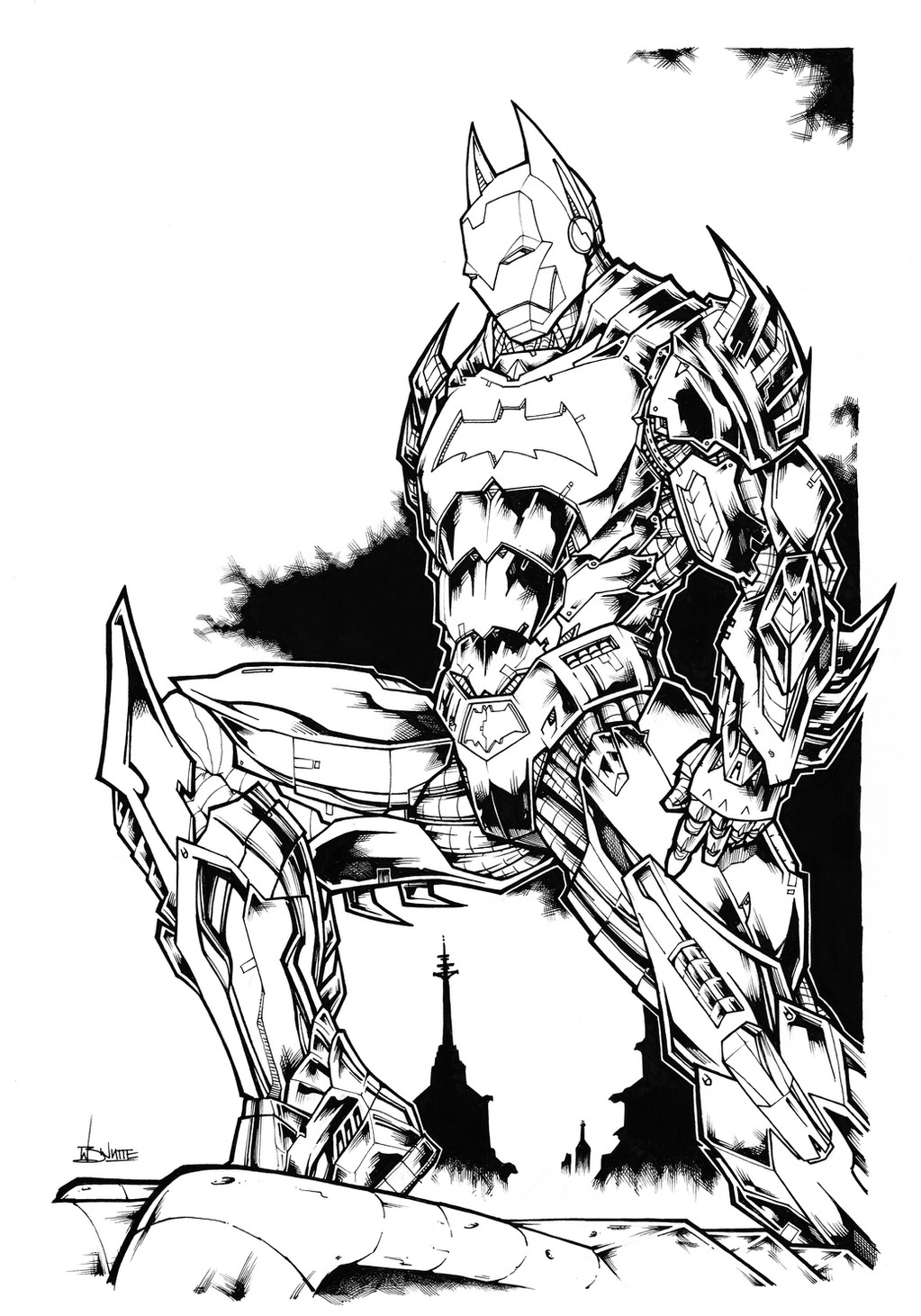
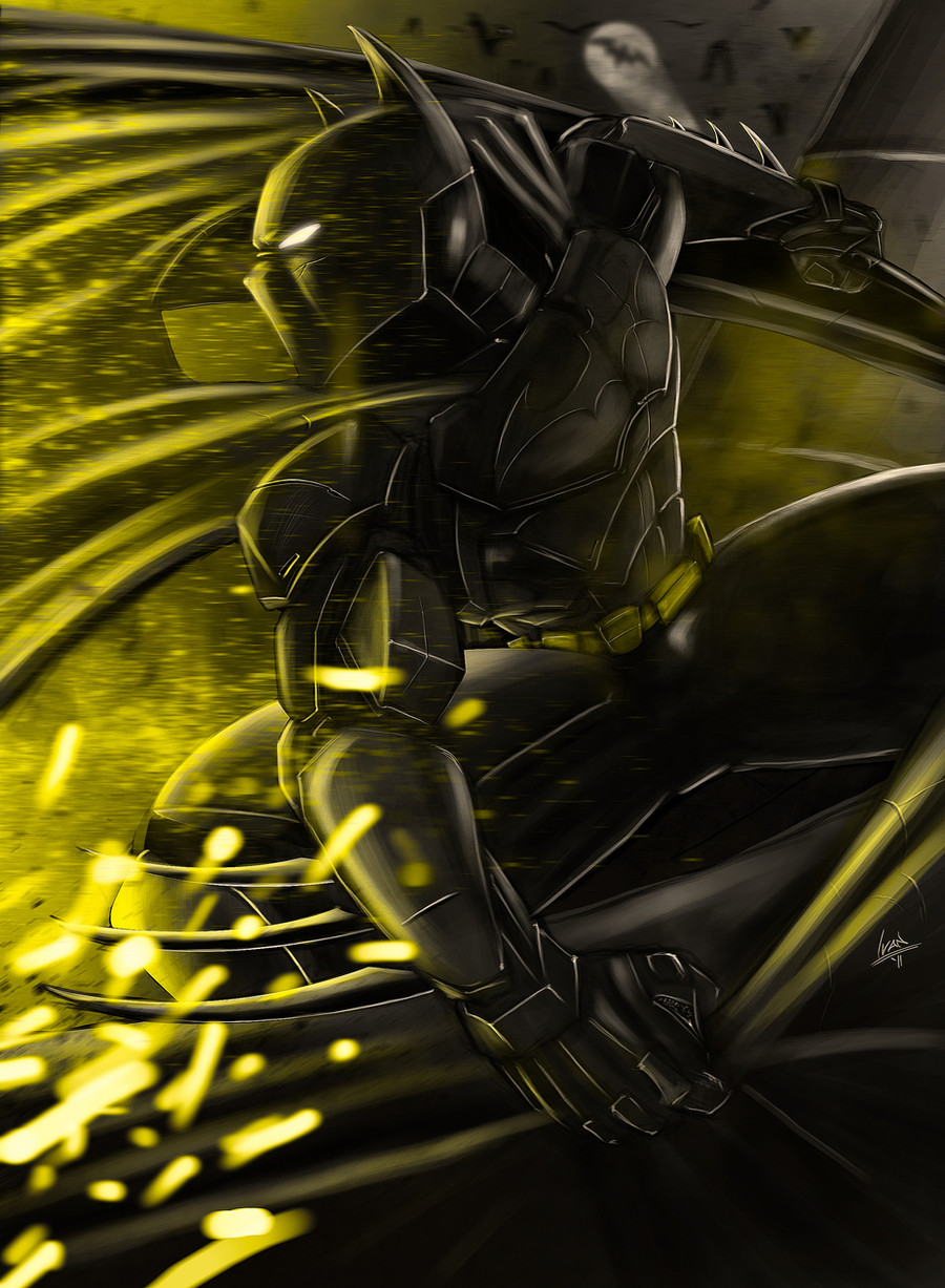
The Iron Knight.This is my submission into the Amalgram Contest for the Marvel and DC United group. I took the Iron Man film armour and redesigned it as if Bruce Wayne/Batman was the original owner of the suit. I wanted to use the 1989 film colour scheme, gold on black, which also incorporated the gold of Iron Man's suit, with this in mind i took the red Bat logo from Batman Beyond to use as the Iron Knight's emblem and used red for the repulser beams and eye glass, using the red to symbolise the red from Stark's suit. The gold half face piece is to symbolise Batman's usual cowl.
Really enjoyed doing this piece for the contest as i love both characters and have never done an Ironman piece.
Lines- Black pens
Colours- Markers and paint pens
Related content


Comments: 28

 (Smile)")


it's been a while, whatsup man......
This piece is so freakin bad@$$!
👍: 0 ⏩: 0

Man, oh, man! Great concept and decent artwork on top of it. Those two are definitely the mirror images of each other (rich playboys turned heroes), although Stark is a little more narcissistic and arrogant than Wayne. This would DEFINITELY be a character I'd want to read. Great job!
👍: 0 ⏩: 0


HOnestly bro, this is a pretty sick piece the only thing i'd say is maybe make it a little more shiny lol like reflective b/c iron reflects a lot. I would love to see a background on this though man it is sick plus the lines are great cool design man props keep at it dude you got skill. I'd just say keep practice man look at references and stuff this is good though man.
👍: 0 ⏩: 0


you've inspired me to make my own. Check it out please!
👍: 0 ⏩: 0
Although I think blue insignia and eyes would be better, and more thrust like, for lack of a better word, hand stabilazers, I think this is amazing.
👍: 0 ⏩: 0
that's pretty slick!
very much like the mainly black armor. i would have gone with red for the 'accents' myself, but that's personal taste.
coloring is fantastic! esp the metalic shine, and the repulsor effect.
also looks like you modded the visor to open without interfearing with the 'ears?'
 (Wink)")
👍: 0 ⏩: 0


Hey man, Thanks very much!! got a bit stressy trying to decided what colour scheme to go forut am happy with it now.
Many thanks again!!
👍: 0 ⏩: 0
Nice one Veas, thanks!! Will try to, have to see what the judges think!!
You not posted anything for a while, need to see some more of your work!!!
👍: 0 ⏩: 1

Hey man don't be cruel! I posted this nice eskimoo
My university is kiiling me. Too much work!
I'm working on an animation for the moment. Hope for the best
Oh, I always wanted to ask. What is that thing on your anatar???
really really curious

👍: 0 ⏩: 1
alright there fella, i get so many watch notices that they sometimes get a bit jumbled up and other times theres so many i just get bored looking at all the new stuff, really liked your last three though, geting some good atmosphere and techniques going. Glad to hear uni's got you working hard, never went myself(wish i did though) so it's nice to see someone using the oppurtunity well, good luck on the animation, have heard it cam be a nightmare!!!
My avatar's from a music poster i used for a mates band, it's of a fire done in the rasta colours.... cant quite get to grips with downsizing image res so had to make do.
Got a question for you to man, where aboyts in Greece you from, my Dad lives on Kos and have been all over your part, well mainly the islands.
👍: 0 ⏩: 1
Well I'm currently in an island too!
I'm studying in Syros. Your dad might know of it. Great place, you should pay a visit some day
")
👍: 0 ⏩: 0

Thanks, like your joker piece too!!
👍: 0 ⏩: 0