HOME | DD
 Kevin — Pixel Vineyard - Cataclysm
Published: 2002-06-16 01:18:09 +0000 UTC; Views: 2780; Favourites: 15; Downloads: 179
Redirect to original
Description
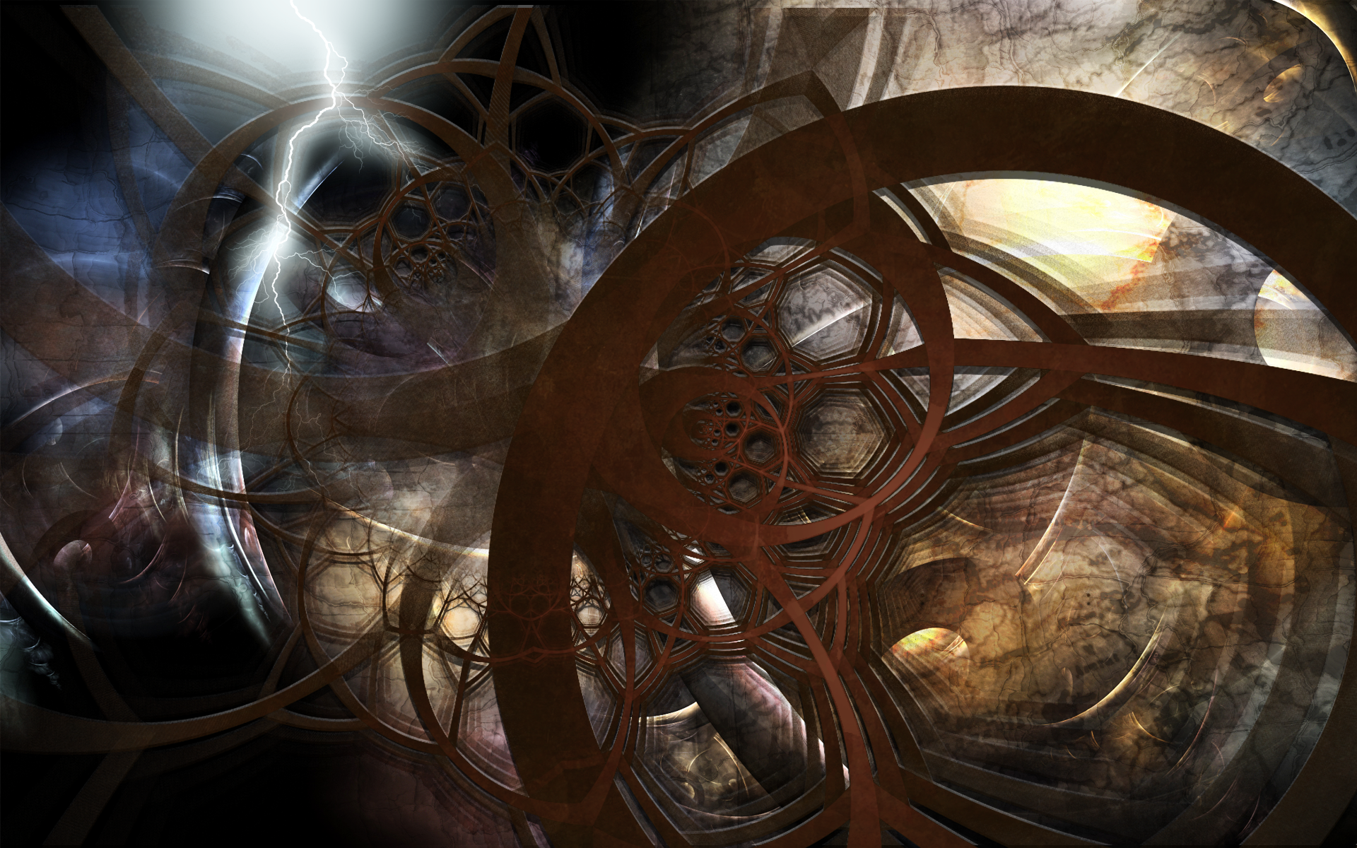
This is my 2nd submition at [link] A new style I just recently came up with. The image is contructed by a bunch of small models/renders then peiced together with photoshop. This is one of my best peices in a while, imo. Enjoy!FULL VIEW PLEASE!
Related content


Comments: 24

nice work...taking a render and piecing it together in ps...thats my trick  (Wink)")
👍: 0 ⏩: 0

oooh
im loving this man, its soo smooth and the colour combo is awesome
👍: 0 ⏩: 0


Nice! I like the cut off tube effect thingie howd u do that? well gj! real GJ!
👍: 0 ⏩: 0


i like !!! very different and is definately *drooling* eye candy
👍: 0 ⏩: 0

The green in this is amazing. The 3d forms are great aswell. Overall it's awesome
👍: 0 ⏩: 0


I think that the grid should be a little more transparent but other then that I like it, the colors are rather original and I like the concept
👍: 0 ⏩: 0


The color is awsome...thanks for caring...my grandma ment alot to me +fav
👍: 0 ⏩: 0

interesting 3d, i think you should lighten up on the grid a bit though. Very unusual brightness but it looks fairly good. Focus is okay but it could definatly be better.
👍: 0 ⏩: 0

Very nice work man! I saw this on DC, and immediately fell in love with it. Its similar to that other piece that I didnt like, but I really like this one, it just seems to have more..Im not sure how to describe what I mean ( ) and the colors are so perfect. Great job on everything
, cant wait to see more work with this, or any other style from you.
👍: 0 ⏩: 0


wtf is the matter with the icons here? I like the ones at msn/aim more...
👍: 0 ⏩: 0
It looks similar to the other one, but I like this better, it looks a bit more detailed. Very funky. Especially the logo container thingie lol
👍: 0 ⏩: 0

Mmmmm... Trippy green vine thingies (?)
Very nice. Do some more!
+++
Snake's Sharkskin Demongloves of the Wolf
👍: 0 ⏩: 0


Muwakka weffin napoopins skunkiff nucka poofnurg. That's Swahili for " I like this. It looks like beautiful stuff. I fav it." I swear it does.... not really...
yea but +fav
👍: 0 ⏩: 0

Rather busy but I like the brilliant green. The shapes look as if they are melting.
👍: 0 ⏩: 0