HOME | DD
 kid-a — Hellbound

Published: 2002-04-09 01:47:24 +0000 UTC; Views: 828; Favourites: 3; Downloads: 73
Redirect to original
Description
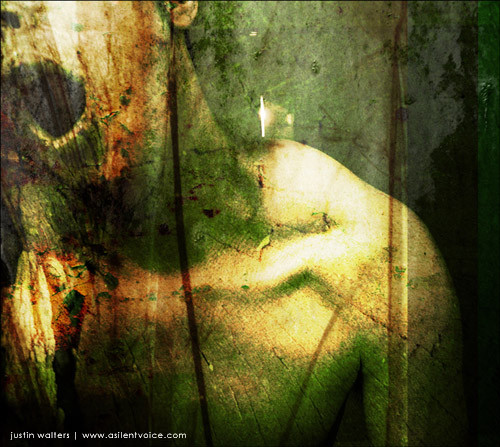
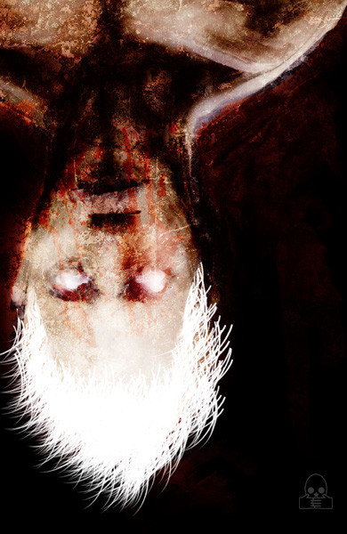
"Going down, the last acts seenCurtain call, begin by wing
Self-appointed abuse king
Hellbound is my belief"
This isn't the piece I was alluding to in my journal, although I just felt the urge to finish this (I think I started it back in December...) Anyway, feedback is appreciated.
Related content


Comments: 32

i love the style of your art!
visit:
[link]
comments and votes are welcome!
👍: 0 ⏩: 0


Ahh yes, kid-a makes another great piece... BIG surprise.
Well done,man.
👍: 0 ⏩: 0

nice work... don't care for text in images... but oh well... that's just me
👍: 0 ⏩: 0

Great great great!!!!!!!!!
I love your arts related to music.
I'm listening to Jerry Cantrell right now.
Oh man, that's awesome the way you can materialize the feel of the music.
This is awesome. You rock!
-----
[ all realism without imagination is mere reductionism ]
[ s . 2 . r ]
👍: 0 ⏩: 0

Fantastic. I love the feeling from it. And the text fits perfectly
-----
- like the name says -
👍: 0 ⏩: 0

wonderful...you really feel the bound energy and frustration/anger. gorgeous textures, composition...*thumbs up*
~jane
👍: 0 ⏩: 0

you know before i read thru all the comments i was wanting to say it looked like a book cover. like something youd see on one of those books you dont put down until you very last word.. you know the kind that draw you in and scare you to death. and thats what i *love* about this piece.
-----
::they cannot cover the scars in my eyes::
👍: 0 ⏩: 0


great stuff... love your style... dark and scary... kinda reminds me of Diablo II: LOD (cover)
-----
Even God would stop the world every now and then to fix his mistakes
👍: 0 ⏩: 0


Good call sk504... To be honest, while designing it, I was in the mode of 'design a book cover' or something of that nature. Glad it struck you that way
-----
Kid A
https://kid-a.deviantart.com/gallery - gallery
http://www.abnormis.com - abnormis.com
graphicslave.net - coming soon
👍: 0 ⏩: 0

I think the typo serves as a kind of determent making the piece break up a bit and the lines accentuate this by bringing your eyes down toward them. This is a very good design scheme if the words were lost it would not be as effective and possibly lose some of its sort of cover page quality.
-----
SK504(Diturbed disgusted and hot)
👍: 0 ⏩: 0

Sooooooo great! Awesome work, i like it.
-----
...demons to some, angels to others...
👍: 0 ⏩: 0

nice! at the same time scary
don't know why but it gave me thát feeling...
although very nice work. Maybe make the typo a little bit transparent...hmm....yes...as the lines maybe...
//yaaaaz
👍: 0 ⏩: 0
I actually messed around with the opacity of the text and the lines quite a bit before I finally uploaded it. When the text wasn't as bold, the image loses a lot of its focus... While I want focus on the face/hand, I wanted it to flow more as a piece than just focusing on the face/hand. As for what it is, I try to leave that to the imagination... Look at it hard and decide for yourself
And to answer your question fetology, I work from photos of myself. I had access to a digital camera for about 3 days and I just took a lot of pictures of myself... When I can get ahold of another camera I'll try and change the subject matter Even though I'm a damn fine model
Thanks for all the feedback, it's very appreciated
-----
Kid A
https://kid-a.deviantart.com/gallery - gallery
http://www.abnormis.com - abnormis.com
graphicslave.net - coming soon
👍: 0 ⏩: 0

nice job, but the text is a little distracting and takes away from the rest of the piece. maybe tone down the opacity of it or something...and i dont like the lines on the side either but they aren't a big deal...nice job though. what is it?
👍: 0 ⏩: 0


Whoa, freaky...
-----
[ s p h i n x . t e c h ] | [ innocent.opia te ]
-----
...if your never remembered,
you never existed...
-----
Please comment and vote in return.
-----
Thank you.
-----
👍: 0 ⏩: 0

interesting........
-----
agoni alias mercyful http://mercyful.da.ru
👍: 0 ⏩: 0

i love those colors u use.. they make your pics
seem like... i dont know how to say it.. as usual
i can only say "WOW"
-----
. darkmind
👍: 0 ⏩: 0


I'm listening to a pperfect cirlce atm (3 libras to be exact) and this fits perfectly, thank you
grat work
👍: 0 ⏩: 0


Wonderful colors and texture. Dark. I love it.
-----
Two roads diverged in a wood, and I-
I took the one less traveled by,
And that has made all the difference.
👍: 0 ⏩: 0

Eek. Those straps are very Hannibal Lector.
Also, I agree with the person who said you need to blend the typo a bit better. I'd just say turn the opacity down about 20%...
Other than that, great piece as usual.
👍: 0 ⏩: 0

as always a great job.
-----
* * * * * * * * * *
: : K3RN3L P4N!C : :
. . Made in Chile . .
👍: 0 ⏩: 0

aweosme, as usual.
one question for you, do you take source pictures yourself, (like of the people) or is freehand??
-----
Do you have any tuna thats NOT dolphin safe??
👍: 0 ⏩: 0

mmmm.....yummy hellish red! love the textures and colors thru out- fantastic work
-----
If man were to be crossed with the cat, it would greatly improve man, but deteriorate the cat~
-Mark Twain
👍: 0 ⏩: 0

It's great... maybe only needs a bit more work to blend the typo and the vertical lines with rest... but It's a great piece!
-----
- the narrowest path is always the holliest -
👍: 0 ⏩: 0

Pretty sweet, the thumbnail looks like a face ... but then its not. Nice.
-----
Kezabelle.
👍: 0 ⏩: 0

ah, neato stairthingie...and prettylicious colourchoice...and font...just genral awesomeness to be plain and simple
-----
oh bother
👍: 0 ⏩: 0