HOME | DD
 KikButtPanda — Color Comic Practice

Published: 2007-01-12 23:29:01 +0000 UTC; Views: 184; Favourites: 0; Downloads: 0
Redirect to original
Description
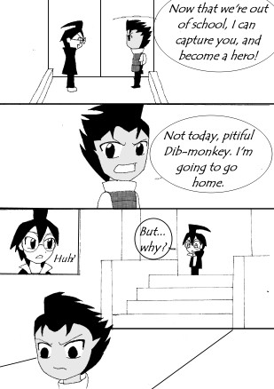
This is my failed attempt at producing a color comic. I've been so inspired by Earthsong and by Inverloche, I decided I would try one. I need to learn to use my layers better.As you can see, both characters are cell shaded. I'm new at this... I need to practice that more.
Also, I did both panels differently. The first with constricting lines, and done quite poorly, and the second with a million layers and textures and stuff but it still looks bad to me....real bad.
Anyone know how to make my color comics look better?
Related content


Comments: 6

I agree, it's a good start, especially with the cel shading (tee hee I like the alien dude). The only thing is that the characters are in the same plane as the background. You might need to add in more depth to your backgrounds to make it more 3 dimensional.
To do this maybe make the background lines thinner and add in texture to the rocks, trees, and cliff. What I mean by texture is to draw it in or apply some cel shading to give it more dimension. Also use muted colors for the background. For example here [link] notice that the colors are subdued, so that the attention is directed to the main character.
For the grass, I wouldn't use the grass tool since it doesn't look nice constricted (especially on the top panel). I mean it gives it texture, but looks out of place. I would just put in a flat color and add in a gradient or cel shade/highlight. Also, you can add in a grain texture (or any texture that looks like dust) and decrease the opacity. Here's an example (first two panels) [link] .
As for the cloud filter, I'd avoid it for making instant clouds. I used to use it myself, but I realized it doesn't look natural. I'd use a cloud brush and stick a few in.
I hope that helps some.
👍: 0 ⏩: 1

Actually that helps a whole lot! You're always there for my comic help, huh? lol. Thanks, i really appreciate it.
I was thinking of doing backgrounds like seraph-inn.com, but i'm not sure how they get their perfect paintingness from it. I've been directed to use corel painter or openCanvas, but im' not sure if i can do it in PS anyway. I don't think i'm gonna cell-shade cuz i'm horrible at it, lol.
👍: 0 ⏩: 1
Yeah, she uses a lot of long and short strokes (especially with the trees). You can do it in photoshop, you just have to select the right brush to get the effect (most likely watercolor or a wet brush). Painter and openCanvas are probably the better choices, though. However, those programs are best used with a tablet (do you have a tablet?). Anyways, I'd look up tutorials for painting techniques and practice practice, practice!!  (Smile)")
👍: 0 ⏩: 1
I have a tablet!! I'm just really bad at it. and i don't know how to set the sensitivity thing so that i can press harder or lighter to make different strokes.
thanx!
👍: 0 ⏩: 0

heh... i didn't meet my expectations, tho..
👍: 0 ⏩: 0