HOME | DD
 kikoeart — B and B Sci Fi two versions
#beautyandthebeast #bst #fantasy #mech #nature #open #ose #robot #romance #scifi #tag #wip #workinprogress #brushsaucetheatre #editorastronaut
Published: 2017-06-21 13:39:33 +0000 UTC; Views: 457; Favourites: 17; Downloads: 0
Redirect to original
Description
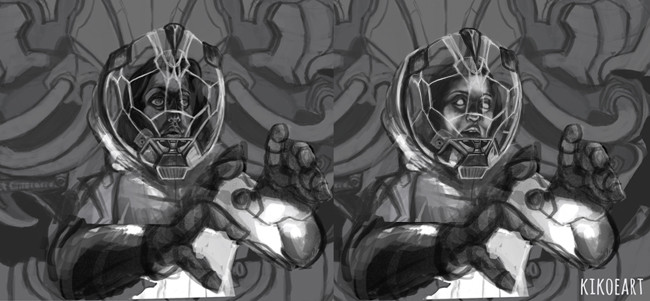
Please let me know which you like best and why") ONLY FACES
ONLY FACESBeauty and the beast sci fi edition...Any feedback is welcome as always!
RedBubble Store
Zazzle Store
Website
YouTube
ArtStation
EMAIL: kikoeart@gmail.com
Related content


Comments: 18

I absolutely love the one on the right hand side! These are awesome! Oops forgot the why: I think because of the glow on the characters face, it tells more of a story. It also matches with the glow that's on the chest and hands and it really gets me wanting to know what is going on! Great story telling in my opinion. Whereas the first one the expression is more studious, like they are working on repairing something. Very focused.
👍: 0 ⏩: 1

Thanks so much for the detailed feedback! there is a finished version now, I did use the one you liked
👍: 0 ⏩: 1
I saw the finished version today! So awesome!!! Love your art <3
👍: 0 ⏩: 1

I have to say, I really like the one on the right hand.
I think the lighting effects show the face much better. It also makes the face light up with the light source that lit up the rest of the picture. Besides, the face looks just haunting that way. So this one has my vote!

👍: 0 ⏩: 1
I agree with you, thanks!
👍: 0 ⏩: 1
You are more than welcome!
Looking forward to seeing how it will turn out!  (Smile)")
👍: 0 ⏩: 1


Second! You can see the face better and I really like the lighting :3
👍: 0 ⏩: 1

Yeah second one. The second one is better lit and you are more drawn to the characters face. The first one feels like the focus is the hands due to the high contrast.
👍: 0 ⏩: 1
I'll use that one! I see what you mean!
👍: 0 ⏩: 0

I love the second more - the character looks more zonked lol. It seems to fit the suit better, to me at least!
👍: 0 ⏩: 1
Thanks! I will continue with that one then
👍: 0 ⏩: 1