HOME | DD
 killjoydesign — Mint.

Published: 2004-07-02 21:47:00 +0000 UTC; Views: 2396; Favourites: 20; Downloads: 688
Redirect to original
Description
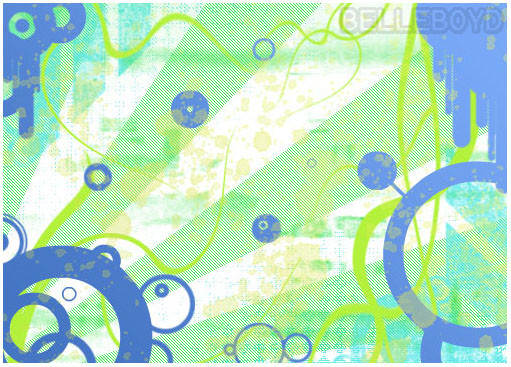
Mint. (c) 2004 Alexander Dennis / KJDSN++.This is a flyer I did for a friend's house monthly. This is my personal version (not the one that ultimately will go to print).
Illustrator / Photoshop.
Related content


Comments: 32


mood=fresh and trendy the colours are bright.. mint=fresh heheh
 (Wink)")
👍: 0 ⏩: 0


really nice work. very clean. great colors going on too!
👍: 0 ⏩: 0

Woah! Very nice work. The details, the colors, the reflections, the style, the creativity all are just wow! Great job. +fav!
👍: 0 ⏩: 0

this is just beautiful!! the colors all reflect each other so nicely, highly creative and stunned me when i saw it in fullview
how about making this a wallpaper?
 (Smile)")
👍: 0 ⏩: 0

very fresh peice here, one of the few i actually look at on my devwatch hah.
👍: 0 ⏩: 0

My favorite part of this amazing deviation are the mint green leave flame eyelash things.....They're awesome.
Very good work on all accounts. Another really nice thing is the balance of color that you've used.
👍: 0 ⏩: 0


FUCK.......that is badass! Completely amazing color and design......just everthing!

👍: 0 ⏩: 0

the logo is a bit of a bite isnt it? (bite/biting = copying/reproducing someone elses idea/style)
[link]
I like the rest of it alot tho. nice work.
👍: 0 ⏩: 1

ha. never seen that one before. the promoters came up with the name mint and i just riffed off of it. seems that putting a leaf in there would be the obvious idea.
but the logo is definitely the part of the flyer i'm least proud of anyway.
👍: 0 ⏩: 0

This is great. Love the stylistic eyes and everything. Great work.
👍: 0 ⏩: 0

")

the font on the smaller text is called Asenine. the logo is a custom creation, however.
👍: 0 ⏩: 0


the design is freakin' awesome man. I love the colours and the eyes. and the green. man. the typo too. it's just so FRESH. like mint. FRESH. MINT. GOOD.
👍: 0 ⏩: 0


that is cool stuff. done a great job on getting the 'cool-mint' feel
👍: 0 ⏩: 0

Beautiful type-work, man. If this isn't the one getting printed, what's the other one look like? Because, this one right here is quite good.

👍: 0 ⏩: 1
it looks far worse, actually. they made me remove the sad mac, the print-toned computer, change the color scheme to all green, and crop the borders. bah!
👍: 0 ⏩: 1

thats a pure shame! this ones wicked
👍: 0 ⏩: 0


I also plan on featuring it in my journal with your approval
👍: 0 ⏩: 1
sure, no prob. glad you dig it
👍: 0 ⏩: 0
Very cool man, I'm rather taken back by it
I don't eve know what to say... good job
👍: 0 ⏩: 0