HOME | DD
 kinkei — ..

Published: 2008-05-30 13:06:41 +0000 UTC; Views: 8574; Favourites: 355; Downloads: 0
Redirect to original
Description
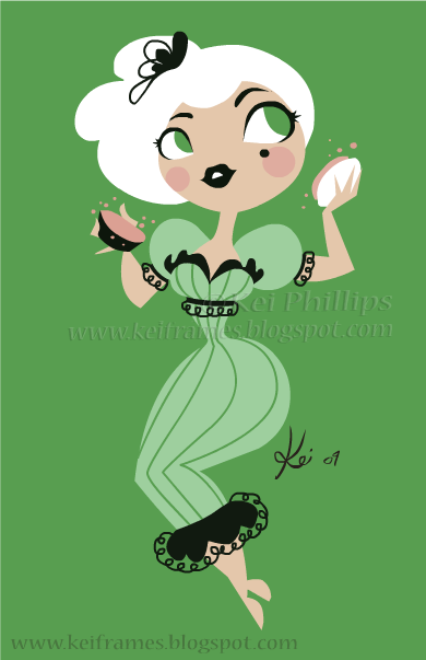
i needed a new id and i liked my last deviation so i based it on that. (Smile)")
Related content


Comments: 69


I've always loved these pictures of yours, particularly this one.
The composition is clean and fluid, and I love how you used those implied lines, distinguishing the hair from the torso. That, or maybe it's the body and face composed of negative space. Not sure which.
I've also found the eyelashes interesting, like a signature feature in your work. Reminds me of some beautiful, exotic fish from the ponds and gardens of Japan, or something. Not sure how to put it metaphorically. But it's a feature I've always found intriguing and distinguishable.
Keep up the sweet-awesome work, Kei!
👍: 0 ⏩: 1

why thank you for such a wonderful and sweet compliment. I really appreciate it. 

👍: 0 ⏩: 1
Oh, of course! It's a wonderful piece, here!
Hmmm... if there's only one downside to this ID, it's that it makes me thirsty XD No, seriously; the soothing illustration and the liquidy, fluid style; along with the bright, cool blues and hues remind me of the water and everything else. It's soooo refreshing. And easy on the eyes, since it's a cool color.
Love it, grrl.
👍: 0 ⏩: 1


Very pretty! I love the brushwork. ")
👍: 0 ⏩: 1


LS: I like the background. Made with watercolors no? Great work!
👍: 0 ⏩: 0

i see someone has been taking influences from the oriental arts :-p
👍: 0 ⏩: 0

Love the artwork, but the font really bugs me. XP It's one of those ones which always gets used but rarely gets used *well*. It's not too bad here (Not as bad as comic sans on a Bhuddist temple -_-; ), but IMHO something else would be more aesthetically pleasing. (What can I say - I'm a font nerd...)
Regardless, it's still gorgeous, and I still envy your amazing art skills.
")
👍: 0 ⏩: 0

you should do a portrait of me.
although - i must warn you i look like a dirtbag
👍: 0 ⏩: 0

I love this as an ID! And the background is so, so pretty! And of course I love the girl, so simple and elegant.
👍: 0 ⏩: 0


love the background, it reminds me of spilling my tea all over my work and leaving it on my images wich is what i do lol the colour works great i love those colours!
👍: 0 ⏩: 0


 (Wink)")


Cool! It looks really sophisticated! I really like it
👍: 0 ⏩: 0

That is an awesome Id. I really like the feel that the watercolory-ink splattery background adds. (Yes I like to make words into adjectives...)
You have an awesome sense of color and layout.
👍: 0 ⏩: 0


Wow, that is so damn stylish.

👍: 0 ⏩: 0

I like the different watercolor splashes in the background 
👍: 0 ⏩: 0


| Next =>