HOME | DD
 kiraposhi — P U N I
#character #oc #original #puni #originalcharacter #puniuu
Published: 2015-10-28 23:57:28 +0000 UTC; Views: 3706; Favourites: 348; Downloads: 28
Redirect to original
Description
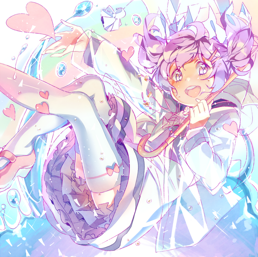
Contest entry for 's contest!Her cute character Puni, I enjoyed drawing her! ^-^
I tried my best with this piece!
Had this uploading error for three days now whenever I try to upload it... but finally it's worked out at the end. I almost gave up on trying to upload it since I was in the hospital. I'm glad, LIKE really. TvT
 Contest Info: puniuu.deviantart.com/journal/…
 +++
Puni(c)
Art(c)
Related content


Comments: 46

Hey, this is super cute! I love the crystal-esque style of it <3
Is it okay if I feature it on my tumblog? I'll give you full credit and link back to the page
kawaii-cute-art-blog.tumblr.com
👍: 0 ⏩: 1
Thank you so much! Here's the link to the post:
kawaii-cute-art-blog.tumblr.co…
👍: 0 ⏩: 0


She reminds me of Neptune I don't know why.
👍: 0 ⏩: 1


 (Smile)")


kira this is beaut *3*
the movement, colors , pose and expression is perf<33
congratulations~!
👍: 0 ⏩: 1


congrats on placing ! your piece is so colorful and vibrant and it's amazing that you were able to finish it even after having to be in the hospital! you did an amazing job ;w; !
👍: 0 ⏩: 1

Grats on being a winner! I love the dynamics and care you put into the color blending, especially near the skirt and in the water! I think out of all of the pieces, yours was the most energetic and gave off the freshest feeling.

👍: 0 ⏩: 1

Whoa nyanfood. You just made me blush ///// even though your art is way on the top. Is it okay to say I thought I wouldn't win mainly because of your entry? It would fit in an art book. Never stop being awesome♡ I am a !huge fan!
👍: 0 ⏩: 1
Er--- actually 8D;;; I sized my piece for an artbook, just in case. XD;;; I was working on an artbook when I was drawing my entry so I think I ended up painting it for printing. . w.; But being artbook-quality doesn't really make a piece better or worse than another. I think your piece captured a great deal of the feeling that I'm still trying to achieve with my art. My art is very static and while my brain knows how to make an image dynamic, my body won't do it. It's something I still have to work through to grow better. That's why your piece caught my eyes so easily. I thought "ah-- this piece deserves to win." Of all the entries, it felt the happiest, most vibrant and most alive. I hope to see much more from you in the future > 3<
👍: 0 ⏩: 1
You could say youre naturally a Pro? Because that would make sense in your case! Honestly though, getting my butt off to draw some full drawing is an achievement in itself. I'm a really lazy person. You will hate it. Im starting a drawing thinking I would finish it, get distracted halfway and think of something else to draw. This is why 90% of my art are just colored sketches... Would you mind giving me your stamina?
Why is mine so dynamic, I don't see anything static in your art that may require change!
👍: 0 ⏩: 1
No way. I'm not even naturally skilled at art. I'm a much slower learner than all my other friends but I spend much more time than most of them, so I'm really used to extremely long projects when it comes to drawing. XD;;; My stamina comes from that sort of training and probably growing up with parents who have unrealistic expectations of discipline. Really it all comes down to discipline and, in a way, a meditative state of mind. When you have those two, you can use your discipline to facilitate contemplation and contemplation to facilitate self-reflection. Self-reflection of your actions within a piece will ultimately help you enjoy the journey far more than the end product... if you're the type of person who enjoys that at all. 
The dynamics in my pieces are actually really specialized. They're designed to make static poses look dynamic. That is to say, most of my pieces are static by nature but only made more dynamic by how they're arranged. I've been practicing poses in order to get a dynamic base instead of just dynamic accenting. Your piece is dynamic in both respects. * v*
👍: 0 ⏩: 1
Is that so? How many years did it take you to reach the skill you are today? I can't judge because I don't know what you've been through, but to me, your art is !hella amazing! bruh. Discipline, huh? hmm.. I don't know how to say this, but I am the opposite of you, haha! I actually want produce so many artworks, so much that my gallery will be full of colors- something you would enjoy looking at. But, what I end up with is a sketch, just a sketch, or sometimes a sketch isn't meant to become beyond sketch. I get bored and want to draw something else. ;A; The process simply bores me! Maybe I should adapt your thinking method, nyehehe thanks for the top secret information! Because I see where you are coming from. Maybe try animating? I do animate sometimes (Just in forms of sketches though) I guess this is what helped me draw faster, more dynamic anatomy?
👍: 0 ⏩: 1
I've done animation before too. XD; tbh I think it's because subconsciously, I don't like dynamic poses. Every time I come up with a dynamic sketch, it comes out really nicely dynamic, but during the coloring process, it goes static, even the pose.
Some people are just more suited to making sketches, and if that's you, there's nothing wrong with that. ")
I've been drawing seriously for about 10 years and I'm a really slow learner. But I'm okay being a slow learner since even though I'm slow, I pick up the technical aspects like color theory and principles of design and stuff. And I learned to reference sources lots and lots. 
👍: 0 ⏩: 1
Holy jesus christmas cake... That's some improvement. I can honestly see a difference between 2009 and 2010, like you've started taking it to a whole new level which eventually improved to today's art. I am sort of convinced, maybe sketching was for me... even though! I really like vivid colors in my art, maybe similar to how you color! I think the way you color is what I want to know. Your color palette is creative, I like how you mix different colors for shading and still looks like a shade. I think I might be color blind!
👍: 0 ⏩: 1
LOLOLOL Everyone says that I made a huge leap between 2009 and 2010. The real reason for that leap is actually that I got a tablet. Previously I was drawing with a laptop trackpad.
The way I use colors is heavily reliant on color theory. Sae-Midori is probably the best to teach that, when she isn't busy. * v* The method I use is actually fairly simple at its most basic, which is.... you decide what color the light is (lighting color), then you decide what color the room/environment is (ambient color), and then you decide what color your object is.
The darker your object, the less lighting color you put on it (unless if it's glossy).
The lighter your object, the more lighting color you put on it.
If the object is green and the light is yellow, I color the yellow onto the green.
The opposite side of the light on the object is going to take on the color of the room, so if the room is blue and the object is green, I put blue on the opposite side of the object's lighting.
If the object is white, it'll reflect more of the ambient color.
If the object is dark, it'll reflect less of the ambient color.
If the lighting is bright, it'll force more of the ambient color to be reflected.
If the room is dark, it'll reflect less on the object.
If the room is bright, it'll reflect more on the object.
If the room is one color and the surface the object is sitting on is another color, you may have a different color bounce-lighting only on the parts of the object near the surface.
If the walls are further apart or nonexistent (like in an open field), there will be less ambient color.
Sometimes I like to reflect the color of the sky to show just how blue it is. It can really help put a character in the scene. > 3<
I'm not sure how helpful that was, but yeah lighting physics * V*
👍: 0 ⏩: 1
Jesus christ.. I kinda understand what you're on about! I do the same, though it happens subconsciously. I'll try to apply my understanding to the next art. I really like how you shaded puni entry. Now that I look at it again the shading isn't just supposed to be colorful. I was really confused at the knee part, the shading was pink, but now that I look at it, it's reflecting her shoe?! There happens to also be some orange toned shadings... Who would've known. It seems like I could translate your art now >w< Youve just saved me LOL. I wish I could just go crazy with colors... but then I'm very conscious of how I use it. Little by little; I'll kinda be just as good!
👍: 0 ⏩: 1
Your colors are already very good. XD You don't have to color like me to be good. Your coloring style really displays your strong understanding of palette. You know what colors go well together. I paint the way I do because I don't have that strong sense and I have to cover it up with complexity.
the knee shading actually isn't reflecting her shoe. I just picked the skintone because the ambient color was blue/green so the opposite(complimentary) color that would bring attention to it is orange/red; and it just so happened that the skin tone was the right color for it so I chose it in order to draw attention to the knees, thus creating a better flow for the composition. It looks pink due to the atmospheric/overall ambiance being warm, so within the context of the overall ambiance, it would project the colors that are not warm and look pink
But you are partially correct in that the shoe is involved. The shoes are pink and the bag she's holding is pink, so it's important to reproduce those colors regularly in order to create a flow for the audience's eyes. In addition, because the character is standing in free-floating space, in order for her to appear "alive," it's often a good idea to imply her surroundings. She's walking as if she exists in a world that isn't a blank background. Perhaps something in her surroundings is pink and close enough for her stockings to reflect (her stockings are white so they're very sensitive to ambient light). It's a form of suggestion that the viewer can fill in the blanks for.
The orange tones are there to compliment against the blues and purples, to draw attention to certain areas as well as to make the image appear more saturated than it is, and so I can present a colorful feeling without hurting the viewer's eyes. > 3< There are all sorts of little tricks to bring a certain area to the forefront of an image.
👍: 0 ⏩: 0


This is amazing! The movement is all so well done and the colors are wonderful ♥
👍: 0 ⏩: 1

even tho I'm a fairly new artist around here, THANK YOU!! >////<
👍: 0 ⏩: 1

Ah I just noticed! ur very welcome ^^~ Also, thank YOU for the watch too! It means a lot!! >///<
~ I cant wait to see more of your work! :3
👍: 0 ⏩: 1