HOME | DD
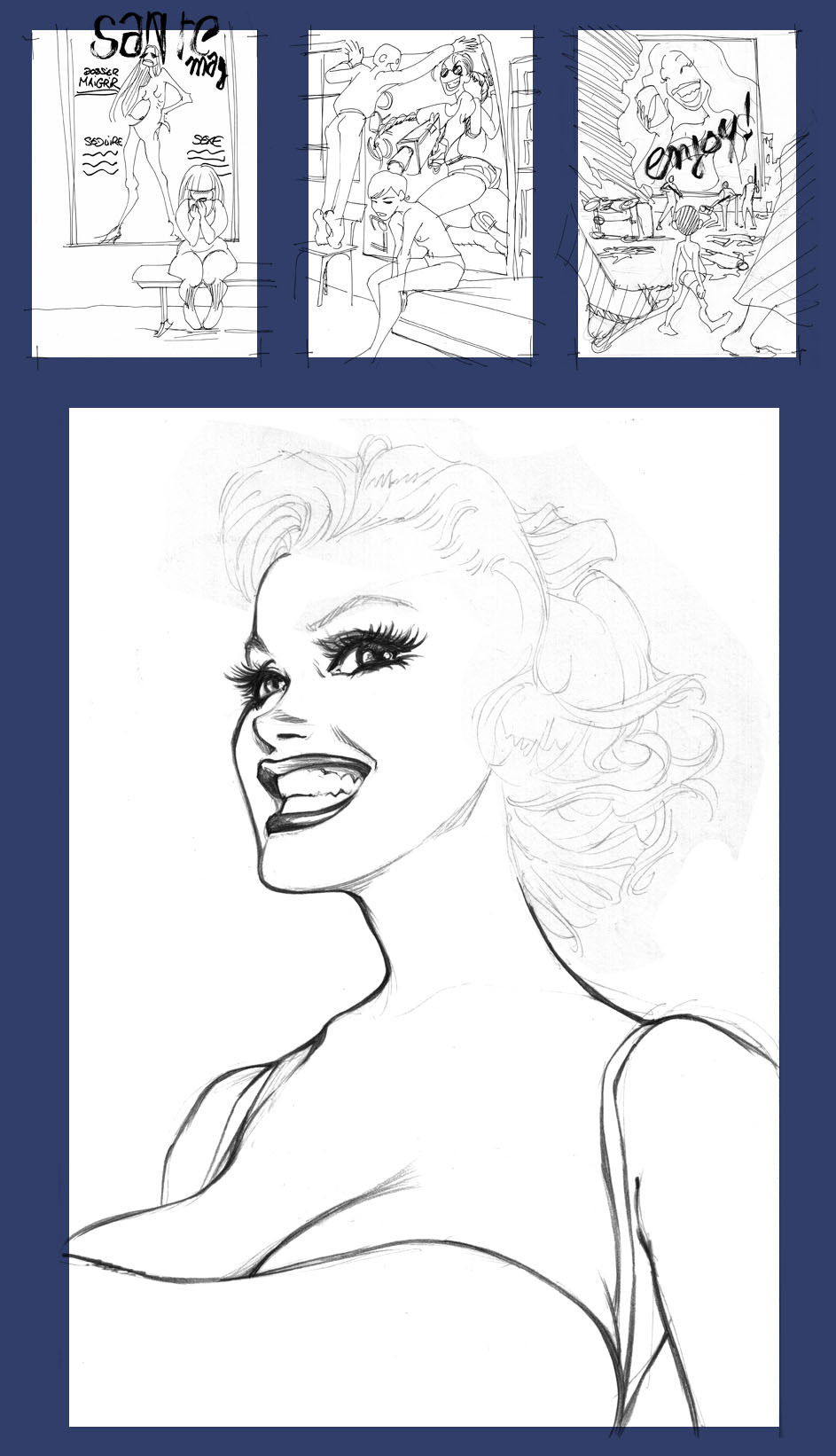
 kiwine — triptych
Published: 2007-07-23 14:47:06 +0000 UTC; Views: 20135; Favourites: 157; Downloads: 661
Redirect to original
Description
These are the three sketches for the triptych concept I elaborate for a "Pin Up" web contest in 2004.I didn't want to do something as simple as the contest title... I wanted to give some purpose to this and give something a little "shifty".
Some reasons to that: I know most of people really don't like the kind of exagerations I usually do, they find it "gross"...
I don't wanted to do a classical "good taste 'n' please anyone" Pin Up so I had to think different.
I started to brainstorm about actual "Woman Imagery"... Big deal, actually.
These three ideas popped up when I was in the shower a few days before contest closure, I had to be quick.
I made the first one, "Femme" [link] in two days.
Now I look at it, I can see what's wrong with it: I must not have done a blushy-shamy girl... this is to much and disturbing the purpose... not badly but a little.
I should have to depict a chubby girl just standing... neutral, waiting for something next to the advertising. It should have been a more efficient comparison with the skinny on the plackard: audience just had to see sickness of "media" VS "real life" a-bit-to-healthy cuty. Snacking-Shameness gives the main idea a little messy and caricatured.
The second one, "Threesome" [link] is about geek addiction to fantasy heroines. I took Lara Croft which is well-known even if it's an "old" reference... one of hundreds !
So, what are geek's girlfriends feelings about this ? Composition idea with Lara's gun above the girl's head is good, I think... but once again, the girl's facial expression is not subtle enough. I must have had to show irritation instead of sadness which makes her too weak.
Buy the way, I did this one whith a young and talented friend... but I think we didn't worked enough on its composition, which is a little shaky.
The third one was the more obvious: Beauty and liberal consumption pictures of ours in countries where people suffer... this is a fact, actually.
Glamour VS Violence... I began to rip a picture of Marilyn Monroe and had a few hours left to make the whole picture before contest closure.
... I wasn't convinced enough to finish it.
Well, any of the two first ones were selected. Not because of technical level, if I refer to some arts which were rewarded, I think it was just considered "Out of subject".
Related content


Comments: 19

"Femme" could also be called, "Faim", n'est-ce pas?
👍: 0 ⏩: 0

I appreciate the thoughtfulness of your efforts here.
👍: 0 ⏩: 0


I have to say that my first impression about your work wasn’t good. Above the exelent quality of the images (trace, painting...), the old and hated bunch of "super-shaped" girls just pissed me off.
Indeed i was quite surprised about a few "tiny-boobs" here and there. But just now when I saw this sketches, I felt myself related with this images, `cause I do feel that way about the stereotypes of women beauty.
It`s hard for a REAL girl to feel confident about her look when it's constantly compared with those icons, really not available for everyone.
I apreciate you to do this stuff, and i`m really glad to find some good clarity behind those exuberant pin ups.
Thnx for sharing this with us, and excuse my shitty english ( it really takes me hard work to write this ñ_ñU)
PS: I prefer the sketch version of "Threesome", `cause the skinny and flat-chest girl contrast better whit Lara Croft. In the finished version, even the girlfriend has nicer body than a "convencional" girl.
But it`s just an opinion.
👍: 0 ⏩: 0

I really like your ideas and art, it has the real life meaning in it...and I like the way you see things and truth.
👍: 0 ⏩: 0

I like these. One thing I'm contemplating is how my fav genre, Sword and Sorcery, gets lots of flak from offended women, who then go on to hurt their self esteem reading "Fashion" magazines.
The lady in the thin "Dress" in Sword and Sorcery tends to be at least also "Full Bodied". Fit, muscular, healthy. Heh, check out Corben's stuff.
On the other hand, the "heroin chic" high fashion where the models have lifestyles that call for four women sharing a cheeseburger, two vomit and a fifth is skipping that meal... And the "Fashion Designers" tend to be homosexual. There's talk that seeing Kate Moss in those jeans they imagine not her, but some young boy just off the bus. The midwestern kid who "Comes out" and his "Good Christian" parents kick him out the door, so he goes to the "Big City".
So the Sword and Sorcery stuff is more healthy, just a manifestation of the "Male Reptile Brain" and while it does have some of the problems you outline in "Threesome" it is far less destructive for women than your first pic on this page.
👍: 0 ⏩: 0


i think your second picture is perfect the way it is. im a girl, and my boyfriend is way into anime and videogames just like the boy in the picture. i think the girls expression is perfect, because even though she clearly has a nice and beutiful body, it shows that no matter how hard she trys to be perfect for him, she can never live up to a pixelized perfect woman.
im sorry if i got the concept of it wrong, but im really glad you and your friend drew this picture because sometimes words cant express how someone feels, but that drawing says more then what i can
👍: 0 ⏩: 0


This is so smart.
Adam Withers said it better than I might have.
👍: 0 ⏩: 0

Great sketches. It’s nice to see the original concepts and compare with the finals. I would argue, though, that your final works actually did a better job of dealing with the subject matter than you take credit for. In ‘Femme,’ having a simple standing pose for the Real girl would have been too simple, and wouldn’t have said much more than “See? They’re different!” What you have, instead, is a piece that not only makes clear the differences between the Hollywoodized, Tabloid Magazine Trash girls and Real women, but also shows the effect such depictions can have on the spirits of girls who can never (and SHOULD never) fit those molds. Furthermore, making the Real girl less of a simple ‘Chubby Chick’ and more proportional goes a step farther and shows a woman who IS pretty and SHOULD feel better about herself, but is made to feel helpless and ugly by what she perceives as what the world wants her to be.
The Second image, Threesome, really NEEDS the girl to look sad and meek in order to work. If she was simply aggravated or frustrated, it could come off as too forgiving of the boyfriend. “Oh, he’s such a dummy! Hee hee, that guy’s in for a rude awakening!” This would have been cute and funny, but wouldn’t have SAID anything to the viewer. What you achieved was a piece that levels the barrel of the guns of the fantasy-woman directly at the Real girl and pulls the trigger. She can’t compete. She knows it, and it makes her sad. This is a serious statement that hits people hard, and SHOULD. We ought to feel bad for her, in order to recognize the arrogance, ignorance, and (perhaps unintentional) cruelty of the boyfriend in de-facto attacking the girl’s self-image.
I’m personally very glad you decided NOT to tone these down, and went with the hard-hitting, grab-you-by-the-gut kinds of artworks you did. Rather than being simple, cutesy depictions of the same clichés we’ve all seen before, these have balls. Great, great job—I applaud you.
👍: 0 ⏩: 1

Oh wow !
thank you very much for this long comment and the two others you left, man.
I'm glad these had strong impact on you.
I don't know what else to say, except "thanks again "!

👍: 0 ⏩: 1
You're very welcome. i dig the whole gallery, but for whatever reason - maybe just the headspace I was in at that particular moment - these pieces just slammed me. Keep up the awesome!
 (Smile)")
👍: 0 ⏩: 0


im blown away by this it actually makes u think
great concepts too.
👍: 0 ⏩: 0

I agree with that which was said above. Love your work
👍: 0 ⏩: 0

it's really nice seeing some of your pre-production sketch work.
it shows some people out there the level of actual thought that goes behind some images, rather than just something for the eyes.
👍: 0 ⏩: 1
It's embarassing, but thanks a lot, man ! ^__^
👍: 0 ⏩: 0