HOME | DD
 KlickWitch — Juvia's Greatest Loss
#fairytail #animemanga #fairytailgray #grayandjuvia #fairytailjuvia
Published: 2016-11-24 00:30:06 +0000 UTC; Views: 517; Favourites: 29; Downloads: 2
Redirect to original
Description
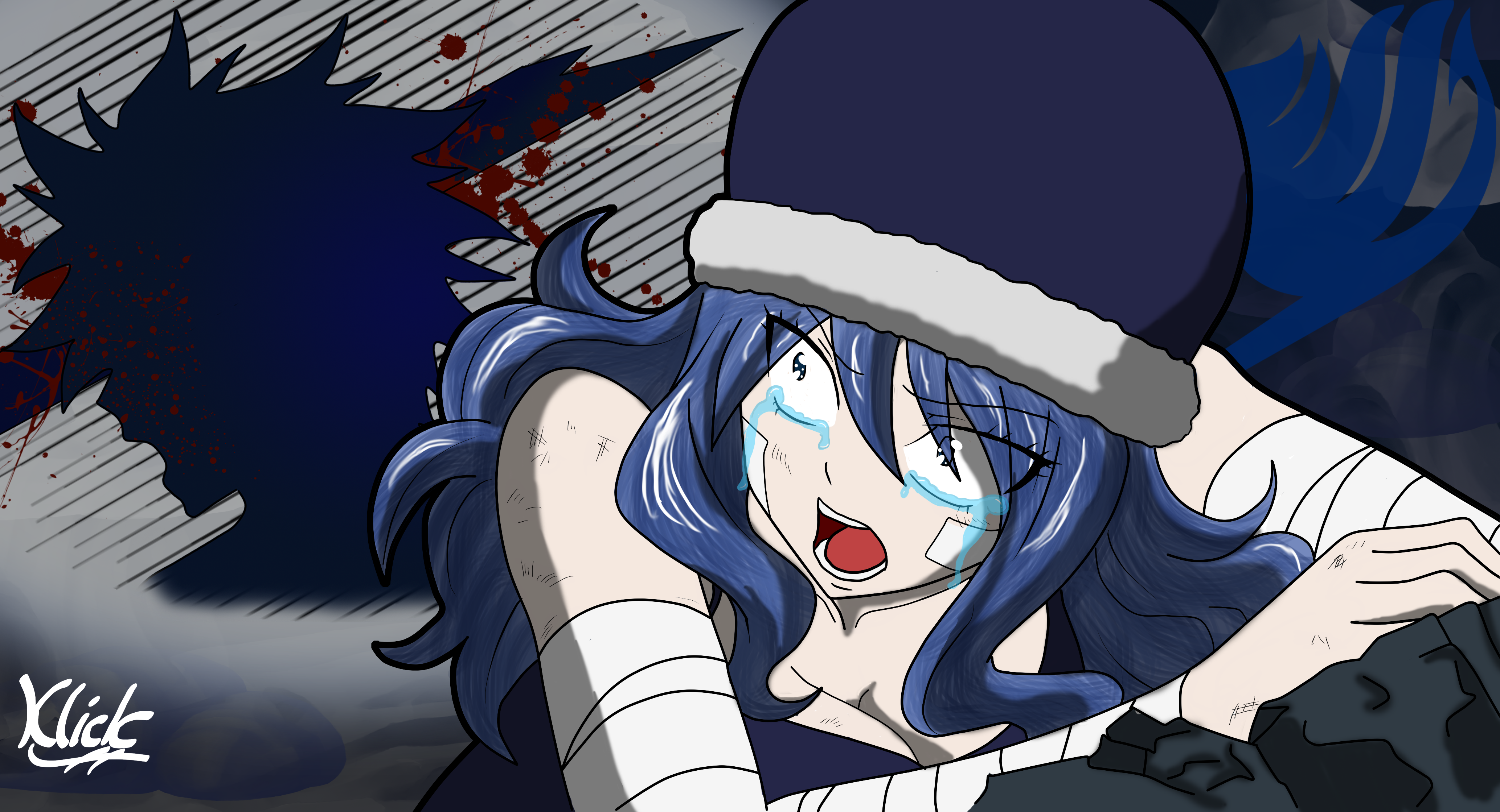
I drew a couple picture of Gray and Juvia getting cosy underwater. But, It didn't really look like Juvia since I hadn't drawn her before. I wanted to have a picture focus on her. Also, I'm not great at romance pics. So I went the other way.Spoilers for anyone interested in Fairy Tail and not past the grand magic games.
This picture is based on a tragic moment for Juvia where Gray died right in front of her. He was saved because time magic, but still. For those of you aware of Juvia's character, I'm pretty sure if Gray stayed dead, all those Dragons wouldn't have a chance.
Other gray and juvia pictures:
Related content


Comments: 12

For this, I did the outline in Paint tool Sai, then I coloured it in with photoshop elements
👍: 0 ⏩: 1

ok i wanted to know because i was looking for good art programs
👍: 0 ⏩: 1
Photoshop Elements is like a cheaper, incomplete version of photoshop. I bought it for about $200 CAN. The Sai paint tool, I believe is about $50, but you can get a free 30 day trial.
👍: 0 ⏩: 1

Greetings from ProjectComment !
I agree with much of what IAmNoHere mentioned in terms of constructive criticism. It's a well thought out composition, and there are a few adjustments that could have really taken it to a special place. What I noticed that IAmNoHere didn't mention has to do with the way you've shaded the hair. It looks like beneath the working line art you took a loose brush and stroked multiple lines in the general direction with the hair, creating a striped and textured appearance that doesn't quite amount to hair. I think the initial colors you used (the blue with the slightly darker blue strands) were perfect, but it's the way you went about coloring it that detracts. It doesn't offer any shadow value, so even with the highlights it looks like her hair is flat but just weirdly colored. Lenient use of the shadow value tones in the correct areas where there would be shadow (rather than trying to create the illusion of flowing hair) would have worked better for this line art piece, and would have conveyed the sense of hair that you were trying to achieve.
The reason why the individual strand thing isn't working is in some of the smaller 'clumps' of hair; you've mistakenly crossed beneath the line art into separate strands of hair, breaking the hair flow in other clumps.
To add to what IAmNoHere mentioned about the highlight, the white is also distracting. A paler color than the original will look far better. Only specifically stylized (where the composition is purposely simplistic) pictures can use white as a highlight and get away with it, otherwise it's a huge unnatural magnet for the eyes and pulls away from the rest of the composition. Even things like her armbands and eyes should carry a hint of value on the grayscale, even if not color. Preferably a color that is being reflected via bounce light by the environment.
And that's the main thing I think you could work on to improve your art. I went into so much detail here because the same mistakes that are here were repeated elsewhere in your different pieces. :] I wish you the best!
👍: 0 ⏩: 1
Thanks for your comment!
I'm acctully using a newer brush for hair texture in her hair. That's where all the little strands are coming from. Still getting the hand of it/debating if I should bother with hair texture in Fairy tail pictures.
You're right about her bandages. They are a light grey, but I should of added more to it. Perhaps some more shading, or blood stains from her wounds.
her highlights, I flat out messed up on. I should of redone it, but i didn't and I don't know why >.<
But i think my biggest regret is not making Gray's layer (the silhouette getting impaled) more translucent, or smaller, or something like that. It's supposed to be happening in front of her, but we are seeing what she sees. I was going to push her back and have a full body impaled Gray in front, but that took away the focus from Juvia, and I wanted the focus on her.
But yeah, thanks again!
👍: 0 ⏩: 0


Greetings from the ProjectComment !
This picture caught my eyes as soon as I saw it, so I decided to write you some of my opinion. At first I must admit that I don't know much about anime, so I'll write my view as somebody, who may not be aware of all anime-drawing style conventions.
I like the composition of this piece. It's compressed to a (relatively) small space, but this way there's something to look at wherever you place your eyes. But still, the hole in the (glass? Wall?) seems to be too close to the girl. I think it should be placed more to the left or a little smaller.
Now to the hole itself. The open mouth completely caught the action behind it and he blood in the air caught the moment. (I thing I've seen lines of the remains of the glass, but it's so dark that it looks like the blood is still in the air, but that's a nice detail rather than a flaw).
The girl is well drawn. I like the detail of scratches on her arm and hand. The only thing here, her arms seem too thick to me. Just a half of a centimeter less would do the trick. I like the shape of the rocks under her hand too, though they could be more structured.
Her face is another thing. It's hard for me to focus on the most important part – her tears, because there's too many lines. I know that people in anime are drawn with their eyebrows overlaying their hair, and that still could be okay, but you have almost her whole eyes overlaying. It makes a mess in the lines.
Apart from that, the hair is drawn with fine and natural structure and that's great. I just find the lighting too bright. I'd use a color just a little brighter than the brightest color in the hair instead of the white.
When writing about the lines, I must say that the outer black lines seem too thick on the left. (On the side of her head and the hair). You probably wanted to divide the girl from the background, but a thinner line would do that too.
I'm sorry for the length of this comment, it's probably far more than 7 lines.
As I said, I'm not a fan of the anime style, but I like this picture anyway. I hope that something from this will help you and I'm curious about your next drawings
👍: 0 ⏩: 1
 (Smile)")

Being a Juvia girl, I felt Juvia's pain when I saw this. I wanted to cry for DAYS!!! However, the show thought it would be 'cute' <-- I say sarcastically to make you relive that moment 5 times! I counted it. After the fourth time, I was able to steel myself against the tears. In your attempt you did a great job depicting Juvia. By the way, thanks for the jab at the heart. with Gray in the background. One of my LEAST favorite parts of the show. Second would be the episode of Fairy Tail Zero where Lucy is talking about what happened between in the gap between Fairy Tail and Zero. It CRUSHED ME!
👍: 0 ⏩: 0