HOME | DD
 KluverDesigns — Spawn...

Published: 2012-05-03 05:36:20 +0000 UTC; Views: 7955; Favourites: 159; Downloads: 0
Redirect to original
Description
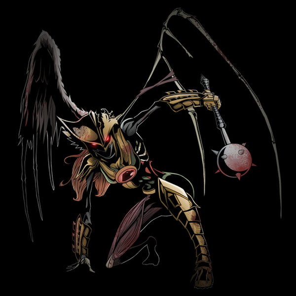
My finished Spawn picture. I will say that I love the way this turned out. The shadows, the colors, the lighting, everything, I'm just amazed at how it turned out. Enjoy!Spawn (c) Image Comics
Related content


Comments: 10


What happens if he dies? Does he respawn?
No, but seriously, great pic!
👍: 0 ⏩: 0

Looks really good. Very atmospheric.
I don't think his right arm stands out enough. It goes with the flow of the fabric and gets lost in it.
His torso kind of gets lost in the cape as well, with the chains adding further confusion to it. But I think thats more of a flaw with the character design than with your drawing. Never been a fan of the 90s "big cape'n'chains" aesthetic the character personifies, makes drawing the character kind of an uphill battle.
The inking is badass though. Kinda bummed that the most powerful part of the b&w version (the hem of the cape) is blacked out here, I liked that when the cape curled back up it was clear while behind it the cape was speckled (what brush did you use for the splatter BTW?).
Some things I'd keep in mind with the colouring are values and saturation. I'd push them a little more and ramp up the contrast on key bits to keep different planes separate. The cape doesn't seem lighter or darker than the black costume, which makes the two blend together. I'd make the reds stronger or make the greys darker.
👍: 0 ⏩: 1

Thanks man, I love getting feedback like this. Do you have any suggestions on how to make his arm stand out? While I was coloring, I had that same fear , I just didn't know how to prevent it. I tried making it a different shade, but it just didn't look right. That was really my biggest flaw here, but I like the torso. When I was looking at comic panels for Spawn, he would always be shrouded in his cape, and to further add to that, the cape is treated like a separate character (or at least to me). But like you said, character design and whatnot.
As for the inking, I was damn proud of it, so thanks. I agree that the splatter was the best part, but I didn't really think it was that important after seeing the full thing colored. I used a brush that I downloaded off of this site, it should be somewhere in my favorites.
I'll keep in mind the contrast of the colors for next time, I'll try playing around with it. I never really sat down and tried to figure out everything that goes into coloring, so maybe now is a good time. But anyways, thanks for the feedback, it's always appreciated.
👍: 0 ⏩: 1
The goal is to establish planes by heightening contrast between objects to clearly separate them. For example, if you have something that heavily crosshatched and you put something thats also crosshatched in front of it they will bleed together, while if the overlapping object has no hatching it will stick out quite clearly over the hatched one and they will be clearly separate. Thats using varying levels of detail to create depth. To apply that to the hand you could take away detail from either the hand or the cape, so its a simple shape on top of a complex shape or a complex shape on top of a simple shape.
But I don't think thats necessary as the hand reads clear in the inked version, its the colours that cause the trouble. The red of the glove bleeds into the red of the cape, the black outline isn't enough to separate them. Notice how the upper portion of the glove reads clearly. Thats because its a light red against a dark red or even black background. What I'd do is I'd add some specular highlights to the hand and fingers, right on the outside edge (facing the light source of course). That will make those edges pop a bit. I'd also darken the shadow on the cape near the hand. Not only does this provide a separation through contrast but it also uses light to reinforce the illusion of depth by making the hand seem like its raised off of the cape.
A good way to figure this stuff out is to constantly check it without outlines and make sure different objects still look separate, especially on areas where the only boundary is a line and on areas where similar textures are overlapping.
👍: 0 ⏩: 0


really cool dude, spawn is one of the bad ass characters ever.
👍: 0 ⏩: 0

")